The End of the Mac As We Know It (Reflections Upon Snow Leopard)
This post has been relocated to
http://thislamp.com/?p=1545
Please continue any discussion and redirect any known links to the above URL.
Libronix/Mac vs. Accordance, Part 2: Printing
http://thislamp.com/?p=1656
Please continue any discussion and redirect any known links to the above URL.
Libronix/Mac vs. Accordance, Part 1.1: Speed Search Revisited
http://thislamp.com/?p=1661
Please continue any discussion and redirect any known links to the above URL.
Libronix/Mac vs. Accordance, Part 1: "Speed" Search
http://thislamp.com/?p=1667
Please continue any discussion and redirect any known links to the above URL.
Accordance vs. "PC Bible Software Ported to the Mac"
http://thislamp.com/?p=1768
Please continue any discussion and redirect any known links to the above URL.
Thoughts on the New iPhone & What's Still Missing
http://thislamp.com/?p=1772
Please continue any discussion and redirect any known links to the above URL.
Biblical Illustrator Plus: Summer 2009

Sunday, I received my new copy of Biblical Illustrator Plus CDROM. I’ve been using Biblical Illustrator for years to help me prepare for the Bible studies I teach on Sunday morning. BI contains background articles that go along with the two main Sunday School curricula used in most Southern Baptist churches. BI is completely separate from the regular teacher’s material, but honestly I value it more. Every quarterly issue contains around 25 articles that offer background information for the biblical texts covered in our studies. The information is usually more detailed than what is offered in the average commentary, but short enough to be digested in one sitting. A working knowledge of biblical languages is not required.
G. B. Howell Jr. is editor of BI. In this newest issue, he is interviewed regarding the role he has played over the past six years. In that interview, he offers a very good description of what BI has to offer:
We continue to offer articles on biblical archaeology, geography, history, people, Greek and Hebrew word studies, and some theology. Every issue has a book review that introduces a new resource to our readers. And we offer a CenterSpread that is art intensive but has an economy of words. ... We have begun offering, though, sidebar boxes with self-contained information (see “St. Catherine’s Monastery,” p. 9). We added a twopage article that addresses some aspect of biblical archaeology, either a find or a site of significance.
The cover of the Summer 2009 issue features a bronze mask of a maenad or female follower of the wine-god Bacchus (Roman, 1st cent. A.D.). In addition to the curricula-related articles, this issue offers a review of Paul Barnett’s book, Paul: Missionary of Jesus. The archaeological article by Joe Cathey focuses on the City of David. The center spread covers the geography of ancient Galatia.
I teach the Explore the Bible curriculum which covers Galatians and James for the months of June - August. Many of the articles that you will see in the table below relate to these books of the Bible. Other articles offer background information for the Bible Studies for Life and MasterWork curricula. Below are the new articles in the current issue of BI:
| Jerry Batson | Anointing in the Early Church | James 5 |
| Joseph Beckler | Abide in John's First Epistle | 1 John 2:3-17 |
| Martha S. Bergen | Jewish Feasts & Festivals | John 7:10-39 |
| Rick Byargeon | Sinai: The Mountain of God | Ex 33:12 - 34:9 |
| Joseph R. Cathey | ARTIfacts: The City of David | |
| Bennie R. Crockett Jr. | Three Social Divisions in the First Century | Gal 3:26-29 |
| Terry Ellis | Sins of the Flesh | Gal 5:16-26 |
| R. D. Fowler | Mirrors | James 1:19-27 |
| John L. Harris | The Book of Jonah in Its Historical Setting | Jonah |
| G. B. Howell Jr. | Paul: Missionary of Jesus by Paul Barnett [book review] | |
| Francis X. Kimmitt | Ancient Culture and Law | Ex 33:12 - 34:9 |
| John Mason | Literacy in the First Century | Galatians, James, 1 Peter, 1 John |
| Allan Moseley | The Tabernacle: Its History and Use | Ex 35:4 - 36:7 |
| Mark Rathel | "Light" in John's Writings | 1 John 1:1 - 2:2 |
| Charles A. Ray Jr. | Genuine Humility | James 4:1-17 |
| C. Mack Roark | James' Ethical Imperatives | James |
| Don H. Stewart | Galatia: Its History | Galatians |
| L. Thomas Strong III | The Social Elite in the First Century | James 2:1-13 |
| J. Mark Terry | Gideon: His Life and Times | Judges 6:11-40 |
| Timothy Trammell | Traveling Through Galatia [center spread] | Galatians |
| Robert A. Weathers | Colossae in the First Century | Col 1:1-29 |
| C. Alan Woodward | The Churches of Galatia | Gal 1 |
The articles above are in both the print issue of BI and the BI Plus CD-ROM. However, the articles below are from previous issues and can be found only on the CD-ROM edition, Biblical Illustrator Plus.
| Scott Andrew | Faith | James 1:3; 2:14; 2 Peter 1:5 |
| Stephen J. Andrews | Sackcloth and Fasting in Jonah | Jonah |
| Stephen J. Andrews | Hazor: A Great City | Josh 10:1 - 12:24 |
| Waylon Bailey | Aaron's Golden Calf | Ex 32:15-19, 30-34; 34:4-6 |
| Bryan E. Beyer | God's Message for Ninevah | Jonah 2:10 - 3:10 |
| James A. Brooks | Gnosticism | 1 John 4:1-3 |
| James A. Brooks | Redemption | 1 Pet 1:18; Eph 1:7 |
| Trent C. Butler | Near Eastern Creation Stories | Genesis |
| James Carter | Old Testament Backgrounds of the Book of James | James |
| Robert O. Coleman | The Fountain | James 3:11 |
| Robert O. Coleman | The Sirocco and the Flower | James 1:11 |
| Bob Dean | The Counselor | John 14-16 |
| David S. Dockery | The Meaning of Deposit | 2 Cor 1:21-22; 5:1-5; Eph 1:11-14 |
| David S. Dockery | To Betray Another | Matt 26:26-56 |
| Charles W. Draper | Law and Faith | Galatians |
| Mark R. Dunn | Counselor: The Meaning | John 14:15-31; 15:26-27; 16:5-15 |
| Mark R. Dunn | Who Were the Samaritans? | John 4:4-26 |
| J. Scott Duvall | Grace | Rom 5:6-17 |
| Kendell H. Easley | The Prison Epistles | Philemon; Colossians |
| Terry W. Eddinger | Ninevah: Assyria's Last Capital | Jonah 4:1-11 |
| Gary Lee Gramling | Paul's Ethical Absolutes | Colossians |
| Sharon H. Gritz | The Betrayer: Judas Iscariot | Matt 26-28 |
| Fred Howard | Prayer: A Word Study | Psalm 28:6-7; Col 4:2-4; 1 Thess 5:16-18; 1 Peter 5:6-7 |
| Paul N. Jackson | A Christian Ethic of Business | James 4:1-17 |
| Robert Earl Jones | Abide: The Meaning | 1 John 2:3-17 |
| Scott Langston | Midian in the Time of the Judges | Judges 4:1 - 9:57 |
| Bill Latta | Gold Rings and Fine Clothing | James 2:2-3 |
| Michael Martin | Fallen from Grace | Gal 5:4 |
| John Mason | Horses: Their First Century Use | James 3:1-5 |
| M. Pierce Matheney Jr. | The Historical Setting for the Book of Jeremiah | Jer 1:4-10; 4:1-4; 6:16-17 |
| David M. May | The Spirit of Restoration | Gal 6:1-10, 14-18 |
| Glenn McCoy | Christ's Second Coming | Heb 9:28; James 5:7 |
| Glenn McCoy | The Royal Law | James 2:1-13 |
| Larry McGraw | Freedom and the Christian | Matt 18:15-17; Gal 5:13-15; 6:1-5 |
| Larry McGraw | The Life Situation of James | James |
| Larry McKinney | The Background of Schoolmaster | Gal 3:1-5, 23 - 4:7 |
| Harold L. McManus | First Century Wars and Their Causes | James 4:1 |
| Warren McWilliams | The Galatian People | Galatians |
| Janice Meier | Gideon: All We Know | Judges 6-8 |
| John Polhill | John's Use of "Witness" | 1 John 5:1-12 |
| John Polhill | The Meaning of "Justified" | Gal 2:11-21 |
| John Polhill | No Respecter of Persons: God's View of Race Relations | Acts 10:34-35 |
| Wayne W. Poplin | Gideon: A Mighty Warrior | Judges 6:11 |
| Gregory T. Pouncey | Libertinism & Legalism | Gal 5:16-26 |
| Michael Priest | Titus and Paul | Titus |
| M. Dean Register | God's Wisdom/Man's Wisdom | 1 Cor 2:1-16 |
| Charles A. Ray Jr. | Antichrist in John's Letters | 1-3 John |
| Charles A. Ray Jr. | Christ and the Kosmos | Phil 2:19-24; James 3:13-16; 1 John 2:15-17 |
| Charles A. Ray Jr. | The Law of Freedom | James 1:22-27; 2:14-18 |
| E. Randy Richards | Stop Lying | Col 3:8-9; James 3:3-12; 1 Pet 3:8-10 |
| C. Mack Roark | Introducing 1 John | 1 John 1:5-10; 2:3-11 |
| Paul E. Robertson | The Churches of Galatia | Galatians |
| David M. Russell | The Colossian Heresies | Col 1:9-23 |
| Billy Simmons | A Religious History of Galatia | Galatians |
| Bob Simmons | The Curse | Gal 3:15 - 4:7 |
| Billy K. Smith | The Meaning of "God's Spirit Moved" | Gen 1:1-5, 31 - 2:1, 15-17 |
| Harold S. Songer | Anointing with Oil: What Does It Mean? | James 5:14 |
| Gerald L. Stevens | "Blaspheme": A Word Study | James 2:1-13 |
| Robert A. Street Jr. | Micah: His Life and Times | |
| Leslie "Thomas" Strong III | Family Life in Ancient Corinth | 1 Cor 7:1-5; 8-16 |
| Roger R. Sullivan | Corinth's Religious Atmosphere | 1 Cor 8:12-13 |
| J. Mark Terry | Jonah's Vine | Jonah 4:1-11 |
| William B. Tolar | A Different Gospel | Gal 1:1-12 |
| William B. Tolar | Paul's Fruit List | Gal 6:16-26 |
| Timothy Trammell | Faith Affirmed | 1 John 5:1-12 |
| Timothy Trammell | The Purpose and Life Situation of John's Letters | 1-3 John |
| Robert A. Weathers | Sexual Purity in the New Testament | Job 31:1-4; Psalm 10:3-4; 2 Cor 10:4-5; 1 Thess 3-5, 7 |
| Elgia "Jay" Wells | Lessons for Race Relations | Acts 10:1-48; 8:26-40 |
| Terry L. Wilder | The Role of a Steward | 1 Peter 4:7-19 |
| Jerry M. Windsor | Grace | Ephesians |
| C. Alan Woodward | Heresies in the Colossian Church | Colossians |
| G. Al Wright Jr. | Testing | James 1:2-4, 9-15, 26-27 |
Now, when I’ve written about BI before, I’ve suggested that it has value even for people who don’t teach from SBC curriculum. Why? Well, the articles provided in each issue are invaluable if one is involved in any aspect of preaching or teaching. Every CD in the “Plus” edition contains almost 100 articles. A couple of years ago, I began copying the articles (all in PDF format) from the CD onto my hard drive. I divide them up by books of the Bible as can be seen below:
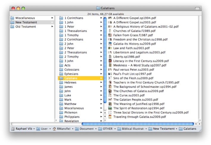
Thus, regardless of whether I’m working on a Sunday School lesson, sermon, college lecture, or some other study of the Bible, I have dozens of background articles at my immediate disposal.
Recently, I’ve started listing articles in my personal notes in Accordance where I do the bulk of my preparation for teaching the Bible. I haven’t completed this project yet, but once I’m finished, I’ll have a running index in biblical order of the articles I have available.
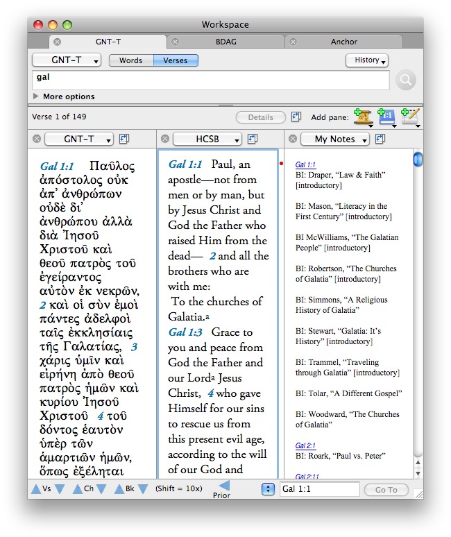
I promise you I receive no commission from Lifeway for promoting BI here on This Lamp! I simply remain very enthusiastic about this resource and highly recommend it to others who are in any kind of teaching or preaching ministry. The print edition is $24.95 a year and the CDROM edition (with all the extra articles from past issues) is $34.95.
Christmas Lights

Ahh the lovely red and green of Christmas...
We were planning to have a round of American Idol Karaoke on the XBox on Christmas Eve (Hey! I don’t judge your family traditions!) when we were greeted with the dreaded “Red Ring of Death” (RRoD). Or, if you prefer, “general hardware failure” as Microsoft likes to call it.
For a brief moment it came back to life--surely a Christmas miracle I thought--but then it returned to its non-functioning state.
Perhaps this is so we will re-focus on the true meaning of Christmas instead...
Hebrew Search Comes to Olive Tree iPhone Bible Reader Beta
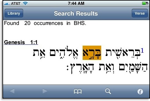
I’ve also found that reading Hebrew on the iPhone works better in landscape mode.
Again, this is still just a beta. Olive Tree has a number English texts already available (go to the iTunes store and search for “Olive Tree” ).
Greek Search Comes to Olive Tree iPhone Bible Reader Beta

Above is a screenshot from the beta released last Friday. The actual method for entering Greek text is still a bit awkward, but it’s a good beginning. Hebrew search is not yet implemented, but is in the works.
Olive Tree has given me permission to discuss and post images of the beta.
First Look: Hebrew & Greek Biblical Texts on the iPhone
The screen shots below are from a beta released yesterday from Olive Tree (I have permission to post these images):


Frequent readers of This Lamp will know that I’ve lamented the loss of original language biblical texts “in my pocket” ever since switching from my Palm Treo to the iPhone last year. After a long wait, Olive Tree comes through with the promise a full replacement, and I have to admit that the texts look much better here than they ever did on my former device.
As you would expect, these texts are fully downloaded to the iPhone and do not require an internet connection for repeated access.
While I’ve got your attention, let me show you a couple of other things Olive Tree is working on for their Bible Reader.
Since my initial review, Olive Tree has incorporated links to textual notes and cross references in their modules.
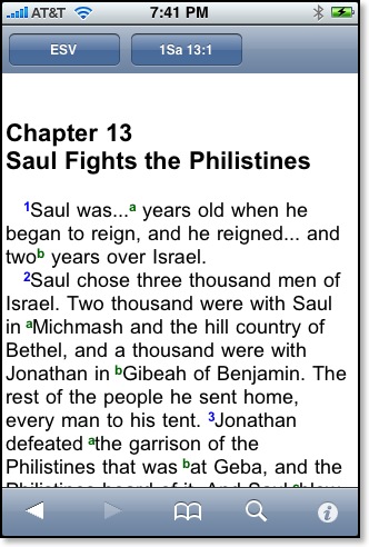
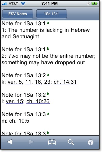
For instance, as demonstrated in the above modules, clicking/touching the superscript letters in the ESV leads to a appropriate section in the ESV notes. This is still not split screen, which I would prefer, but it’s a good start.
Traditionally, Olive Tree has allowed users who purchased texts for one platform to download these on any other platform as well. For instance, after purchasing modules for the Palm years ago, I was also able to download the same texts to a Windows Mobile device while I was testing one out a while back. However, this generous level of cross platform mobility has not been possible so far with the iPhone because Apple tightly controls iPhone apps and requires them to be distributed via the iTunes Store only with the exception of beta releases as seen in some of the images here). And not only do previously purchased modules have to be re-purchased, they have to be purchased separately. Again, this is not a policy from Olive Tree, but rather from Apple.
Right now, for instance, if an iPhone user purchases the NIV Family Pack for Bible Reader and the ESV Study Bundle, two separate installations of the Bible Reader are loaded with each respective set of modules. Other text reader programs in the iTunes App Store have been allowed to include modular purchases, so Olive Tree is trying to work with Apple to make the same kind of access available to users of their Bible Reader.
These screen shots below from a beta release (features not yet approved by Apple) show a “store” from Olive Tree where users could purchase texts directly for download over the internet to their iPhones. Once texts have been purchased and downloaded, they show up on a “My Olive Tree Account” page.
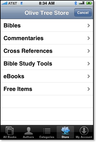
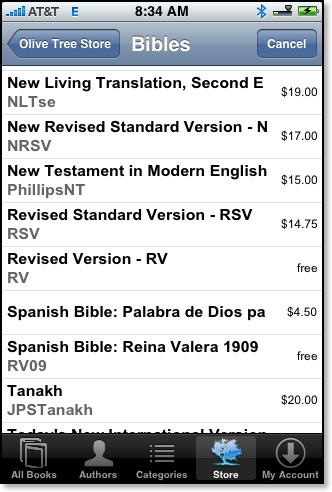
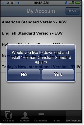

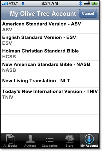
Let’s hope that Apple will approve Olive Tree’s solution because it’s a good and fair answer to the current modular dilemma.
See also:
• Olive Tree’s iPhone page
• To see Olive Tree’s current offerings in iTunes, search for “Olive Tree” in the iTunes Store Search window.
Then in the “Applications” box, select “See All.”
Ten Years on a Mac (1998 to Present)

In the summer of July, 1998, I was Associate Pastor of Church Growth and Development at Springdale Church. We had just begun experimenting with a projector and screen during our worship services, something that is very common in churches today. Perhaps because I had a copy of PowerPoint or perhaps because I had a Toshiba laptop that I could take into the auditorium, I had been assigned to work with the worship staff and prepare the slides for each Sunday’s service.
In preparing these slides, rather than working on my laptop’s 10.4” screen, I thought it would be easier to use the brand new Compaq PC in my office and then transfer the PowerPoint file to my laptop. I had only one problem: every week as I prepared the slides, I had to suffer through multiple crashes of PowerPoint ’97 in Windows ’98.
I was also a bit of a Microsoft snob. I knew there were other platforms out there as well as other presentation software packages, but I was certain that Office would surely run better on Windows than anything else because both were Microsoft products. I would learn this wasn’t necessarily so.
I’ve always had a high expectation with computers, regardless of what platform I’ve used. Is it unreasonable to expect them to operate as their promoters promise? With PowerPoint constantly crashing, I felt like I was wasting valuable time. It’s at this point, I decided there had to be a viable alternative. I began looking at other programs as well as other platforms.
Okay, I have to admit that I had tremendous prejudice against Apple and the Macintosh platform--all the regular stuff you hear from hardcore Windows folks. Part of my bias went all the way back to a computer class I took in 11th grade in high school. We learned to program BASIC on both the Apple IIe and the TRS-80 Model IV. The BASIC programming language on both machines was written by Microsoft, but for whatever reason programming on the Apple computers often required extra lines of instruction not needed on the TRS-80s. My bias against Apple came early and was based on experience.
In 1998, Apple was just starting to come out of its darkest days. Steve Jobs had returned after more than a decade long exile from the company he’d co-founded. An exciting new self-contained computer called the iMac had been announced that featured a see-through case and a strange technology known as “USB.” There seemed to be a buzz about Apple all of a sudden, and my interest was piqued.
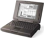
In spite of my bias against all things Apple, I had to admit that my experience with that particular PowerBook at been positive--or at the very least, I had no major complaints. I couldn’t remember applications crashing on me. But at the same time, I never used the PowerBook 5300cs as intensely as I used my Windows PCs.
So, I started seriously investigating the Mac platform. I talked to Mac users on online forums. They promised me that Macs never crash. That was certainly not true, but ironically, after making the switch I was pleased to discover that Microsoft PowerPoint for the Mac was indeed more stable than the Windows version in Windows 98.
I had three concerns in switching. At the time I was using a number of Adobe apps: PageMaker, Photoshop, and Illustrator. This was before the days of the Creative Suite and they had to be bought separately. I was very pleased to see that all three were available for the Mac. In fact, back in 1998, the Mac versions turned out to actually be a bit better than the Windows version--especially Illustrator. I had already seen that I could get Microsoft Office (Word, PowerPoint, and Excel) on the Mac. There wasn’t a Mac version of Microsoft Access, but I only maintained a couple of databases, which I realized I could manually convert to FileMaker Pro which I later did. For the sake of transition, I could even run Windows 98 on a Mac through VirtualPC from Connectix (later bought by Microsoft). It was pokey, but it worked.
My greatest concern was Bible software. At the time, I was using BibleWorks for Windows, and there wasn’t a Mac version. So in my research I came across Accordance Bible Software, which at the time was partnered with the well-respected Gramcord Institute. The more I read about Accordance, the more impressed I became. As powerful as BibleWorks was, Accordance promised to take things to the next level. In the end, of course, I made the switch, but I always credit Accordance as being the final solution to convince me to go over to the Mac.
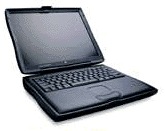
The Wallstreet II was the last PowerBook to include the “rainbow” colored Apple at the bottom of the screen. It still relied on serial and ADB connectors even though Apple was transitioning to USB in its desktop machines around this time. However, with the PowerBook’s card slots, I was able to add USB and even Firewire capabilities to it eventually. In many ways, that PowerBook offered the best of old and new technology in one machine.
When I received my PowerBook, it was running Mac OS 8.1 but there was already stirrings in the Mac community about the replacement operating system eventually named OS X. In the end it was OS X that made me give up my Wallstreet II PowerBook in 2001. I was an early adopter of OS X, which the Wallstreet PowerBook could run just fine but with one exception. Initially the first versions of OS X didn’t offer DVD playback. This wasn’t a huge deal because as Apple transitioned to OS X, the user was able to boot into either OS 9 or OS X. However, once DVD playback was finally added to OS X (around version 10.1.5 if I remember correctly), the Wallstreet was left out in the cold. For whatever reason, DVD playback wasn’t included on that particular model. Regardless, I had three very good years with that first Mac.
I still remember after my initial transition to the Mac platform how lost I felt at times. I had been extremely comfortable with both DOS and Windows. I remember sitting in front of my new Mac, sometimes struggling to figure out how to do something I already knew how to do in Windows, wondering if there would ever come a day that I would know the Mac as well or better than I knew Windows.
That day came soon enough, but I’ve never completely taken both feet out of the Windows world. After I left my church position, I worked briefly part time for a computer support company in which 90% of our work was on Windows machines. As I daily fixed problems with Windows machines which would not have been problems on Macs, my decision to switch was confirmed over and over. Later, I would become a chaplain and Bible teacher at a private school where one of my responsibilities was to oversee a computer network consisting of three Windows servers and about 140 Windows client machines. I convinced our headmaster to allow me to buy an eMac which I was able to use to monitor and maintain all three servers and the entire Windows network thanks to Windows Remote Desktop. In fact, when French hackers breached our firewall and set up UNIX directories on our servers, unseen from the Windows Explorer, it was my UNIX-based OS X Mac that was able to go in and delete the hackers’ files.
Even today, now with a couple of Intel based Macs, I occasionally find a need to fire up Windows using Parallels. It’s no longer quite so pokey because emulation is no longer needed since Macs and PC’s share the same Intel processors these days. I’ll admit up front that with the advent of Windows 2000, the Windows platform itself became more stable and less prone to crashes like I experienced in 1998. But on a Mac, I don’t have to worry about viruses, spyware and the like that is a constant threat on any Windows machine.
Could I switch back to Windows? Well, I could if I wanted to with little transition or slowdown. The fact is, however, I have no desire. The old joke someone told me back when I was researching the Mac platform in 1998 was that “Once you go Mac, you never go back.” It’s true. I have no need or desire to go back. And I assume the next ten years will be even better and more interesting than the first.
Anyone Have an Old Copy of a TLG CD?
At one time these texts were released on CDROM, but since 2001 these texts have been made available online to subscribing institutions and individuals. At SBTS, where I am studying, I have access to these texts online.
However, years ago we had the texts on CDROM. I even used the older CDROM version over a decade and a half ago for a paper that I wrote in my last semester for my M.Div. Recently, I tried to see if these CDROMs were still around because Accordance Bible Sotware includes the ability to directly import these ancient Greek texts and convert them into user modules for use in Accordance and in conjunction with other Accordance modules. Unfortunately, this only works with the CDROM modules, not the online texts as the underlying format has now changed. Anyone familiar with Accordance would recognize the value of having these texts available as modules over the limited ability to search and manipulate the texts online.
When I looked in SBTS’ library catalog, the TLG CDROMs are still listed. Unfortunately no one could find them. The discs were probably packed away in a box without proper acknowledgement in the database. I’m certain they will be unpacked in a hundred or so years and then summarily thrown away.
Therefore, I am sending out this request to anyone who might still have access to the old CDs so that I might obtain the texts in their original format to use them with Accordance.
To my knowledge, I am not doing anything illegal in asking to borrow these discs since my institution has/had copies of both the physical CDROMs as well as a current subscription to the online service.
More on Olive Tree's iPhone Bible Reader
Today, Steve Rogers (Captain America?) left a comment asking the following questions:
Will these bibles work with the iphone 3G? Are there plans to create an NIV and NLT versions for iphone 3G. Those are versions that I read.
Olive Tree’s Bible Reader works with any iPhone that has the 2.x software loaded, obviously including the iPhone 3G.
And yes, there are plans to release the NIV and NLT versions. In fact here are screenshots of these two translations from a beta version I have loaded on my iPhone:
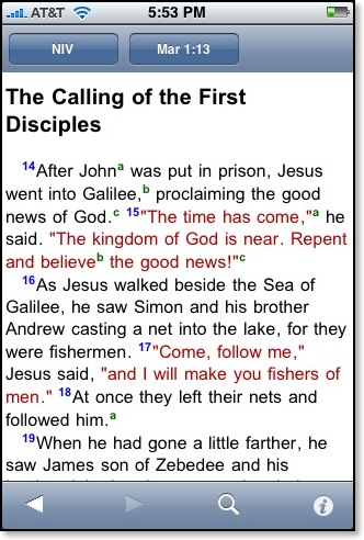
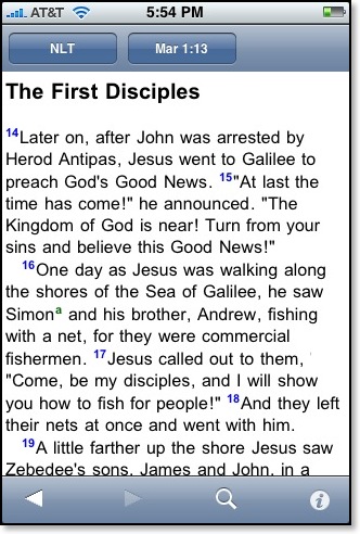
Note: Olive Tree does not require I sign an NDA for use of its beta, and I have been given permission to share any information about the beta including the images above.
How Not to Advertize Bible Software
I picked up a brochure for [unnamed Windows Bible software] today and couldn’t help but chuckle at the photo inside the brochure that I have scanned and reproduced below:
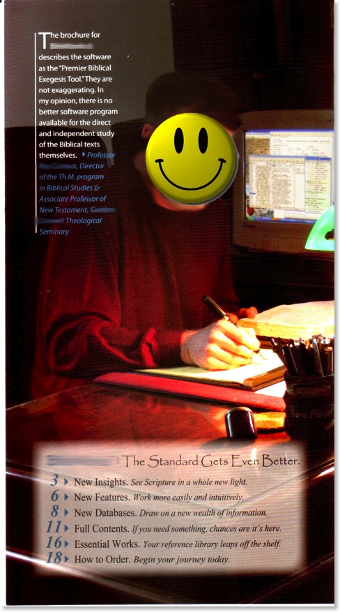
Before you read any further, think to yourself...What’s wrong with this picture (besides the smiley face and my other edits)?
If I were in charge of advertising Bible software, the above photograph is the exact opposite of what I’d want to represent in a brochure. Notice that the professor is concentrating not on [unnamed Windows Bible software], but instead he’s using a physical Bible and he’s taking notes on a legal pad--very old school, very non-Tech. Meanwhile, [unnamed Windows Bible software] is relegated--unfocused and at the moment, unused--to the background.
Now, I’m sure lots of people actually work this way. Sometimes I have a notepad handy when I work for quick notes or outlines, but I generally compose directly on the computer. And it’s not unusual for me to have a physical biblical text in front of me while I’m using Accordance. But that’s different. Why? Because this is an advertisement for software, for the love of Margaret! But the ad doesn’t focus on the software; it focuses on the way we studied before we had software!
Surely whatever Bible the professor in the picture is using would also be found in [unnamed Windows Bible software]. The brochure boasts 115 translations in 35 languages! And ten years ago when I used [unnamed Windows Bible software] before switching to the Mac and Accordance, I distinctly remember that the program had a very handy text editor included, so I’d toss the notepad for sure
I will say, however, that he’s sitting at a very attractive desk; and I certainly like the banker’s lamp...
What Is It with Apple and Grammar?
When I was in high school, none of my teachers would have allowed me to use the sentence above from Apple’s newest iPod touch campaign.
Technically, there are at least two problems with the ad. First, the period implies that the text is more than a label or description, but rather an actual sentence. Yet, if I were grading a paper and saw this exact text, I would label it an “incomplete sentence.” Of course advertisers regularly add periods to text such as this to give a description a sense of finality. Essentially this is shorthand for saying “[This iPod is] the funnest iPod ever.”
Second, there’s a problem with the word funnest, which technically isn’t a word at all. According to traditional English language rules, funner and funnest are not words. If a writer wants to use a comparative or superlative form of fun, correct usage dictates the selection of more fun and most fun, respectively.
Of course, using either of the correct forms makes for awkward advertising copy:
The most fun iPod ever.
or more correct:
This iPod is the most fun iPod ever.
or perhaps Apple could have just said
My new iPod is a lot more fun than your old iPod.
Okay, I can see where correct grammar doesn’t always make for good advertising. And I also have to assume that Apple’s advertisers aren’t uneducated, and they fully realize they are breaking the rules of good usage. Since Apple Macintosh computers come with a software dictionary based upon The New Oxford American Dictionary, I had to wonder what Apple’s own software would say about using the word funnest.
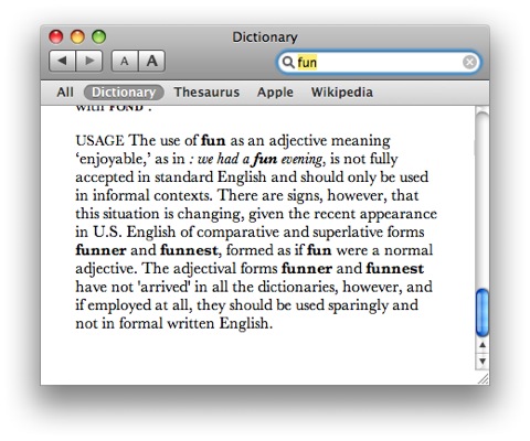
Well, according to Apple’s own internal dictionary, the usage for the word fun may indeed be changing. Note the last sentence: “The adjectival forms funner and funnest have not ‘arrived’ in all the dictionaries, however, and if employed at all, they should be used sparingly and not in formal written English.” Okay, fair enough. Advertising copy is not necessarily a formal context--at least not in regard to this advertisement.
When I teach writing classes, I strongly enforce the rules of grammar and usage because I feel that the parameters given in students’ textbooks offer a foundation for writing that can be modified later in appropriate contexts. I tell my students that great writers know when to bend the rules of grammar accordingly. For instance, Shakespeare regularly invented words when the glossary of his day didn’t express his intention (such as the adjective form of “alone,” lonely). Tolkien will occasionally use a double negative in The Lord of the Rings, but he does so with purpose in order to create a positive meaning from the combined words. A sentence like “It was a dark and stormy night” is not only cliched, but also begins with a pronoun lacking an antecedent. Nevertheless, Madeleine L'Engle could begin A Wrinkle in Time with those very words because she knew what she was doing and was an established writer by the time she wrote that book.
Even Apple’s detractors usually admit that the company makes great products--often products that set the parameters of the playing field for their competitors. So, perhaps they can get away with phrasings that would quickly be marked off on one of my students’ papers. And this is not the first time Apple has been known to break grammatical rules. English teachers gritted their teeth over the “Think Different” campaign in the late nineties (think is a verb and would require the adverb differently, not the adjective different).
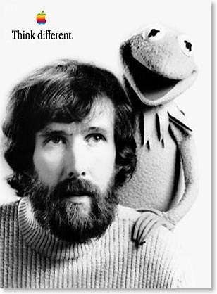
Nevertheless, if you are one of my students reading this, stay away from funnest or I’ll mark it accordingly!
Starbucks and "Free" WiFi: They STILL Don't Get It

Okay, I consider myself fairly savvy when it comes to technology. I’ve been using computers in one form or another since 1982. I have a great appreciation for technology that is user friendly, and little patience for technology which is not. I mean, as of this year, we’re now thirty years into the personal computer revolution. Something like connecting to wi-fi internet in a coffee shop shouldn’t be that difficult, right?
Kathy was meeting some teacher friends she used to work with in Louisville tonight, and she asked me if I wanted to tag along. I asked where she was going, and she said “Starbucks.” I groaned. Why not Java Brewing Company? Why not Heine Brothers? Why not Panera? These other coffee shops have no-hassle, easy to access wi-fi. My last experience at Starbucks, described in the link at the top of this post just didn’t turn out that well. Don’t get me wrong--I like Starbucks coffee better than these other places. But because Starbucks’ wi-fi is such a pain, I’ve relegated Starbucks to drive throughs-only over the past couple of years. When I want to hang out in a coffee shop, I go to one of the other places for easy internet access.
So tonight I went with Kathy anyway, figuring I could give the Starbucks one more shot. I needed to grade some papers, and I email out progress reports when I’m through. Granted, I could send the emails out when I got home; maybe I’m just addicted to the internet and feel a need to always be connected.
The first thing I did was ask the barista behind the counter how I would go about getting on the internet. I just played dumb so I could get full information about logging on--in case I had missed something the first time around. No, I had everything right after all. However, I couldn’t find my registered Starbucks card. Perhaps in the nonsense that transpired in July, I had left it in the Starbucks in Louisiana where I unsuccessfully tried to log on.
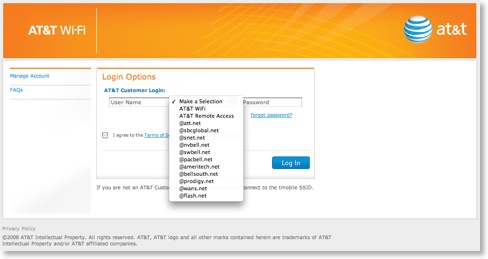
So, I purchased a new card with the minimum $5 balance to get “free” internet, and went to a table. The barista had told me that if I had trouble getting online, I could call the 800 number on the back of the card. My MacBook immediately connected to the Starbuck’s wi-fi and upon launching Safari, I got this screen:
Now, look at that screen and tell me from the perspective of a Starbucks customer, what I’m supposed to do next. There wasn’t even mention of Starbucks on the screen. So I dialed the 800 number on the back of my card. The automated service went through about half a dozen options, none of which were related to in-store wi-fi, so I pressed nothing and was put into the queue. A message informed me that hold times were unusually long.
After an incredibly long wait, a very nice person named Brianna answered the phone. I told her my situation, and she instructed me to type http://www.starbucks.com into the URL line of my browser so that I could register my card.
What?!
Look carefully at the screenshot above. Was there any indication that I could go to starbucks.com? Was there a link anywhere that even mentioned Starbucks? No, there wasn’t. And attempts to go to any other website were blocked.
After getting to the Starbucks site, the steps for registering my card and signing up for “wi-fi rewards” were pretty straight forward. In fact, I told Brianna that I could probably handle it from thereon. However, I suggested to her that all of this would have been much simpler if there had been some kind of link or information on the AT&T screen indicating that I should go to starbucks.com to register my card. She simply said, “Yes, that is a problem we’re aware of.”
So I hung up with Brianna, completed the registration of my card, which took me back to the AT&T login screen. I entered my user name and password but I still couldn’t connect to the internet. I regretted letting Brianna go so quickly.
At this point, I simply felt I needed to grade my papers. “Forget it,” I told myself, picking up my iPhone to check my email. The iPhone had automatically connected to the store’s wi-fi which I knew would be a bust for the same reason I couldn’t log on with my MacBook. So I disconnected my iPhone from wi-fi and hit the internet through the Edge network. In my inbox came this email:
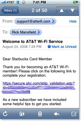
Here was the reason I had been unable to connect to the internet: I had to click on an emailed link to complete my registration. Had my iPhone, which is email capable, not been with me, I could not have completed this step until I returned home. So I clicked the link which led to this screen on the iPhone’s Safari browser:
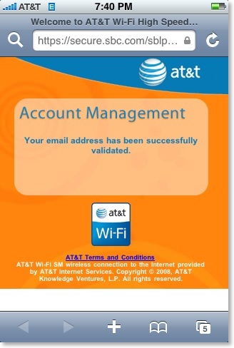
I tried logging into AT&T on my MacBook again, and finally I achieved success:

But can you see how inane this entire process is? The process to connect to the internet cannot be finalized in-store unless the user can receive an email to validate registration. However, the user cannot receive the email because the registration has not been validated. This is one of the stupidest processes I’ve ever seen! Who designed this system? Had I not been able to access my email by another device, I would have never been able to connect until my next visit to Starbucks.
How long did this process take from the moment I came in to the point I connected? Forty minutes.
After connecting finally, I looked up and saw Kathy saying goodbye to her friends. She was ready to leave.
So maybe next time, but maybe not. I realize that I won’t have trouble connecting the next time I’m in a Starbucks, but I’m highly offended at how unfriendly the entire system is. And the company wonders why it is suffering financially lately?
One more thing: for the record, Starbucks wi-fi is not really free (or “on the house” as they like to call it). It’s impossible to access the internet unless the user purchases a Starbucks gift card and keeps a $5 minimum and uses the card within a set period. So not only do I have to pay up front, I have to continue paying at certain intervals if I am going to use their “on the house” internet.
But really... if I have to purchase something to get something, then, I’m sorry, but it’s not “on the house.”
Review: MacGourmet Deluxe
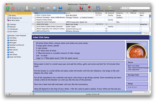
Click on image above for larger view.
Recipe database programs have been around in one form or another as long as personal computers have been in homes. Some of these are standalone programs dedicated to recipes, but even standard database programs such as FileMaker Pro come with recipe templates. I’ve been using personal computers since 1982, and I’ve kept recipes saved electronically (in word processing documents or PDF files) since the first computer we had with a hard drive, way back in 1988. But I’ve never been impressed with recipe database software...until now.
Now, let me say up front: yes, you can see a MacGourmet Deluxe (MGD from this point forward) advertisement in the sidebar [only at cookingincastiron.com, not at This Lamp]. But what you must realize is that I first contacted Mariner Software in regard to their advertising with us because I was incredibly impressed with this software. In fact, as I already mentioned, recipe database software is nothing new, but in reality, MGD seems to me to be the mature end result of nearly three decades of this kind of software that has gone before it. I strongly encourage you to download the MGD user manual as I will not be able to nearly touch upon all of MGD’s features in this review. I’ve jokingly said to a friend that MGD seems to do everything except cook the meal for you, but maybe that’s projected for version 2.0.
Of course, MGD does what you would expect--it allows you to keep a database of your recipes. The interface is iTunes-esque, allowing you to create your own categories in the left sidebar. And like an iTunes smart playlist that automatically expands as new songs meet pre-set criteria, MGD allows the user to create “smart recipe lists” that look for certain criteria as the user adds new recipes.
One of the most impressive features of MGD is the multiple ways that recipes can be added to the database. Certainly, the user can enter ingredients and directions manually, but there are also a number of ways to add them automatically from other sources. There are “supported” websites such as allrecipes.com, epicurious.com, foodnetwork.com, williams-sonoma.com, cookinglight.com and food.yahoo.com in which all a user has to do is select the URL on a recipe’s webpage, go to the services menu: MaGourmet, and choose “Import Recipe from Web Page.” 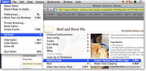
MGD automatically parses the information, separating the ingredients from the directions, the description of the recipe and even includes the picture:
But what if a website is not supported? Well, to test this out, I went to one of my favorite cast iron related websites, “Black Iron Dude.” About a month ago, there was a recipe at this website for Arbol Chile Salsa. To import the recipe from Greg’s website, I first highlighted all the text in his post and then I dragged it to the “Clippings” window in MGD. This is a great little window in MGD that allows the user to drag over recipe after recipe and then go back and format them later. After I had dragged over the text for the salsa, I double-clicked on it to import it in my recipe database. 
All of my captured text is gathered at the top of the import window. From the drop down menu, I can select “Ingredients” and MGD knows that this information is separate from the preparation directions. And of course, I can do the same with the directions, information about the recipe, etc.
What impressed me further is that in parsing the list of ingredients, MGD could distinguish between number, actual item and special instructions. Notice for example in the list below, taken from this recipe, that “25” is separated from “dried Arbol chiles” which is separated from “remove stems and shake out some seeds”: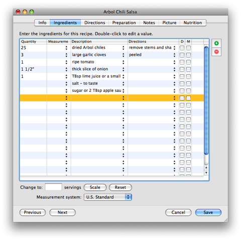
For those watching what they eat (and who isn’t these days?) MGD comes with the abbreviated USDA National Nutrient Database. Ingredients are automatically evaluated by this database and if MGD is unsure about a particular ingredient, the user can open up the USDA database and manually map ingredients. Once all ingredients are mapped and servings are figured, MGD calculates an extremely accurate breakdown of nutritional data.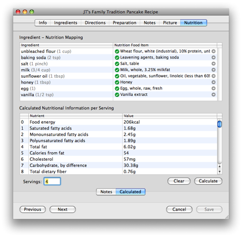
This information is calculated for 45 separate items:
And when printing out recipes for personal use or to share an abbreviated box with nutritional information is included such as this breakdown for JT’s Family Pancake Recipe:
This kind of information would be extremely helpful not only for the person watching what he or she eats, but also for the personal chef or any person in charge of providing meals for groups of people. MGD includes a weekly meal planner that can be exported to iCal, and shopping lists can be created from planned recipes.
Kathy and I have an older iMac we keep in the kitchen for easy access to recipes we’ve collected electronically over the years. Whether you have a dedicated kitchen computer or simply a laptop on the counter, MGD offers a “Chef’s View” that enlarges ingredients and directions for easy access:
Almost every church group or civic organization has produced a cookbook at one time or another. There are publishers who specialize in this. These publishers should be a bit concerned for their future because MGD includes tools for creating one’s own cookbook with pictures, section dividers, chapters, and more. Once a cookbook has been created it can be exported to PDF ready for publication from a company such as Lulu.com.
And of course, when someone asks you for your Garlic Beef Enchiladas recipe after the church potluck, you can print out your recipe according to a variety of attractive built in templates.
As the name implies, MacGourmet Deluxe only runs on Macintosh computers, but the program is so sophisticated, it might be reason enough to switch from Windows if you aren’t already a Mac user. Regardless, MGD can import files in a number of formats: MasterCook, MasterCook Mac, Meal-Master, CookWare Deluxe, Cook’n text, RecipeML, and Yum XML. It can export to iPod notes, MasterCook, MealMaster, RTF and text files.
Our Cooking in Cast Iron website is still fairly new, but as we add recipes in the future, we will also make them available in MGD format which means that if you want to add one of them to your own collection, it will be as easy as dragging an icon from our website directly into your MGD database.
MacGourmet Deluxe is available from Mariner Software for $44.95.
Olive Tree Comes to the iPhone: Finally the Promise of a Decent Bible App
Well, wait... there was still my iPod, obtained in 2002. Although I didn’t carry it with me everywhere as I had done with the cell phone and PDA, it was still handy for listening to audio books, the Mars Hill Audio Journal, and occasionally some music. But it was always something else to keep up with.
Then in 2007, my electronic gadget world converged one more time with the iPhone. Now I had a PDA, cell phone and iPod all in one device. But two things were missing on the iPhone that I had used quite extensively on previous Palm PDAs, including my Treo: Pocket Quicken and Bible software from Olive Tree.
Intuit now has an online version of Quicken that works with the iPhone, but I’m not yet sold on the idea of placing all my financial data into “the cloud.” Originally Apple was not going to open the iPhone to 3rd party applications, insisting that all such endeavors were to be handled through Web 2.0 internet apps. Regarding Bible applications, there were initially some halfway decent web apps, but they had two drawbacks: (1) they were all dependent upon internet connectivity to work, and (2) there was no real support for original language texts.
With the advent of iPhone 2.0 software last month, we were finally able to obtain true third party applications on our iPhones. But as I had previously written, I had been enormously underwhelmed by initial offerings because they were either lackluster or required internet connectivity to function.
Yesterday, Olive Tree launched its first offerings for the iPhone: its BibleReader and ESV Study Bundle for Bible Reader.
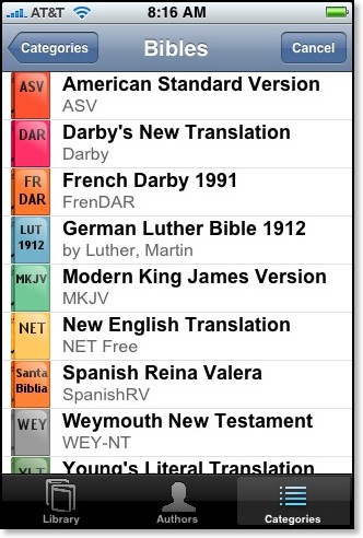
- American Standard Version
- Darby’s New Translation
- French Darby 1991
- German Luther Bible 1912
- Modern King James Version
- New English Translation (without notes)
- Spanish Reina Valera
- Weymouth New Testament
- Young’s Literal Translation
None of the texts in the free edition are formatted yet (image below on left), but as this screenshot taken iTunes (image below on right) shows, the ESV text is formatted:

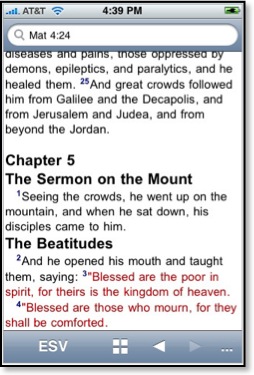
I’m not sure yet if the red lettering can be turned off. The ability to turn off red lettering will come in a later update.
The search dialogue at the top of the screen can be used for either direct reference input or word searches. It also automatically updates as the user scrolls through the biblical text. A search for “righteousness” yields 134 hits in the NET Bible as seen below:
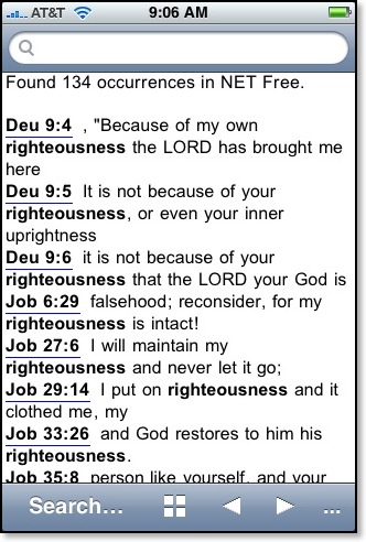
Touching any of the underlined references takes the user to the verse in context of the entire passage. Pressing the icon at the bottom of the screen (is that a window or a plus sign?) brings up a listing of all books available in that particular Bible module:
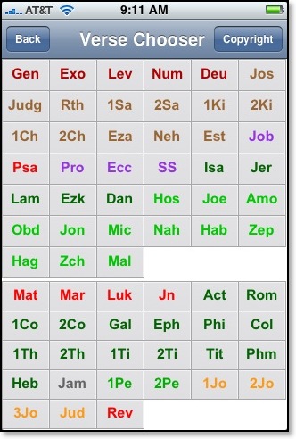
Clicking on any of the biblical books leads to another screen (not pictured) that lists all chapters in the biblical book and then to another screen with all verses. Selecting a particular verse will not display the verse by itself but the entire passage in context which is very helpful.
The most beneficial aspect of Olive Tree’s BibleReader is easily that it does not rely on an internet connection to use any of the biblical modules. All texts are fully loaded onto the iPhone. I especially appreciate that because I still find myself without any signal from AT&T at times when I am deep into the heart of a building--especially older buildings. At this point, I’m not worried about space limitations. iPhones now come in either 8 or 16 GB models, so for most users there should be room to spare. This is in contrast to my old Treo 600, of course, with which I had to use an extra SIM card in order to store all 60,000 notes of the NET Bible.
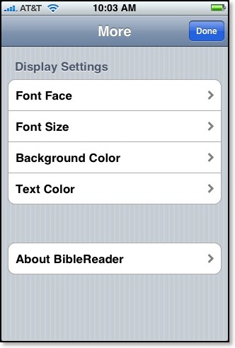
The interface for Olive Tree’s BibleReader is completely customizable as seen in this settings screenshot:
In fact, until I installed BibleReader, I had no idea what fonts were available on my iPhone:
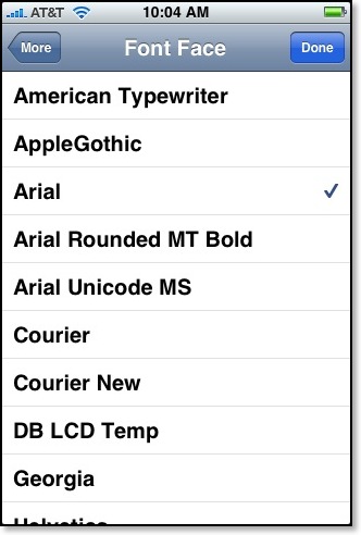
[In addition to the fonts listed in the graphic above, BibleReader also tells me I have the following typefaces installed on my iPhone: Helvetica, Helvetica Neue, Hiragino Kaku Gothic ProN W3, Hiragino Kaku Gothic ProN W6, Marker Felt,
STHeiti J, STHeiti K, STHeiti SC, STHeiti TC, Times New Roman, Trebuchet MS, and Verdana.]
I noted in the title of this blog entry that Olive Tree’s BibleReader was the first third-party iPhone Bible app with real promise. I say that because not all of their extensive language offerings are available yet, including their Greek and Hebrew texts. But I corresponded with Stephen Johnson of Olive Tree yesterday, and he assures me they are in the works along with many of the other modules in Olive Tree’s library.
Certain features that we’ve come to expect from Olive Tree, such as split screens, aren’t available yet, but features will be added to BibleReader over the next few months.
Users such as myself who had already purchased Olive Tree texts may face a bit of a conundrum. In the past if a customer had bought a module for the Palm platform and then switched to the WindowsMobile platform (or vice-versa), it wasn’t necessary to re-purchase the texts. For instance, a few years back I briefly owned a Compaq iPaq and was able to load modules such as the Greek New Testament with Gramcord morphology onto the Compaq device even though I had previously purchased it for the Palm platform. After a few weeks, I decided connecting to a WindowsMobile (I believe it was called WindowsCE back then) device from a Mac was too much hassle and switched back to a Palm PDA. In all of this switching back and forth, I never had to pay anything extra to OliveTree. I’ve always found their cross-platofrm policy to be very generous.
However, with the iPhone, the issue is a bit more complex and the problem doesn’t lie with Olive Tree, but with the iTunes Store. Apple doesn’t allow third-party iPhone developers to sell their applications from their own websites. It has to be done from the iTunes Store. So, for instance, if a user has already purchased the ESV text for a Palm or WindowsMobile device from Olive Tree, there’s no way at present to keep from paying for it again if purchased for the iPhone. Olive Tree is in talks with Apple to determine if there’s a way around this, but for right now if an ESV aficionado already bought it for another platform and now wants to install it on the iPhone, he or she will have to pony up another $24.99.
And there is another problem for Olive Tree and their customers. Olive Tree’s modular model of distributing texts doesn’t work as well with the iTunes Store. In the past on the Palm or WindowsMobile platforms, once the BibleReader software was installed as many text modules could be added as their was room available in the device’s memory. Currently, the iTunes Store doesn’t allow this adding of one text at a time as the previous model allowed--at least not without having many separate apps installed on the iPhone. So, if for instance, Olive Tree releases the TNIV text next week, a user couldn’t simply add it to an already-purchased ESV Study Bundle. Rather, two separate installations of BibleReader would have to be installed with the TNIV in one and the ESV and accompanying resources in the other. And theoretically, even once split screen features are implemented, modules in two separate installations couldn’t be viewed side by side.
This complication is not something that just affects Olive Tree, but rather all developers who offer modular add ons to its software. Again, Olive Tree is in talks with Apple, and hopefully the way iTunes is currently set up can be adjusted for the benefit of the customer in the future.
Regardless of these early snags, Olive Tree’s venture into the iPhone platform looks very promising. I am hopeful I can eventually reproduce the same functionality with Bible texts on my iPhone that I had previously experienced on my Treo. Since useful iPhone Bible functionality is something I am genuinely seeking, expect to see more on This Lamp about the subject as new developments arise.
For further information:
Olive Tree’s iPhone Page
Olive Tree’s Blog
Still Looking for a Decent iPhone Bible App
One of the best features of iPhone 2.0 is the App Store. But I’m still waiting on two applications that I was fairly dependent upon back when I had my Treo before the iPhone. One is Pocket Quicken which I hope will eventually be released for the iPhone. The other is a decent Bible app. Initially, I was reviewing a number of the original iPhone web-based Bible apps here on This Lamp, but I finally lost interest in it because although some were some apps better than others, none of them really satisfied my needs.
When I had my Treo, I had the Bible Reader software from OliveTree. On my Treo I had installed the Greek New Testament, the NET Bible including its 60 kazillion notes (which I had to keep on a sim card), and the NASB with Greek and Hebrew dictionaries.
Access to English language Bibles abound on the iPhone, buth for web-based apps and now in the App Store. But there’s still no original language texts, and to be honest, none of the current offerings really stands out in my opinion.
One of the Bible apps currently getting a lot of attention seems to be the free Bible app from Lifechurch.TV. It idraws its content from the YouVersion.com website. This means you can switch easily among vairous translation. And it has some good ones, but no Greek or Hebrew.
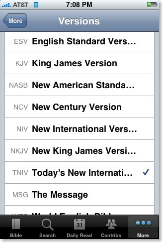
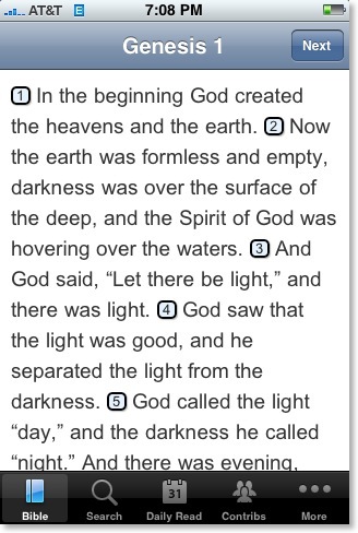
But there’s a catch. Unlike some of the fee-based Bible apps, the Bible app from LifeChurch.TV depends on an internet connection because of its ties to YouVersion. This means that if you are without a signal--Edge, 3G, or Wifi (which is a situation I occasionally find myslef in)--you cannot access your Bible at all. You must be connected to the internet to use this app. At least its free.
I made the mistake of purchasing “Bible Unleashed: NET” in hopes of having the NET Bible with notes on my iPhone. But it doesn’t contain the notes at all, AND it is totally dependent upon the internet for its content. So, I wasted $1.99 on this purchase. A better offering is simply the NET Bible (with notes) available at enetbible.com. It’s a web app, but certainly superior to this one.
Speaking of enetbible.com, I noticed that with the iPhone 2.0 software upgrade, we finally have Hebrew text on the iPhone as seen at the top of this note from Exodus 2:2 in the NET Bible:
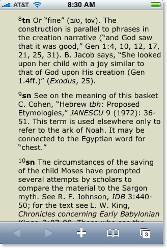
You may remember that the original iPhone software would display Unicode Greek, but not Unicode Hebrew.
I am hopeful that OliveTree or Laridian will develop true self-contained suites of biblical texts available for the iPhone soon.
Finally, another good thing about the new iPhone software is that we can finally make decent screen captures as seen above unlike with the original software in which I had to take photographs of the screen with my camera.
Starbucks and "Free" WiFi: They Just Don't Get It

Often I like to get out of my office and work from a coffee shop to get a change of scenery. For these coffee shop hangout sessions, I stopped going to Starbucks a while back in favor of other coffee shops. Why? It’s simple: free wireless internet. When Starbucks first started offering wireless internet, it was through TMobile and it was very expensive--$6 an hour, $9 a day or $30 a month. Those kinds of prices seemed insane, so I started going elsewhere. Just about every other coffee shop has free wireless internet. This is what Starbucks doesn’t understand. Although there coffee is good, I’ll take a lesser cup of Joe if free WiFi is included.
So I was pretty excited when Starbucks announced they were moving from TMobile to AT&T for wireless internet and offering free service through the latter. Of course the “free” AT&T internet is limited to two hours and the patron has to have a registered Starbucks gift card. Okay, that seemed like a short amount of time, but it was better than nothing, so I made sure one of the gift cards loitering in my wallet was registered.
This week and last I’ve been in Louisiana visiting family and friends. I called Philip Wade on Saturday and he suggested we meet at the local Starbucks. Since I wanted to upload a video podcast for the cast iron site while we talked, I got to Starbucks a few minutes early so that I could go ahead and connect and begin the upload.
After ordering my tall black coffee, I opened up my MacBook and selected “AT&T” from the list of wireless networks. I noticed also that TMobile was in the list, too. For some strange reason, the AT&T network switched over to TMobile’s although the screen still showed the AT&T logo. From there, I wasn’t certain what to do.
My screen showed an AT&T logo and asked for my login name and password. There was no mention of Starbucks anywhere on the screen or in the drop down menu. What login name and password? I tried using the same information I had used a few days before on the Starbucks website when I registered my card. No luck.
Not knowing what to do next, and since there’s no Internet access beyond the login screen, it’s not like I could have my login name and password emailed to me, so I approached one of the baristas at the counter. The fellow behind the counter looked at my screen and said that he didn’t know what to do either. Now, consider that this is one of the employees at Starbucks and he has no idea how to get on to his own store’s wireless network. After poking around on the screen for a few minutes, he looked at me and said, “Well, if you sit in the front corner of the store, you can pick up Subway’s internet.”
Unbelievable.
I sat back down at my table. I saw Philip pulling up outside as I looked back down at my screen. There was a link for help, so I clicked on that and saw a toll-free support number for AT&T. As Philip was walking in the door, I was telling the fellow from AT&T what I had tried so far in order to log on. The support fellow seemed totally oblivious. “Did you say that you tried your login?”
“Well, what login do you mean? My Starbucks login, the account number on the Starbucks card or what?”
After I told him I’d tried both, he asked for my name again and tried to look me up in his database. Not finding my name anywhere, he suggested that perhaps my card was not set up for WiFi rewards. What?
Of course, he said that he couldn’t set that up for me. He’d have to give me another number to call where they could supposedly set up my card. I looked at Philip. “Starbucks’ internet is impossible to get on. Do you know of another coffee shop where the internet is free?” Philip suggested PJ’s across the street.
I still had the AT&T guy on the phone. “Do you want that number?” he asked.
“Forget it,” I said. “We’re going somewhere else.”
We went to PJ’s where getting on the internet was as easy as opening my MacBook.
This is why other coffee shops will continue to get my business over Starbucks. As I said, Starbucks’ coffee is great. But in the end, it’s about more than just the coffee--it’s about the experience. And they just don’t get that.
Nifty [Stupid] Leopard Tricks: Screen Sharing to Infinity
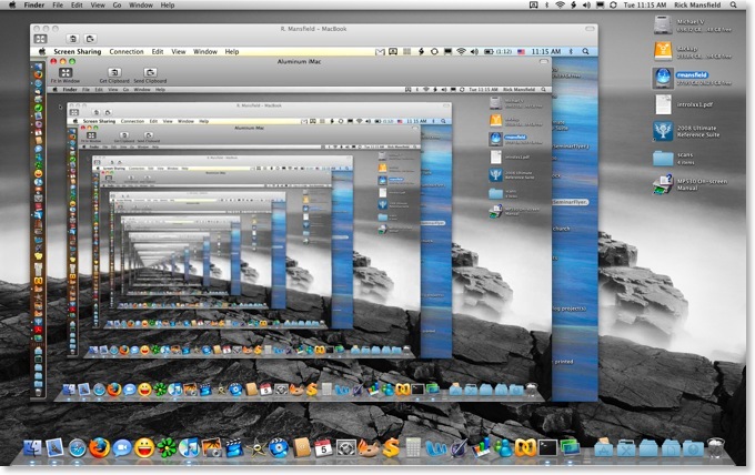
I carry most of my current work on my MacBook, but occasionally when I'm working at home, I prefer to use the iMac and simply start up a screen-sharing session back to my MacBook. So recently, I wondered what would happen if I started up a screen share on each Mac to the other Mac. Here is my result (click on the image to see a larger version):
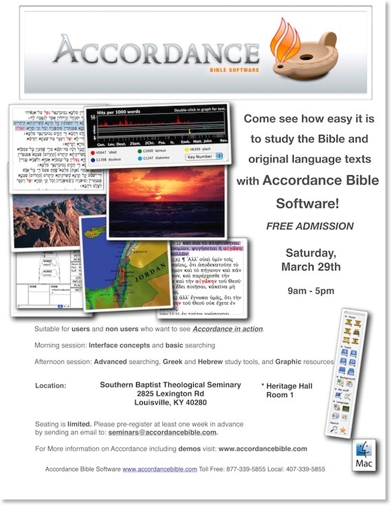
All-Day Accordance Seminar To Be Held at SBTS
For more information, click on the image below or click here for a PDF copy.
Xslimmer: Cut the Fat from Your Mac
Further, most software programs come ready to run in multiple languages. But do I need to access the Finnish and Korean versions of MS Word on my Mac? Probably not.
Enter Xslimmer, a great little program that does two things: (1) it detects whether you have an Intel or PowerPC processor and removes the code for the other processor, and (2) it strips out unneeded languages from your programs. If you occasionally use more than one language, you can specify in the preferences which language to keep.
Do you think such extra code is insignificant? Consider these representative numbers after I ran Xslimmer on my MacBook:
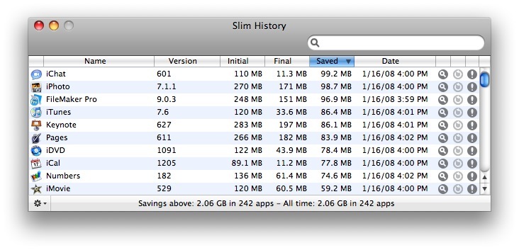
Notice that after running it on 242 application, I reclaimed over two gigabytes of space! What's more, not only do I save space, but many of these programs that have seen significant reductions, such as some of those shown above, now launch faster because less code is having to be analyzed as the program starts.
Some programs don't work well with Xslimmer though, such as the Adobe CS3 apps which must stay a specific size for verification that they aren't corrupt when updates are run. These programs are "blacklisted" and the software checks itself against an online database as it is scanning a computer. As I ran Xslimmer on my Mac, the only real software I was worried about was Office 2008 which was just released yesterday and installed on my MacBook last night. However, if for some reason I alter a program that should not be altered, the solution is as easy as reinstalling it which won't affect preferences and personal settings.
Nifty Leopard Tricks: Windows Machines on the Network Have a Blue Screen of Death
Here is a screenshot taken of computers on the SBTS library's wifi network. The very top machine listed under shared is a Mac which if highlighted shows an OS X aqua background. But the rest of the computers are Windows machines and if you look closely at the one I selected you'll see it's representing the dreaded blue screen of death indicating a system failure of some kind..
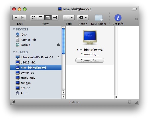
Paul Thurrott calls this "lame and childish" and says that it's hubris on Apple's part since a bug in the installation of Leopard caused some folks to get a blue screen of their own. Personally, I find it simply to be an amusing and friendly jab at Microsoft from Apple. But then again, my installation went smoothly
Oh, and contrary to what the screen above shows, I did NOT connect to someone else's computer. I wouldn't do that without permission!
Nifty Leopard Tricks: Cover Flow
Check out the Cover Flow view of Biblical Illustrator files below. Be sure to click on the image to see it full size.
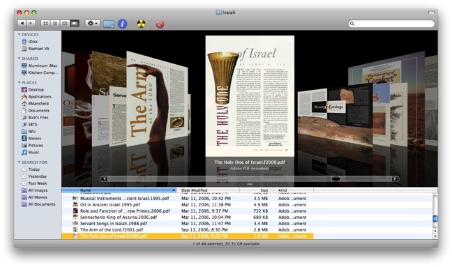
Way cool!
Leopard Guided Tour
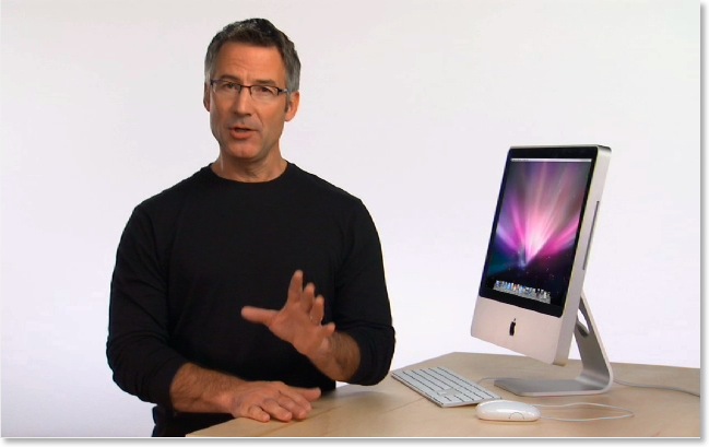
And if that's not enough, check out Apple's page of 316 new features in Leopard.
3rd Party Apps for the iPhone: Finally
Let me just say it: We want native third party applications on the iPhone, and we plan to have an SDK in developers’ hands in February. We are excited about creating a vibrant third party developer community around the iPhone and enabling hundreds of new applications for our users. With our revolutionary multi-touch interface, powerful hardware and advanced software architecture, we believe we have created the best mobile platform ever for developers.
It will take until February to release an SDK because we’re trying to do two diametrically opposed things at once—provide an advanced and open platform to developers while at the same time protect iPhone users from viruses, malware, privacy attacks, etc.
I want just two things: Pocket Quicken and a robust Bible app with access to the original languages. The screen on the iPhone has a much higher resolution than any Palm or Windows Mobile device, so Greek & Hebrew should look incredible...assuming they get Hebrew working on the iPhone, that is...
The downside is that if an SDK is not available until February, it might be a number of months until significant apps are released.
10 Days to Leopard
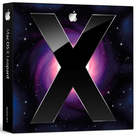
Apple's website has now been updated allowing us to see even more details about the new OS, including what they are counting as 316 new features. Not all of these features are earth-shattering, and some have appeared in various forms on the Linux or Windows platforms, but the release is significant nonetheless.
Final requirements for the new OS are as follows:
- Mac computer with an Intel, PowerPC G5, or PowerPC G4 (867MHz or faster) processor
- 512MB of memory
- DVD drive for installation
- 9GB of available disk space
- Some features require a compatible Internet service provider; fees may apply.
- Some features require Apple's .Mac service; fees apply.
In case you Mac users didn't catch it, G3 processors have been completely cut from the list of computers that will run the lastest OS X, as well as certain G4's such as my Cube which I'm about to put on Craig's List anyway.
I've already been asked if I'm going to stand in line for my copy of Leopard. Well, I'm not, although that would certainly be a fun thing to do. However, ever since the eighties when I began buying software, I've usually been able to receive academic discounts. If I wasn't a student, I was a teacher. If I wasn't either, Kathy was one or the other, so I've always had such access. However, I was disappointed that the academic price of Leopard is only $116, a mere 10% off the regular price of $129. In the past new releases have been $79. I know that folks who pay full price regularly will have no sympathy, but I find it ironic that during Apple's most successful time in the history of the company, they've become the most stingy in their pricing.
The image below shows off the new desktop in Leopard. Notice the new "stacks" feature meant to keep your desktop uncluttered. what I find interesting is that there are no icons on the desktop at all, not even an icon for the main hard drive.
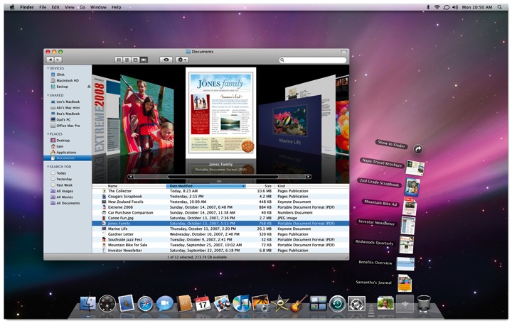
If this is the new default desktop, personally I hope that it can be customized. I'd prefer to have an icon for the hard drive and any other files or application aliases I choose to park there. If memory serves, the original OS X public beta in 2000 did not have a desktop hard drive icon either, but demand from users made Apple change this by the final release in the Spring of 2001. I think Unca Steve just likes clean desktops and wants all of us to appreciate the same. In general, I clean mine up every two weeks or so and either file or delete stray icons. Nevertheless, I'd prefer to have the option for a messy desktop if I want it. A desktop in which a person cannot add any icons at all reminds me of Windows 3.x in which the user could only change the desktop picture.
I'm very intrigued by some of the new features that work with the .Mac service. One of the most valuable aspects of .Mac for my needs is the ability to sync calendars, address books, email, web bookmarks, keychains, and more on any Mac in which I have a login. Even if I am going to use someone else's Mac for a temporary amount of time, I can create my own login, add my .Mac info and within minutes, all my personal information is included on the new machine. Leopard adds further functionality such as syncing dock items, dashboard widgets, notes, and system preferences.
I'm also intrigued by the new "Back to My Mac" feature described as "Connect to any of your Mac computers at home from any Mac on the Internet. Your home computers appear in the shared section of the sidebar. Just click and you’re in." That's really helpful since the 160 GB hard drive on my MacBook gets pretty crowded. Now, I'll be able to leave files on my desktop machine at home and access them from any place I have internet access.
In case you haven't guessed by now, I tend to be an early adopter with these kinds of things. Yes, I know there's always room for disaster, but I backed up all my personal files just this week, and I never add hacks to my system that often are the cause of problem upgrades. Apple's promised to deliver Leopard on the afternoon of the 26th. My MacBook will updated within the hour. If you don't hear from me for a few days afterwards, you can just assume that everything blew up.
One More Step On the Road to Robots Making Us Batteries: My Xbox Is Writing His (Its?) Own Blog
I've got a new blog. Well, technically, I don't... my Xbox does. Yeah. Really.
Well, kinda.
The folks over at 360voice.com allow folks to submit gamer tags and then narrative voice is given to the Xbox 360 owner's latest activity (assuming there is an Xbox Live account). The perspective of the narrative is from the Xbox itself which is very intriguing, if not a bit cheesy at times. In fact, he (my Xbox) tends to whine a bit on the days I don't play anything. There's even a place for comments.
And evidently, besides all this existing as a very interesting, but unusual gimmick, there's a bit of cutting edge computer AI stuff associated here. From the About page at 360voice.com:
How did you come up with the idea for your site?
As a member of the Xbox Community Developer Program, Steve had access to the live gamer feeds and was playing around with the data. I attended the O'Reily Emerging Technologies conference where I heard Bruce Sterling give a keynote about blogjects (a term coined by Julian Bleecker)... futuristic objects that write "blogs" about their interactions with the world and other devices just like humans write about their interactions with the world and other people. In discussing this keynote with Steve, it didn't take long for us to see how this academic concept could relate to the Xbox 360, albeit in a much more scaled back fashion. We got quick prototype of the idea up and running in a few days. The response from the prototype was so huge that we immediately developed it into a full blown product which became 360voice.com.
So, yes it's all very weird, but somehow still I have to go look and see what my Xbox has written for the day--even after days when I've played nothing.
By the way, my Xbox will refer to me in his posts under my gamertag name, Borofaxx. I got that name from the cream of the same name that my mom used to put on my cuts and scrapes when I got hurt as a child (and she put it on diaper rash when I was an infant, but that's probably more than you want to know). I'm pretty sure it's no longer being produced (we all have Neosporiin now!), so I thought the name would make a good and unusual gamertag. And of course I added the extra X at the end because that makes any word or name cooler.
One last thing. Sometime my Xbox is...frankly.. a liar. No, I don't mean about my gamer score. Take for instance the statement he attributed to me on October 5. It's simply not true. I have chosen not to use that particular word.
Feel free to check it out (and even leave a comment) if you want at http://www.360voice.com/tag/Borofaxx.
The Apple Key Is Dead (13 years late); Long Live the (solo) Command Key

Apple has a history of changing its basic tools of user interface--namely the keyboard and mouse--and letting the fallout of controversy land where it may. The totally redesigned ultra thin keyboard that accompanies the new aluminum iMacs is no exception. Mac users either love it or hate it. I've spent a little bit of time with one, and I'm a bit undecided. However, I'm also a big fan of the Matias Tactile Pro keyboard, and if you know what that is, you know it's very different from Apple's new keyboard.
And yet in the changes that have come with the new aluminum keyboard, one alteration that I've seen get a little attention, but not much, is the removal of the Apple logo from the Command key:
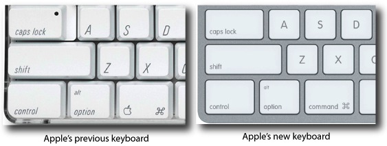
Note that the Apple logo has been completely removed from the Command key and now this key is labeled like the the control and option keys are. Incidentally, over the years, I've heard the Command key called the "Apple key" (Kathy tends to do this), but I've tried to avoid it myself since all manuals and instructive literature from Apple have used Command. However, when trying to help folks who have switched to the Mac from Windows, I would get blank stares when I said, "Hit the Command key," and inevitably, I'd resort to "or the Apple key."
But here's the question of point to this post: how come the Macintosh keyboard had both the Apple symbol and the Command symbol to begin with?
Technically, the question itself is a misstatement since the original 1984 Mac 128K keyboard did not have the Apple symbol on the Command key, although the Command key and Option keys were indeed there. The keyboard layout is essentially the same today except that the original Mac didn't have a Control key.
Over the years, I've heard various explanations about the origins of that "butterfly" looking Command symbol (it's not really a butterfly), but I'd never heard why the Command key had an Apple on it, too (up until the new aluminum keyboard, that is). And then I stumbled across the answer yesterday. I was reading a January, 1989 (yes, you read the year right) issue of the now defunct magazine (at least in the U.S.) MacUser. In the section called "The Help Folder," Chris Espinosa was asked this very question.
As an aside, Espinosa has been an employee of Apple since the days that it was in Jobs' parents' garage, and he still works there today. Further, he was part of the original Macintosh team, so even in 1989, he was the perfect one to answer this question. This is all nothing more than Apple Trivia, of course; but nevertheless it's interesting. I'll reproduce the question and Espinosa's answer from the original January, 1989, MacUser magazine below. The bracketed note in the question is mine, but the bracketed note in the answer belong to the 1989 MacUser editor.
Q. What does the funny symbol on the Command key mean? And why is there an Apple symbol next to it on the new keyboards [Rick's note: keep in mind the reader is asking about the keyboards that were new in 1989!].
A. On the Apple III way back in 1980, we put two Apple keys on the keyboard for programs to use as they wished. We put an Apple key on the Apple IIe's keyboard when we introduced it in 1983. In 1983 the Command key on the Lisa keyboard also had the Apple symbol on it.
The Macintosh was going to use the same symbol and have the Apple symbol in the menu for the Command-key equivalent, just like the Lisa. But late in 1983, somebody (I bet you can guess who) decided that using the Apple symbol on the keys and in menus was "corrupting the logo"--sort of like those rare Britons who don't lick postage stamps because they don't approve of spitting on the back of the Queen's head. So we had to change the keyboard and the software and the documentation all in a very short period.
But first we had to come up with a good Command key symbol. The requirements were pretty heavy: It had to be small, recognizable, unique, and easily rendered in a simple font character (for the menu), an it had to mean "command." The International Standards Organization (ISO) book of symbols offered little help (its recommendations for the Shift and Option keys can be see on Apple's non-American keyboards).
Finally Susan Kare and Barbara Koalkin found the symbol that's now affectionately known by many names: flower, propeller, freeway, splat, command, feature, and cloverleaf [Don't forget butterfly.--Ed]. It came from a book of Swedish campground trail markers and means "remarkable feature!"
The Apple symbol came back with the introduction of the ADB (Apple Desktop Bus). Now that Apple keyboards are interchangeable among many Apple computers, that key has to do double duty: It's the Command key on the Macintosh family and the Apple key on the Apple IIGS.
So there you have it. They key served two different platforms, and it was legitimately the Apple key or the Command key based on what computer one was using--back when people were using Apple II's that is. However, I find it interesting that Apple discontinued the Apple II platform in 1994 (when it was already way past its prime), but didn't get around to removing the Apple symbol until 2007. That's 13 years late! And isn't it odd that the Apple symbol was retained even on the USB keyboards in spite of the fact that Apple II's were discontinued well before the creation and adoption of the USB standard. I suppose the Apple symbol was retained because that was what people were used to, even if hardly anyone knew why it was there anymore. Can anyone say, "Meaningless tradition"?
Regardless, now it's gone, and better late than never, I suppose. So...
The Apple key is dead!
Long live the Command key!
I'm Gonna Have to Say "No" to Facebook (and the rest)

And I never will be.
Not too long after Facebook friend invites started pouring in, one friend who requested I add her, and after obviously seeing a neglected profile and no interaction sent me a text message saying, "You've got so much to learn about Facebook!" Of course I interpreted her message as saying, "Ha ha, I know more about something on the internet than you do for once!"
Well, not exactly true. And perhaps if you're one of the folks with whom I've exchanged invites you feel the same way. But let me explain my position. Here's the thing... I've got this website that you're on right now called This Lamp. In spite of the fact that I haven't had time to update the site much lately, Sitemeter tells me that I'm still receiving over 400 hits a day, which is pretty healthy for a personal website, especially a neglected one, in my opinion. And that's not even counting the folks who read This Lamp strictly on the RSS feed which I'm not tracking at the moment. And I wonder how many pastors, politicians and other public figures would love to have that kind of audience on a daily basis? Thus, with my limited time, if I am going to invest my online efforts anywhere, I think I should simply do it here.
In fact, I'm going to completely cancel my FaceBook profile in a few days. There's no point in keeping it. I'm warning you now. I have no idea what happens when one of your FaceBook "friends" disappears. Just don't take it personally.
So am I being anti-social by saying no to social networking? No. This website can be quite the social place at times as are some of yours. Frankly, I consider myself a very social person, and if you've ever received an email from me, you'll notice that I even give out my cell phone number freely. Plus, I've got four different instant messaging identities because I have different friends who use different systems. I often have all four running during the day. Feel free to add me:
AIM/iChat: rmansfield@mac.com
Microsoft Messenger: rmansfield@hotmail.com
Yahoo Messenger: rick_mansfield
ICQ: 7367293
Feel free to chat away with me on any of the above. You'll find I'm quite social. But as for FaceBook, and last year's "in" social site MySpace and all the other social networking tools (Twitter, LinkedIn, and all the new ones that launch each day), I'm going to have to pass.
Who's got the time?
Apple Store: Oxmoor/Grand Opening Pictures, Reflections
Okay, I admit it. I'm the kind of person who will stand in line for stuff like this. I've seen quite a few midnight showings of movies on their release day. In 2004 I stood in line to get a copy of Halo 2 for the Xbox at midnight. A couple of months ago, I stood in line to to get an iPhone on its launch date. What's wrong with me (and others who do the same thing)? Am I simply too impatient? Did I have to be at the Oxmoor Mall for the grand opening of Louisville's new Apple Store? I mean couldn't I go this weekend and avoid all crowds?
Certainly. But that's not why we go.
Such activities are an event themselves, a pinpoint in one's personal history that merges with the history of significant cultural events. Standing in line with folks you don't know personally, but with whom you obviously have much in common makes for great conversation despite a lack of personal history. You can look back and say, "I was there--there on the very first day."


All of the sales people were extremely friendly. I didn't leave to cheers (because I didn't purchase anything), but I did get my t-shirt and friendly farewells from the Apple Store employees. One of the workers, a young man in his twenties with bright red hair said to me, "Isn't this great?!" He seemed just as enthusiastic about being an employee as the rest of us felt about being customers. I said, "Yeah. Hey, are there any grand opening specials going on tonight?" I hadn't seen any indication of such, but often stores such as Best Buy will offer tremendous sale price savings for the entire week when a new store is opens. He smiled, and without hesitation said, "No, really the free t-shirt is the special tonight." Makes sense. There was a steady stream of people to get in, and another steady stream of people walking out with iPods, iPhones, and iMacs. Why on earth would they need to run specials. Cult of Mac, indeed.
But at least I got my t-shirt.
Don't forget to see all my pictures of the Apple Store Oxmoor Grand Opening at my web gallery.
This Lamp Is Not Moving (Sorry for the Confusion)
So, I apologize to all the folks who reset their links and subscriptions. I promise not to do this again anytime soon.
But for right now, everything is staying right here.
iPhone Bible App Roundup: 08/09/07
About three weeks have passed since I wrote my first iPhone Bible app roundup. Yet in that very short span of time, four new iPhone Bible offerings have been made available. In this post I will offer short reviews of each of these apps.
While looking at these apps, I began to notice some similarities in interfaces. I discovered that a number of them are based on the "iPhone User Interface" (iUI) created by Joe Hewitt. This interface is similar to the color and design of some of the Apple-based apps on the iPhone such as the Mail app and the list view in the iPod app. Of course, it's not just Bible apps that are using the iUI; a quick look at the iPhone Application List shows that lots of folks are using it. This is in spite of the fact that Hewitt himself has called the interface a bit boring. Personally, I like the simplicity of Hewitt's interface because I immediately know how to use any app created with it.
Also, I want to point out that although I used screen captures from my MacBook for the last roundup, from this point forward, I will be using a camera to take pictures of the screen to give a better idea of what these apps look like on an actual iPhone (with one exception below). The downside of that is that the images will not be as clear as the previous ones. That is not to say that these apps are not clear on the actual iPhone, but rather that it is just extremely difficult to take a picture of the screen on an electronic device. I did finally figure out that I should turn off my flash though.
iPhone Bible (NAB)
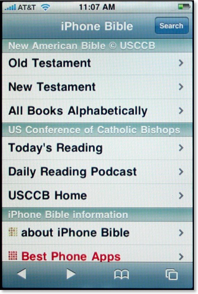
I was initially intrigued when I first heard of the iPhone Bible (does this mean they now have control of that name?) because it would be the first iPhone Bible app to include the deuterocanonicals/apocrypha. Using Hewitt's aforementioned iUI, the opening screen of the iPhone Bible is both clear and colorful. Using a similar method we've seen elsewhere, the user selects Old or New Testament, which leads to the appropriate books of that testament (plus preface and section introductions), chapter numbers, and finally the full text of the selected chapter. That's where the surprise comes.
The biblical text for the iPhone actually comes from the already existing NAB pages from the United States Council of Catholic Bishops website. What that means is that these pages are not already formatted to a mobile device such as the iPhone and as demonstrated above, can be barely read at first. To see the text better, the user has two options. First, the iPhone can be turned sideways:
This is helpful, but still not a perfect solution. Another option of course is to simply do the iPhone multi-touch pinch resulting in text as large as desired:

Yes, Steve said we'd have the actual internet on the iPhone, but it's not always as practical as it sounds. Even with the text enlarged, this is still not an ideal solution for reading large sections of Scripture as one would constantly have to move the page around to see the entire text.
The NAB iPhone Bible is a great idea, but it suffers from the inherently small text that renders from the original USCCB pages. There is no search function built into the iPhone Bible, but there is a search available upon arriving at the USCCB pages. However, the user will want to restrict searches to the entire Bible because by default the entire site is searched. This was certainly a good idea, but perhaps the developers could get permission to reformat the NAB text specifically for the iPhone and other mobile devices.
The Net Bible
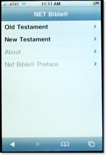
Soon after I got my iPhone, I thought to myself how incredible it might be to have the NET Bible with all 60,000 notes literally in the palm of my hand. I contacted the folks at Bible.org to suggest they offer a NET Bible iphone app, but they were already well ahead of me as they had already been considering the very same thing. The NET Bible for the iPhone also uses Hewitt's iUI, and the navigation to a particular passage of the Bible is similar to the one described above.
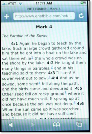
In my last set of reviews, I praised iBibleSpace for the best interface of any iPhone Bible app so far. That evaluation remains so far, but I can say that the NET Bible has the best layout of text of any of the Bible apps so far. Not only are all formatting features (italics, bold, etc.) retained from the original NET Bible, but also the text is large and not crowded. There are spaces before and after section headings so that the text does not run together. Note the blue numbers above. These are links to the NET Bible's 60,000+ textual notes. The folks at Bible.org have thought through the implementation of these notes quite well because when the user seeks to access the NET notes, an entirely separate page is launched. This allows the user to flip back and forth between the text and the notes without having to wait for a page to load from the internet.
However, a current limitation of the iPhone causes a problem in the NET Bible notes as well. Compare these two screens below--notes from Gen 1 on the left and Mark 4 on the right:
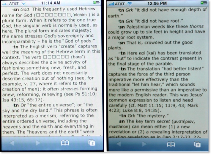
[Note: the actual screens of the NET Bible notes are the same color. The images above just reflect my poor photography skills.]
As I mentioned in a previous post, Hebrew does not show up correctly yet on the iPhone. So notice on the left image which contains notes from Genesis 1, that square boxes appear where Hebrew text displays in the original. There are other places where the boxes show up in place of Hebrew, such as the section headings in Psalm 119 and references to Sinaiticus in the NT notes. However, on the right screen, with notes from Mark 4, the Greek word μυστήριον appears correctly. I would recommend to the NET Bible team that for right now they do nothing to "fix" this text. The iPhone will have to include Hebrew as the phone is marketed internationally. One would assume that the addition of Hebrew and other international fonts will be included in a later iPhone software update. I should also point out that the since I took these shots, the superscript numbering at the beginning of each note has been enlarged.
The NET Bible on the iPhone will no doubt be very beneficial to many iPhone users, including myself. Like a lot of these apps, there's no search feature as of yet. I might also throw out a challenge to the programmers to create a window that has the biblical text on top and the notes on bottom (or side to side if the phone is turned). Regardless, this is a good and needed beginning.
God's iPhone (GWT)
[Note: the above image was taken as a screenshot off my MacBook because the opening screen has changed so dramatically since I first took my photographs.]
God's iPhone was created by Israel Anderson of New Zealand. This Bible app uses the lesser known, but still very good, God's Word Translation of the Bible. This project is not yet complete, but so far, Anderson has made available the entire New Testament and parts of the Old Testament (Genesis, Exodus, and Psalms). Also Anderson has added a section for Christian classic (presumably public domain) works. The first entry made available is A. W. Tozer's Pursuit of God.
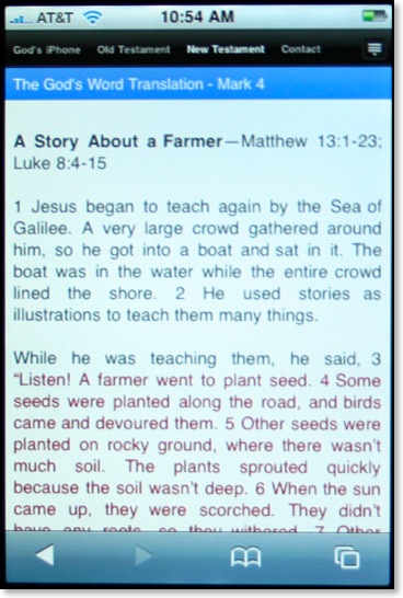
I'm assuming that Anderson has used RapidWeaver's new iPhone template for his Bible app. As a RW user myself I've played around with this template in hopes of eventually offering a Greek NT for the iPhone (but I'm not sure how legal this is since the NA text is copyrighted). The RW iPhone template includes a drop down menu seen in the icon at the far right of the image above. Anderson has opted not to take advantage of this leaving all menu items on the screen. This is just as well because I've found it difficult to make selections with this menu in my own tests.
As seen in the image above, text is clear and well spaced, but I can't help thinking it would be easier to read if the text were not displayed using full justification. Studies have shown that full justification, while looking neat and orderly, is actually harder to read because it makes it harder for the eyes to find the next line.
Regardless, God's iPhone has an easy to use interface and has the distinction of being the only way to view the GWT on the iPhone. There is no search function yet, but it is still a work in progress.
ESV Mobile
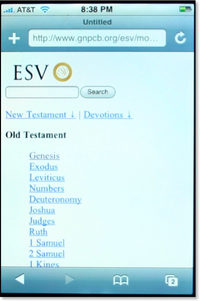
I've found the community of ESV users to be quite savvy when it comes to the internet and most things technological. They tend to be forward thinking and embrace new technologies quicker than those who sponsor competing translations of the Bible. Crossway, the publisher of the ESV has updated their mobile site making it more iPhone friendly. This now makes three separate iPhone apps that use the ESV (iBibleSpace uses the ESV by default and 3onesix allows for the ESV by including the abbreviation before a search). Crossway is distinguished as being the first major Bible publisher as of this writing that has offered a method of reading the Bible to iPhone users.
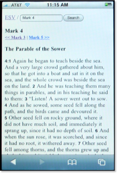
A very helpful feature of the ESV Mobile site is the inclusion of a search feature on every screen. The text is formatted with plenty of space, perhaps even better than iBibleSpace which tends to run headings and text together and use a verse by verse format. Oddly however, the text itself when viewed on the iPhone is serifed in spite of the fact that when I look at it on my MacBook it is sans serifed. I'm not sure what font is being used, or if one is specified at all, but I would think a sans serifed font like Arial or Helvetica would be much easier to read not only on the iPhone, but other mobile devices as well.
The ESV Mobile site also offers a variety of daily devotionals/readings as well. Like I said in my review of iBibleSpace, I can't imagine reading a devotional from my iPhone (or even a full daily reading of the BIble), but others may be more so inclined.
If you hear of an iPhone Bible app, or an iPhone app related to biblical studies, be sure to let me know and I'll mention it here on This Lamp.
New Version of Apple Pages Checks for Gender-Specific Words
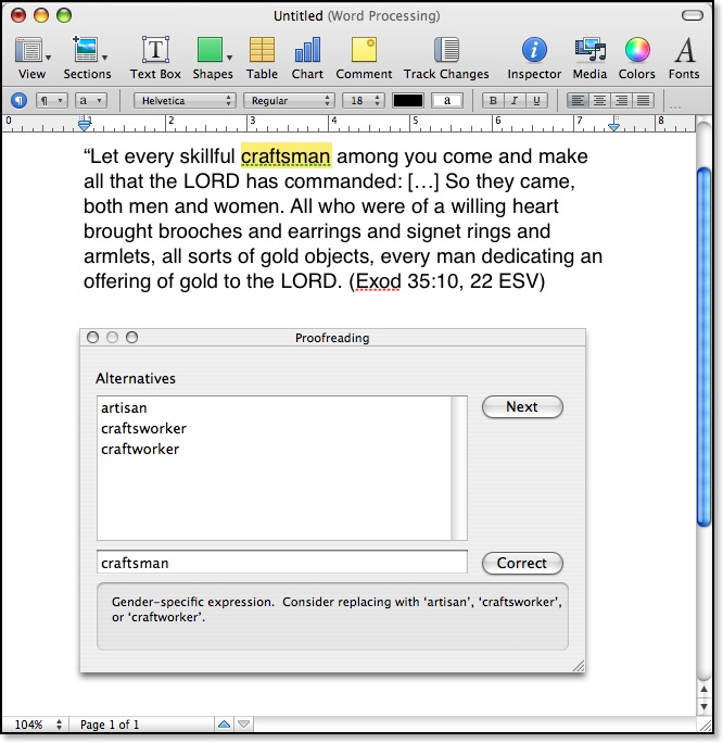
I didn't know it until today, but MS Word 2004 checks for gender-specific terms, too. However when I pasted the above verse in Word, kinsman was not flagged.
Pages, which is part of Apple's iWork suite was introduced in 2005. Version 3 (or '08), which debuted yesterday, is the first release to include a grammar checker of any kind, and evidently, it's more specific than that in the current version of Word for the Mac.
This Lamp Set to Move (Tentatively)

I also think I've begun to reach the limits of RapidWeaver's ability to handle my site. The recent update improved this somewhat, but there are still problems. The actual site on the web is over 1300 separate files, but RapidWeaver keeps them all contained in one file on my MacBook. Right now, this file is over 150 mb in size. It takes a while to load and forever to save and shut down. I have continued fear of it losing integrity one day, but I do back it up regularly.

If you simply have my site linked/saved/bookmarked as www.thislamp.com, you will be fine as I will simply change the pointers to the new site. However, if you link directly to these files or subscribe to the RSS feed, you will have to update your bookmarks.
There's still a chance this won't happen, but from everything I've seen of iWeb '08, I think it's about time to pack my virtual bags.
Biblical Fonts on the iPhone: Greek--YES! Hebrew--NO!
As I said in my post yesterday reviewing Bible apps on the iPhone, I would like to eventually see original language biblical texts on the iPhone in addition to the English translations already available. So I decided to conduct a couple of tests on my own. If the iPhone won't display Hebrew, will it display Greek?
First, I wanted to confirm the lack of Hebrew character support, so I ran over to Iyov's blog where I remember he used some Hebrew fonts last Monday in regard to a post by yours truly. Below is an actual photograph of my iPhone screen on Iyov's post "Brief Notes (Rosh Chodesh Av, 5767)":
Sure enough--the Hebrew does not display at all.
So what about Greek? On Wednesday, Suzanne McCarthy posted an entry on the Better Bibles Blog titled "From Sapho 2." While not technically a biblical passage, the post includes Greek text. Here is another photo of my iPhone:
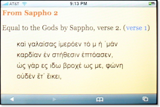
As you can see the Greek renders fine--in fact, it's perfect. So why doesn't the Hebrew? Modern Unicode fonts include characters for both Greek and Hebrew as well as quite a few other character language sets. My only conclusion is that iPhone v. 1 software uses limited font sets.
Hopefully, as the iPhone is introduced in other parts of the world, these missing languages--including Hebrew--will be added in.
TNIV Truth: TNIV on the iPhone
See my newest post at TNIV Truth.
iPhone Bible App Roundup: July 2007
Let me say up front that on the iPhone, there's nothing like the kind of offerings Olive Tree has for other PDA's and smartphones. In fact, I contacted Olive Tree to see if they were working on any kind of solution for the iPhone. They asked me if I would be interested in testing the text files they offer for iPods on my iPhone since no one at Olive Tree actually has an iPhone. I had to inform them that text files cannot be placed on an iPhone in the same manner that one can on an iPod because the free space on the iPhone's flash drive cannot be directly accessed. At this point, I don't know where Olive Tree's strategy stands for the iPhone, if there is one at all.
A major drawback of the iPhone is that Apple will not allow third party applications on the iPhone at this point. Now, I've heard rumors that a software development kit is in the works, but supposedly the Windows version isn't up to speed with the OS X version at the moment, so Apple wants to wait until the SDK's have platform parity before either is released. These days, Apple Inc. (no longer Apple Computer) has quite a few Windows software offerings and actually sells more iPods and iPhones to Windows users than to Mac users. Until the Windows SDK is up to par, we have no third party apps. Again...if this rumor is true at all.
The solution, and one endorsed publicly by Apple, revolves around Web 2.0 apps that can run in the iPhone's stripped down Safari browser. Quite a few "programs" have been released so far and are cataloged at websites such as The iPhone Application List. Some of these applications are quite handy, but in the interest of myself and readers of this blog, I thought I would try to create an ongoing series regarding the Bible offerings for the iPhone as they become available.
Currently, there are three iPhone applications that offer access to the Bible. I will offer brief reviews of them in the order they were released.
iPhone Scriptures/LDS Standard Works (KJV & Mormon)
Technically, these are two separate programs, but they use a similar interface, so I'm going to assume there's some connection between them. Released about a week after the launch, iPhone Scriptures was the first Bible related app available for the iPhone. The interface is straightforward. Clicking on a selection such as "New Testament" offers the user a list of New Testament books. Selecting a book takes the reader to another screen with chapter numbers. Selecting a chapter yields the entire text for that chapter:

The button at the top of the text that says "Library" takes the reader back to the initial screen. What seems to be an obvious omission are arrows that would take the reader to the previous or next chapters. No search features are present, but it's promised to be available soon. In case you didn't notice, the biblical text is limited to the King James Version, which is the officially used translation of the Mormon Church. This isn't surprising, but will certainly limit widespread use of this program.
The only functional difference between iPhone Scriptures and LDS Standard Works is the ability to turn off the Mormon Scriptures in the latter program for those who don't want to look at the Mormon-specific titles. This is done in a "Settings" tab at the bottom in place of the "About" tab in iPhone Scriptures.
I saw iPhone Scriptures within a day or two of it's release, and the initial interface had very tiny tabs making it virtually unusable. The current version is much improved.
3onesix Ministry Tools (NIV)
This Bible was released around July 10, and takes a slightly different approach to accessing the Scriptures than the programs mentioned above. In 3onesix Ministry Tools, the user must know what passage he or she wants to view in advance. For instance, typing "Matthew 1" results in that chapter being displayed.

Clicking either of the links on the chapter screen takes the user to the regular eBible website which is what this program is based on. Currently, the only text available from 3onesix is the NIV, but one would hope that others would eventually be made available since eBible offers multiple versions. At the moment, unless the user goes to the eBible site, there is no direct search feature in the app specifically made for the iPhone.
iBibleSpace (ESV)
By far the most impressive iPhone Bible app to date is iBibleSpace released a couple of days ago. Anyone who has already spent time on an iPhone will immediately recognize an interface that draws its cues from the regular iPhone home screen. By choosing the first option, "Bible," one is presented with a similar interface as found in the original iPhone Scriptures application mentioned above, but it's designed to look much better in iBibleSpace. Again, the user can select a book of the BIble (OT & NT books are on the same screen), and then a chapter.

The text as shown above is quite clear, and contrary to the screenshots I took above on my MacBook (I don't know of any way to grab screens on my iPhone), the text such as the word "Reference" above fits perfectly onto it's button on the iPhone.
iBibleSpace has quite a few features going for it that puts it ahead of the other two iPhone Bibles. First of all, the ESV text as shown here includes access to textual footnotes: notice the "" at the end of v. 3. That note designation is actually hyperlinked and will take the user to the bottom of the screen where the footnotes all appear at the end of any chapter. You might also notice the right-pointing arrow that will take the user to--you guessed it--chapter 2 where there are both previous chapter and next chapter buttons.
A number of other options are offered at the top of the screen as well. The large single-colored left pointing arrow will take the user back to a listing of all chapters in the biblical book. The "Notes" button allows the reader to access a personalized account where one can store customized notes. The plus (+) button on the far right allows the user to add a new note and even highlight a verse in one of six different colors [gee, maybe I could transfer all the notes from my wide margin NASB to my iPhone!...or maybe not]. The "Reference" button takes the user to notes from Matthew Henry's Concise Commentary (not of great interest to me, but it's a nifty feature, nonetheless).
The only real downside I saw of the biblical text in iBibleSpace was the dreaded words of Christ in red. If this "feature" could be turned off, I believe that would be helpful to many.
Going back to the IBibleSpace main screen is simple because it always remains as a separate page/tab in the iPhone browser (in case you didn't know, the iPhone will allow the user to have multiple pages open at once, much like tabs in regular browsers). "Today's Verse" is just what you would expect it to be: a daily Bible verse. There is a link to read the entire chapter from which the verse comes in context if one is so inclined.
Another distinguishing feature of iBibleSpace is its search feature:
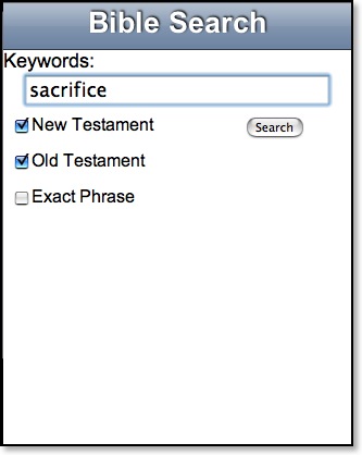
One can search either or both testaments and exact phrases. Results are displayed in groups of five at a time with an option to select "More."
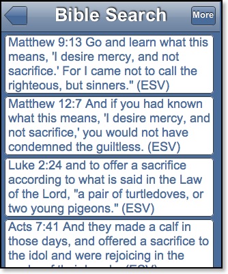
However, I found it odd that NT hits are listed before OT results. I would prefer them my results to be listed in canonical order. Further, in most Bible programs the search word is usually highlighted in some way, but not so in iBibleSpace.
The other two buttons on the home screen will lead the user to daily devotions from Spurgeon or podcasts from a variety of conservative Christian radio shows. The selections are a bit odd in my opinion. I cringed when I saw Joyce Meyer, but I occasionally enjoy listening to Ravi Zacharias' show. The great majority of the offerings, however, I would not have any regular interest in. I also doubt I'd run to my iPhone for a daily devotional from Charles Spurgeon either. In fact, it seems odd to me that it's a primary button on the home screen.
Regarding the podcasts, though, I followed one all the way to the show to see if the iPhone would actually play it. The link was to an MP3 file that launched QuickTime on the iPhone. I think that was the first time that I realized that I even had QuickTime on my iPhone!
iBibleSpace is impressive on many levels: features, design, and consistency of its interface (one never follows a link that leads to a page not formatted to the iPhone unlike the 3onesix app). Even though the ESV is not one of my preferred translations, I put iBibleSpace at the top of my iPhone app bookmarks. At the present time, iBibleSpace is far and away the best Bible app available for the iPhone.
I'd still like to see original language texts on the iPhone, although I have no idea if the iPhone would even support Greek and Hebrew fonts. Of course one would presume that it is using Unicode fonts already. Something like the NET Bible would be interesting to have on the iPhone as well, and perhaps because the folks behind the NET have been so Internet savvy, we will see something in the near future. One also wonders if an iPhone interface to something like Bible Gateway couldn't be created to take advantage of multiple translations.
Further, I still am hopeful for third party apps. The major drawback of any of these apps relates to their dependence on the Internet. Even with a WiFi connection, they are not as fast as a native application would be.
In the meantime, three weeks have yielded three distinct Bible apps of varying creativity and features. As others will undoubtedly come available in the weeks ahead, I'll be sure to cover as many as possible here on This Lamp.
iPhone = Convergence
In 2003, I had three electronic devices (not counting my laptop) I used regularly and carried with me most places: a Palm Tungsten T, my Motorola Timeport cellphone, and a 20GB (second generation) iPod. Then in October of that year, I obtained the newly released Treo 600 which combined the cellphone and Palm functions. The number of devices I carried were down to two. I remember reflecting at the time that if only I could combine something like the Treo with the functionality of the iPod, I'd be set.
I realize, of course, that to some such gadgets seem unnecessary, but they've become extremely integrated into my life. Let me explain. A little more than a decade ago, I carried a physical daytimer. It was convenient enough for the calendar and address book, but for anything else I had to remember where I had written it. Then in 1997, I bought a Palm Professional which appealed to my proclivity to all things electronic and computerized. Truth be told, there's something I miss about writing appointments with a physical pen or pencil onto an actual page made from wood pulp. Nevertheless, the Palm was most practical. It went into my pocket. I could run searches for information without having to worry about where I had written it. It wasn't something extra to carry with the stack of books that often seem to follow me around wherever I go.
[Sidenote: For those curious, since 1997 I carried in this order a PalmPilot Professional (came with 1 MB of memory but I upgraded it to a whopping 2 MB), Palm IIIe, Palm Vx, Palm Tungsten T, and finally a Palm Treo 600. Of those devices, for purely Palm-based features, the Palm Vx was probably my favorite of all. It was slender, sleek and had a crisp monochrome screen that I felt was never equaled in the color screens of the Tungsten or Treo models that I used. Oh, and I also briefly carried a Compaq iPaq 3850 in early 2002. This PocketPC device was certainly more sophisticated that a Palm PDA, and the promise of it appealed to me; but in the end, I found it to be buggy and needing regular (as in at least daily) reboots to function normally. My final straw was calling tech support about its unreliability, asking why I had to restart it so much, only to have the tech from Compaq say, "What do you expect? It's Windows!"]
As for the iPod, you may be saying to yourself, "I have trouble imagining Rick with headphones on, psychedelically bebopping around like one of those iPod commercials." Well, no, you won't see me doing that. In fact, you'd rarely see me with an iPod although I carried it with me everyday. Generally, I only used it during my commute, which can sometimes last up to an hour. Yes, I do have music on my iPod, but I admit that I don't listen to it that often. My iPod use is mainly geared around listening to content such as lectures, the Mars Hill Audio Journal, audio books, or even audio Bibles (lately I've been listening through the entire TNIV).
And regarding the cell phone aspect, a number of years ago, when we first moved to Simpsonville, Kathy and I opted not to carry local telephone service. Why did we really need to? Couldn't we simply use a cell phone for everything? Is there ever really any need for a landline anymore? So we each have our own cell phones and we haven't missed the $30 or so dollars we used to send to the phone company each month.
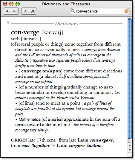
First of all, after a week of use and after experiencing the activation woes I wrote about (see here and here), I can say overall that I'm very pleased with the iPhone. Yes, there are a few features it's lacking, which I'll mention below, but overall, it lives up to its promise. Plus, the key to the iPhone is software and currently it's listed at version 1.0. I fully expect that the rough spots and the gaps in the iPhone's applications will be worked out with software updates in the weeks to come. So while, I'm missing some functionality here or there--some of which I was even used to on my Treo--I'm not really concerned.
In my opinion, when timelines are drawn twenty years from now on the the history of mobile phones and the like, the iPhone will have a prominent place along the line. One could easily point out where another PDA or cell phone does many of the same things the iPhone does, but it's the ease of use and the intuitive interface that's key for the iPhone. Email is easy and works as it should. And internet browsing is not an exercise in frustration as it was on my Treo. On the Treo, invariably, the internet's memory cache would get full and I would have to go in and clear it out. Graphics would take so long to load that I completely turned them off so that I simply had little squares with graphical symbols. Plus, it was invariably difficult to maneuver around a webpage on my Treo because it would convert multiple columns to one column. With the iPhone, a webpage renders correctly (except for Flash, but they're working on that) and you can resize it as you need. Double-tapping on a block of text zooms in wonderfully. The internet is actually usable on this phone, and because the screen's resolution is much higher than a typical computer monitor, even the smallest text is quite readable.
A number of folks have complained about AT&T's Edge data network, specifically in regard to speed. However, when the iPhone sense a wifi internet connection, it immediately switches over to that which is faster than any data network anyway. And maybe Edge is slow to some, but I can tell you it's certainly faster than whatever I was using from Sprint on my Treo 600.
I'm so pleased with the email and internet capabilities of the iPhone that it enables even another level of convergence for me. Often, in making a daytrip somewhere, I'll carry my MacBook simply so that I can check email once or twice while I'm away. The iPhone's capabilities are so extensive, however, that I think I could get by for significant amounts of time simply with it alone. Therefore, on short trips I can now leave my laptop at home and simply carry the iPhone. Traveling light is always a plus.
All the concerns over the iPhone's virtual keyboard are mostly gone by now for those who have spent anytime with it. Mistakes are usually corrected with a tap of the virtual space bar if I'm paying attention and willing to trust the iPhone's own "intuition." I think for heavy editing, I might still like an external keyboard. I admit that I haven't used one of these since I had the foldout keyboard for my Palm IIIe (again, it was just something extra to carry), but such a keyboard would be useful with the iPhone, and it could connect via the iPhone's built-in bluetooth, so I hope third parties are already working on something like this.
One of my early concerns for the iPhone was the relatively small flash drive (8 gb). Only recently have I actually filled up the space on my 20gb iPod purchased back in 2002 (this is a pre-photo, pre-video, old-school monochrome iPod). At that point, I began unchecking a few of the unabridged books I have that take up so much space. But the iPhone encourages a different approach. The idea is not to carry everything with you, but just what you need between syncs. And really, this makes sense. I mean if I listened to everything in my iTunes library, I would have to listen for over three weeks with no sleep. I realize now that it's really unnecessary to carry all that stuff with me. The key is to create albums in iTunes so that you can simply select those and sync over what you think you'll need for the time being.
And that's the other thing about the iPhone. I know folks who have so-called smart phones that never sync them regularly. The iPhone seems to drive the user to sync on a regular basis, to update the content for the next day or two's use.
Having said all that, not everything is rosy. Apple's restrictive policy toward 3rd party apps is a real pain. Two applications I miss from my Palm Treo are Pocket Quicken and Olive Tree's Bible Reader. I kept Pocket Quicken synced regularly with Quicken on my desktop Mac and used the mobile version as a check registry when away from home. And although I usually have access to a Bible with me (or Accordance on my MacBook), there were quite a few times that the Bible Reader on my Treo came in quite handy. On the Treo I carried the Greek NT and the NASB with Greek and Hebrew dictionaries. The only third party apps available for the iPhone have to be created using Web 2.0, so I don't expect anything to reach the sophistication of Pocket Quicken. And so far, I've only come across one Bible program for the iPhone (which I'll review in a separate post), but it's KJV only in addition to Mormon scriptures which are, naturally, of no interest to me. I would really like to see someone create an iPhone interface for something like Bible Gateway.
And there are a few basic missing features on the iPhone. For instance today, Kathy emailed me asking for the address of a family member. I had that information in the contacts on my iPhone, but currently, the device does not allow for selecting text and copy and paste. So while I could look up the information, I couldn't copy and paste it into the iPhone's email program. I still had to retype it. This certainly seems like a step backwards. Didn't the original 1984 Mac have copy and paste?
But I'm riding on the assumption that these kinds of issues are minor inconveniences that are inherent to a version 1.0 of the iPhone's software. I'm confident they will be address and hopefully very soon.

However, on a negative note, those "fewest dropped calls" commercials on television are starting to seem a bit disingenuous. Granted my experience is only anecdotal, but I promise you that I've had more dropped calls in the last week with AT&T than I ever did in seven years with Sprint. It's very annoying.
Overall, I highly recommend the iPhone. Yes, the price is a bit steep. But if you can use the features and if it brings convergence to some of the devices you carry, you may agree with me that the iPhone is worth every penny.
iPhone Activation Woes, Part 8 [3 updates]
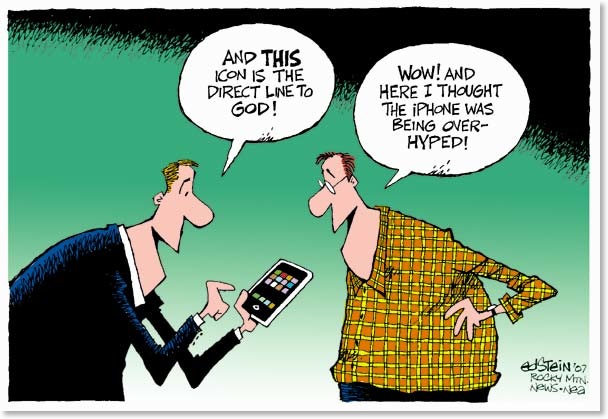
To read my initial tale of iPhone activation purgatory and six subsequent updates, see my previous post.
Quick summary: after waiting 35 hours, AT&T finally activated my iPhone on Sunday. It worked for a little over 12 hours and was deactivated. Kathy's iPhone took much less time initially: only 24 hours. Then, after getting my iPhone reactivated and after about two hours of activation for the second phone, Kathy's phone was also deactivated. So my phone works; hers does not.
Now keep in mind that I first started the activation for Kathy's iPhone on Sunday afternoon. Now it's WEDNESDAY night, and except for the aforementioned two hours, her phone is nothing more than an expensive WiFi capable PDA and iPod. These other functions work because it was activated for a brief while.
I haven't posted anything since Monday afternoon because we've been traveling (we're now actually in Louisiana) and we spent the day with family, but in the last 48 hours or so, the incompetence displayed from the tech support for the iPhone has reached new heights. Now keep in mind, that with the exception of one, all the reps I've talked to have been extremely friendly. And I can't imagine that anyone would have a secret agenda for keeping Kathy's iPhone deactivated. Nevertheless, the events I'm about to relate would be described as a comedy of errors if only it simply were so not funny.
And here's an interesting tidbit: during one of my conversations with a representative from AT&T, he gave me some interesting insights into the problem that go well beyond the late training that AT&T employees didn't receive until the day before the product's release. He told me that the reason I keep getting handed back and forth between AT&T and Apple is that Apple will not release to AT&T complete information about how the phone works. He told me that with the Blackberrys they sell, all support is done entirely through AT&T. Not so with the iPhone.
In the last post, I also mentioned John from Apple who sympathized with my case and promised to stick with me until everything was resolved. To his credit, he has done just that. He lets me use his Apple email address to contact him when successive attempts to activate the phone have not worked after a few hours have passed. And he also never simply transfers me to any other support person. Instead, he's stayed on the phone with me in conference with AT&T. That level of personal support has been graciously appreciated. However, I hate to say it but the biggest blunder in this whole situation also came from his hand.
Over the past two and a half days since my last post, I've been on the phone a half dozen times and have spoken to a dozen or so people. The good thing is that unlike previous days, I don't have to start at ground zero with support. John from Apple has been with me every step of the way. I've been offered all kinds of crazy explanations as to why Kathy's phone is not working. Truthfully, I don't know if I'll ever have the answer, and frankly, I don't really care. Keep in mind that I started the activation on her iPhone on Sunday and now we're at the close of Wednesday and it still is not active.
So yesterday after we had arrived in Louisiana after driving straight through the night, I was going to take a nap when John called me. Believe it or not, I had also handled some of the troubleshooting while driving. John said that he was certain that my SIM card was bad. He knew I wasn't at home, so he asked for the ZIP code where I was. After telling him, he hung up with me, and began hunting down the closest AT&T store. After discovering one about 15 miles away from where I am, he called the store and said he was going to send in a customer to swap out the SIM card.
Now, I'll admit to you, my faithful reader, that upon hearing this, my spidey-sense began tingling. Like anything of this nature, I've investigated these iPhones pretty well, and I was certain I had read that the SIM cards could not be swapped out. Nevertheless, he's the expert right? So I got in the car, picked up an old friend who lives in the area, and we headed to the AT&T store in Bossier City, Louisiana.
At the AT&T store, they switched the card out with no hassle. Of course, I found it odd that they charged me for the new card--a whopping 2¢.
So, I got home, emailed John that the card was switched out, and then we waited. Kathy got another notice in her email that her phone was now activated (between our two phones, we've received about a dozen of these so far). But we waited and then nothing. I emailed John and let him know. He called me back and got AT&T support on the phone. As I've mentioned, everyone has had a different theory as to the problem, but I think this one fellow from AT&T was probably right: he said we should have never switched the SIM card on the phone. Surprise, surprise (I should always listen to my spidey-sense).
I read to him the number of the new SIM card, but his system wouldn't let him change it. He said this was because only certain SIM cards were to be used in the iPhones. He believed that Kathy's iPhone had not activated simply because Sprint had not yet released the phone number. I reminded him that her iPhone did work for about two hours on Monday. Nevertheless, he said that another department would have to help me--one that had the authorization to change the SIM numbers in the system. We toyed with the idea of my going back to the local AT&T store, but decided against it on the assumption that the SIM card was probably discarded in the trash. The fellow from AT&T gave me a case number (FINALLY--a case number! My problem is official!), and said that he was submitting it to a group working on specific problems. He said the wait was longer (meaning probably that since it was the end of the day they were probably gone and wouldn't be back until after the Fourth of July holiday), but that my case was being handled and everything should be resolved within five days. Five days. That's five days from yesterday which means that by SUNDAY, July 8 at the latest, Kathy's iPhone should be active. So we're back to waiting.
So I didn't expect to hear from anyone today. I mean...it's a national holiday, and although I assume AT&T support was open at some level, the guys who tackle the major problems (such as authenticating a rogue SIM card number) were probably eating hot dogs and tossing horse shoes. So last night I settled in for what I hoped was at least eight hours sleep--after only getting about one and a half hours' sleep the previous night because we were traveling and getting only four hours' sleep each of the two nights before that because I was on hold with tech support. I went to bed about 11 PM and set the alarm clock on my iPhone (mine works, you'll remember, and yes, it even has an alarm clock for travel) for 8 AM. That would be a solid nine hours' sleep. And when the alarm on the iPhone went off, I hit the snooze (it has a snooze feature!) In fact, I slept a good extra hour--all the way till nine o'clock. Then my iPhone rang--not the alarm but an actual call.
Because I've talked to so many people at Apple and AT&T over the last four or five days, evidently I'm now on multiple "check back" lists. I've started getting follow-up calls to see if my problem has been resolved. That was the subject of the call at 9 AM this morning. In a very friendly voice she asked if my issues had been resolved. In a very groggy voice, I told her that they had not been resolved, but I had been given a case number and was promised resolution within five days. She told me that they tell everyone five days, but it's usually much shorter than that. I certainly hope so.
At the end of the conversation, she asked what I've come to realize is the obligatory "Have we resolved your problem and is there anything else I can do for you today?" closing sentence. It seemed a bit out of place under the circumstances. I laughed and said, "Well nothing is resolved, but I appreciate your checking on me." That was understandably the only call I received today since it's a holiday.
Stay tuned. Surely tomorrow...
Update 7/5 12:01 PM. Starting over? As expected a representative from AT&T called me this morning to see if my phone was now working. According to her, everything was clear on their end of things. After starting the iPhone over a couple of times, she said, "Well it should work. I can't do anything else for you. Let me get you this number so that you can call Apple."
Then the call dropped. It was another one of these situations that I've experienced where my signal will go from five bars to nothing.
To her credit, she called and left a voice mail giving me the number to call Apple. The problem with this is that now I'm essentially starting over with my problem yet again. So while I called Apple, I also emailed John, the representative who had promised to see my problem through. Meanwhile, a representative from Apple came on and I gave him the twenty second version of what was wrong with the phone: the activation process began on Sunday; it was working for about two hours on Monday, and now it can't get service.
Of course because this fellow is new to me, he begins by going through the same old things I've tried with other reps a dozen times before: turning the phone on and off, switching airport mode on and off, etc. He even at one point asked my area code because he wanted to know if there was coverage where I was. I quickly explained to him that I was using another iPhone to talk to him.
He was about to have me redownload the software for the iPhone and completely start the activation process over when I suggested that we should see if the SIM card number is correct, and I explained to him the issue from two days ago when an Apple rep had me go get a new SIM card. He thought that was a good idea, but of course he has no access to that information on his screen and needed to call AT&T. He put me on hold.
Then the call dropped. Unlike John from a few days ago, and unlike the AT&T rep this morning, he made no attempt to contact me although obviously he has access to contact information. If you've read my entire account of this issue, you'll know that this is not the first time this has happened, and I find it totally irresponsible and the complete opposite of any definition of customer service.
So I've emailed John again, but I got a message back that his case load is extraordinarily heavy today due to being gone yesterday for the 4th, but he'll try to get to me when he can.
Meanwhile I'm just waiting. Considering my problems started on Monday, you'd think my case would have some kind of priority. Actually, I've been told by both Apple and AT&T at different times that it did have priority; nevertheless, I'm simply waiting, and I get the feeling I'm waiting back at the starting line...
Update 7/5 1:54 PM. Attention received, but still waiting. John from Apple has come through once again. He called me stating that he was able to offer some of his lesser account issues to some of his co-workers so that he could concentrate on my issue. Neither he nor I believe there is a problem with the physical phone, but rather in the service on the AT&T side of things. He is running interference for me with AT&T rather than making me do it endlessly waiting on hold and such. Plus he's got much more direct access. I asked him to double-check the SIM card number with AT&T's records. I'm waiting for his call, so hopefully (again) we'll see something resolved very soon.
Update: 7/5 2:46 PM. iPhone working! I'm a bit gunshy to claim the problem is resolved since we've been down that road. However, I am pleased to report that Kathy's iPhone IS now working. John Clark of Apple got hold of a fellow named Samuel Brown at AT&T and together they solved the problem. Exactly what the nature of that problem was, none of us know for sure. Samuel contacted a number of departments at AT&T and there were some flags on the account such as one stating that the number had not yet been ported (it had). It's possible that these flags were in error but simply causing the system to not allow use of the phone. Who knows?
Samuel was nice enough to give me his personal email at AT&T just as John had done at Apple. I hope that we won't have any more problems with our phones, but if we do, at least I now have direct contacts with both companies.
In appreciation for their help, I sent both John and Samuel iTunes gift cards.
So all's well that ends well, I suppose--assuming that it has, in fact, ended.
There's no need for me to write a full review of the iPhone. Those are out there aplenty. But I will give you a few minor thoughts and reflections tomorrow.
Apple's iPhone: GREAT! AT&T's Service: NOT SO GREAT! [6 updates]
The whole ordeal started this past week. In spite of all the hype and mass hysteria surrounding the iPhone, I was undecided as to whether I'd get one until just a few days ago. I do use a so-called "smart phone"--a Treo 600 purchased in 2003 (actually, I've gone through five of them because they're a bit fragile, but fortunately I had insurance with Sprint). After watching Steve Jobs' keynote in which he introduced the iPhone a second time and the slew of videos released by Apple over the last few days, I made my case to Kathy and we decided to take the plunge. I determined that I could cash in some Membership Rewards points from Amex, grab the hundred or so in rolled coins, I've saved for a rainy day, sell the Treo and a couple of other phones I don't use and I should have enough cash to cover the iPhone.
So on Friday, I decided to go to the sole AT&T store in Shelby County, Kentucky, assuming that the crowds would be smaller than at the stores in Louisville. I was right. Kathy and I arrived at 5PM, an hour before the iPhone was supposed to go on sale, and there were only eight or nine people ahead of us. The wait wasn't too bad. Then we bought our phones and left. What's interesting is that with the iPhone, AT&T doesn't activate it for you. It's a process that you do by yourself through iTunes on any Windows machine or Mac.
However, we should have known we were in for problems while still in the store. This was Friday, and the AT&T staff admitted that they had only received training on Thursday. That had to do with the secrecy surrounding the iPhone, and I imagine had a lot more to do with Apple than AT&T. One of the fellows in line ahead of us worked for UPS and described the armed guards that surrounded the thousands of iPhone shipments through the previous night. Procedurally, everything was different to standard AT&T methods in regard to this phone and it showed.
Inside the AT&T store, there were three salespeople, and the store manager who was working in a supervisory role. AT&T corporate had sent a regional manager to work security and determine how many people to let inside at any one time. Nothing in the store seemed to be working right. The system that controlled credit checks (mandatory before the sale) was down. Strict inventory control was in place. Salespersons were only allowed to go get our iPhones after we requested them. The boxes could not be opened while we were in the store, and the bags were sealed before we left. We had to give our name, address, social security number, drivers license number, and email address just to purchase the phone. One of the salespeople kept making errors. I could tell the manager was getting ticked at her, and it didn't help his frustrations when she mentioned she had been an hour late to the training the day before.
We were in no rush, so I took my phone home and waited until about 8:30 to actually attempt to activate it via iTunes. After requesting that my Sprint Treo's number be ported to the new iPhone, filling out the forms, agreeing to the user contracts (one for Apple, one for AT&T), the software ran through this process to activate my phone. It said that it might take up to six minutes. No problem. The instructions noted that once the phone was activated, I might be able to dial out, but initially calls might not come in. Again no problem because all other features of the iPhone should work.
After the six minutes were up, the activation process timed out. I was given a message that further time was necessary for my activation. I quickly received two emails: one from Apple and one from AT&T. One of the messages stated that my activation would take 24 hours and I needed to be sitting in front of my computer on or before 8:35 on Saturday night. Frustrating, to be sure, but I went with it. The interesting thing about the iPhone is that until it's activated, one cannot make use of any of its features, including internet or iPod features. It's essentially a very expensive paperweight unless it's fully activated. Supposedly, there's an option to make an emergency call even if the phone is not activated. When I touched this button (not to actually make an emergency call, but to see where the screen would take me) I discovered that had I been in an actual emergency, the phone still would not have worked because until it's activated, the signal bars remain flat. No one is going to dial out on an unactivated iPhone--not even in an emergency.
On Saturday, about 20 hours into the ordeal, I decided to call one of the iPhone/AT&T support numbers just to make sure all my information was correct when the 24 hour mark should occur. In trying to explain my situation to one gentleman, I was told that my experience was "mistaken." If I got to the end of the iTunes activation screens without some functionality added to my phone, I must have done something wrong. He told me to plug my iPhone back in and start over. Upon doing this, iTunes recognized the phone and gave me the same message about needing additional time to activate my phone. The AT&T representative all but accused me of lying because evidently, this stage of activation limbo was not in any of his documentation. If I didn't see what was in his manual, I must've done something wrong. I told him that his information was not complete and I'm sure he would get a memo on Monday. The call was going nowhere, so I ended it in frustration (although I never got ill-tempered or rude).
So 8:35 came and went and my phone still was not activated. By 11:30, it was now 27 hours into the process so I decided to call AT&T again. This time, a very helpful woman told me that my number had been ported over. I knew this already because my Treo no longer worked and I was having to use Kathy's Motorola phone (we are planning to transition her phone over to AT&T as well but were waiting until mine was finalized first). The representative also informed me that activation for my phone was now complete in their system, but I was in the cue to be activated. She said it should be very soon. In fact, she even very politely offered to call me back in two hours, trying first on my iPhone, but if there was no answer, she would try my wife's phone. Even though I had to get up early for church, I decided to stay up and review my Zephaniah lesson for Sunday. Two hours came and went, and no call, so I decided to go to bed.
This morning at 6 AM, I got up and upon seeing that my iPhone still was not activated, I called AT&T again. Another friendly sounding representative told me that my activation should be very soon--that all my ducks were in a row for activation. She apologized multiple times for the other representative not calling me back, but took down both my number and Kathy's and promised that someone would call to check on us in the next five days. Further, she emphasized the fact that a couple hundred thousand phones had been activated over the last day or two and it had totally bogged down the servers. I'm always polite on the phone, of course, so I didn't say it, but my thoughts were, "And what exactly did you think would happen?!"
Well, again I was stuck in a position of not really being able to do anything, so I tried to just let it go--to push it out of my mind figuring I could always call again after church. Five minutes before 8AM as we were about to walk out the door, I heard the ding of my email, and would you believe that I had a notice from iTunes saying that my phone was now active. I turned it on, and sure enough it was! I knew I didn't have much time since it was time to leave, so I let it sync my contacts and calendar, and I took off for church. The whole activation process had taken 35 hours before I could actually use the phone.
At church, I only specifically showed it to a couple of folks, but it seemed to draw a crowd. I'm really not one to try to show off such things, so I found it a bit uncomfortable to have so many people interested in this new gadget in my possession. After our Bible study class, and what I thought was a very engaging discussion on the book of Zephaniah, I was nearly rushed by four of the men, not to ask further questions about the lesson, but to see the iPhone because they had heard I had one.
I spent the afternoon playing with it, setting preferences and exploring all the features. As for the iPhone itself, I can honestly say that for the most part, it is just as amazing as what you've seen and read. There's no slight of hand when it comes to the commercials. What you see is pretty much what you get. The most frequently heard complaints have been about the virtual keyboard and the slower internet delivery of AT&T's Edge network. By mid afternoon, I was starting to get used to the keyboard. So I don't think this is going to be a big worry at all. The Edge network itself seemed to be out for part of the afternoon, but I happily noticed this morning that the iPhone automatically switched to our church's wi-fi system which made internet access faster than any mobile phone internet delivery system.
My biggest complaint about the iPhone is that text cannot be selected and then cut, copied or pasted. This seems extremely odd because didn't even the original 1984 Mac have this ability? The only bright side to this is that this is a software issue and could be addressed in a future update. In the meantime, I can't imagine doing any heavy text editing on the iPhone without such basic features.
Interesting side-note: after lunch, I went back by the original AT&T store in Shelbville where I purchased the phone because I decided I needed a case (the device is quite smooth and can simply slide out of the hand quite easily). I saw the fellow who sold me my phone and he recognized me. I pulled it out of my pocket and proclaimed, "After 35 hours, it was finally activated!" He immediately stood up and asked if he could see it. I let him play with it for a while. The amazing thing is that even though he had been through the training about the iPhone, he had actually never seen one or held one in his hand before I walked in. He told me that AT&T employees had been forbidden to buy one until demand went down.
So everything looked rosy by the evening. I had gone up to Kathy's school for a bit to help her as she tried to clean up for the end of her year. I noticed that I didn't get any reception in the middle of the building where her library is, but this wasn't surprising. My reception using a phone on the Sprint network had only been sporadic as well that far into her school.
I walked out of her school about 8:30 to see the signal bars rise once again on the phone. I was about to call a buddy of mine when the phone indicated that there was no service. I thought this was very odd for the signal to completely drop out, and it was still not getting a signal when I got home. I came in to check my email, only to notice another iTunes activation message, the exact same wording as I had received this morning. I thought that was really odd. It was not Kathy's activation. It had my number on it. Had this second activation deactivated my phone?! A few minutes later, a second email came in saying the same thing again.
So about 8:50 PM, I called AT&T on Kathy's Sprint phone which we have left active until my phone is straightened out. I was on hold 42 minutes when suddenly and without warning I got disconnected. So I called a second time. After 46 minutes I seemed to have left the queue because the line started ringing. But no one ever picked up. Then suddenly, I was disconnected again.
So I called a third time, and I'm still waiting. Kathy's phone notes that it's been two hours and seven minutes since I first made this call. I've been on hold the entire time. Two things to consider: each time I've called tonight, the AT&T recording says that due to extremely high volume the average wait time is only 20 minutes. Ha--if only I could be so lucky.
Also, it should be noted that AT&T has only ONE hold song--some piano tune that could surely be used to torture captured enemy combatants.
So now, after being on hold for two hours and ten minutes, someone finally picked up on the line. She said my phone is no longer showing an activated status, but a pending status because I have an incorrect service plan. I told her that the service plan I chose, I chose from within iTunes--a family plan for 1400 shared minutes. She said she couldn't help me, but would have to transfer me over to customer care. I asked her what was wrong with my plan, and she said she couldn't look it up because their system was down.
So, now it's 12:44. AM I've been on the phone for four hours trying to get my iPhone activated again.
The wait for customer care was not as long. Evidently I got sent straight in. The customer care representative told me that there was nothing wrong with my plan. So she's sending me to another department. But she warned me ahead of time that this wait might be quite long.
Also, interesting tidbit. According to this person I just talked to, she said sales of the iPhone have been stopped until all current customers are activated and stabilized.
Again, I have to ask, What did they think would happen?
It's 1:00 AM. Still on hold. I'm going to post this and I'll update more later.
Update 1:53 AM. I finally got through to this third department. A very perky rep said that she sent my activation through, but I still never got any signal bars. I asked if she knew why my phone was deactivated to begin with. She said she didn't know because the system was down.
While I had her on the phone, I asked her to check on the status of my wife's phone. She said that there was a problem with the wrong sim card in the phone. I pulled it out and read her the number to which she said, "No, that's the right one."
But ultimately, with their system down, there was nothing more she could do for me tonight. She suggested I call back in six or seven hours. I only wish I could get that much sleep, but I have to be somewhere in the morning at 6:30 AM.
Right now, when I try to call my cell phone number from my wife's phone, I don't get the new voice mail message I set up earlier today. All I get is a message saying that the number is not valid. I hope to goodness that somehow in all this AT&T hasn't lost my number.
Okay, I'm going to bed. More later.
Update 8:53 AM: RESOLVED. I had an early meeting this morning, and afterwards came back home intending to take a nap after having only four hours sleep last night. Instead, obsession got the best of me, and even though the six or seven hours I was told to wait before calling back had not yet passed, I called anyway.
But here's the intriguing aspect. When I went to make my call, Kathy's Sprint phone would no longer work, thus indicating her phone number had been transferred to AT&T. I checked her email, and sure enough, there was a message stating that her new phone was active. So using her iPhone, I called AT&T again, and upon reaching a second level representative, I found someone who could really help me.
She told me that there were definitely some problems with my line, but they didn't believe it had anything to do with the actual phone based on what I was telling them. The AT&T rep was extremely friendly, and I made sure I remained friendly as well (Mom always taught me to be polite on the phone). She put me on hold a number of times while she checked with engineers on this or that. At the very least, in contrast to five hours of rabbit chasing last night, I felt like I was finally getting some attention to my problem.
They were about to pursue one possible solution to my problem (I had already been told that my case seemed to be unique), when on a hunch, she had me read to her the SIM number from my phone. She immediately recognized the problem. In some weird series of events, the registration of Kathy's phone had copied her SIM number over to my records and thus my problems began. I asked her if there was anything I did incorrectly. I explained that I used separate login accounts on our computer for each phone as well as separate iTunes accounts. She said that I did everything correctly, but her guess is that the error occurred because of the high volume of activations over the weekend.
After making the corrections to my settings on her end, the iPhone started working almost immediately.
Again, this AT&T rep was very friendly as have been all their employees that I've talked to (with the exception of the person who argued with me over what I was telling him my screen said). But the title of this post stands because I simply don't think AT&T was adequately prepared for this level of new activations--and they should have been since none of this was a sudden surprise, and they had months to get everything in place.
I believe the idea of activating one's own service is a great one, but this was not the product launch to test it out. The internet is filled this morning with horror stories similar to mine, and in the discussion forums on Apple's website (as of this writing) nine out of ten comment threads are negative in nature. It will all blow over as problems like mine get resolved, and the iPhone itself is an exceptional and perhaps even groundbreaking product. But for me as a new AT&T customer, I've begun my TWO YEAR contract with a really bad taste in my mouth.
Update 10:13 AM: NOT Resolved After All: Okay, so ten minutes after getting off the phone with tech support, Kathy's phone stopped receiving a signal. Same song second verse. I called the same number back, got put through to a number of different departments. After going through my problem, one fellow told me that he couldn't help me, but I needed to call a number that he needed me to write down. I wrote it do it down and hung up only to realize he had just given me the original number I had called to begin with. Maybe we could give that a new name: "Circular Support."
So, now I'm back on hold again. This time, AT&T is transferring me over to Apple.
Update 11:30 AM: Still on hold. I've talked with half a dozen folks in the last hour or so. I keep getting transferred. I wish I could get the same woman again who got my first phone working this morning. Recently, AT&T transferred me to Apple. He wanted me to do inane things like walk outside with the phone to see if I would get better reception--in spite of the fact that I was talking to him on the AT&T network on the other phone from the inside just fine, and in spite of the fact that I was using the phone inside this morning before it died. He wanted to know where I live to see if I had coverage--AGAIN, in spite of the fact that I was on an AT&T phone with him. And would I switch to a company without checking to see if I had coverage first?
After exhausting all these kinds of options, he asked me to hold so that he could get an AT&T person on the line. After I talked with this person for a few minutes, he told the Apple guy just to switch me over to him completely because he said he knew what the problem was.
And so I remain on hold while he's checking on something, eating a donut, smoking a cigarette or something...
Update: 12:55 PM: Starting all over again... After getting two hours into the most recent round (of being switched back and forth between Apple and AT&T), the call dropped. Now it's obvious that the person to whose level I had finally climbed had my phone number because this is inherent to the problem. However, in a move that's an obvious affront to the very nature of customer service, she chose not to call me back.
So I've had to start over yet again. Kathy's phone still won't work even though it worked earlier today. It simply says there's "No Service" even though the other phone is picking up service just fine. I'm about a half hour into the climb to find someone who hopefully will be able to help me. Of course, I was two hours into it last time, which also was essentially starting over as well since they had me call the same number I started with.
Update: 2:37 PM: Waiting. After climbing the tier of response for an hour I was transferred again from AT&T to Apple. I told my story to an Apple rep named John Clark, who was sympathetic to my situation. He told me he was taking ownership of my problem and one way or another he would see it through. Right as I was about to give him my phone number in case we got disconnected, the call dropped! However, true to his word, he emailed me asking for my phone number. John called me back and we started working our way through potential issues that could be causing his problem. He did have to consult AT&T at one point, but he did not transfer me back to them, but put us in a conference call. They seem to think that multiple activation commands have been sent in on some of these phones that upon receiving subsequent commands, have negated the original one. Currently, Kathy's phone is in the queue for activation again, so now we just wait. But John gave me his direct email address and wants me to check in if the phone activates or check in every two to four hours if it doesn't. So that's where we are. I guess I'll go get a shower and start my day...
Mac OS X 10.5 (Leopard) Minimum Requirements

- an Intel processor or a PowerPC G4 or G5 processor
- a DVD drive
- built-in FireWire
- at least 256 MB of RAM for a PowerPC based Mac, and 512 MB for an Intel-based Mac
- a built-in display or a display connected to an Apple-supplied video card supported by your computer [The Installer may not support your video card.]
- at least 6 GB of disk space available, or 8 GB if you install the developer tools
Presumably the final minimum requirements would not be that different. However, it's notable that PowerPC G3 processors were included in Tiger's specs, but not in Leopard's. So if these remain as the final minimum requirements, it would mean the first release of OS X that won't run on G3 Macs.
TNIV.com Completely Revamped
Take some time to explore it. I know that the folks at Zondervan were working on the site well after business hours last night trying to work out the kinks. If you find an error or have a suggestion for improvement or simply want to offer your thoughts on the redesign, please use the feedback form on their site. Or you can email me and I'll pass it on.
Accordance Updated to v. 7.2

Well beyond the Mac vs. Windows debate, the very best reason to adopt the Macintosh platform may simply be Accordance Bible software. Today, Oak Tree Software released v. 7.2 of Accordance. There's so much here, one might've expected the release to carry an 8.0 designation. Nevertheless, there's plenty here to explore. From the Accordance website:
Major New Features:
- Import of User Bible texts.
- Printing of highlighted text, both of regular highlighting in text and tool panes, and when using Compare Texts.
- Horizontal option for display of the Resource palette.
- Prior and Next buttons appear after using internal hypertext links in a tool pane in a Search window, with control-command left and right arrow key combinations which also work for the Tools window.
General New Features:
- Larger and more colorful text access buttons at the bottom left of many windows.
- Contextual menus: additional menu for More Options in Tools, and Favorites submenu added to contextual menus.
- Up to 512 characters are allowed in Range definitions.
- The CHAR item in the Construct allows multiple entries.
- Pressing shift with command right and left arrow keys selects the intervening text.
- Diagram window exports as an editable PICT image.
- An option in User Notes preferences allows multiple edit windows.
- SBL standard references for abbreviations is an option for display and export of text.
- Command-click on a verse reference in a tool amplifies to all the references in the paragraph.
New Original Language Features/Updates
- Optional modern Greek Polytonic keyboard for text entry.
- Character palette supports modern Greek and Hebrew keyboards.
- Export to Graeca II font is supported instead of SuperGreek.
- Preferences page to reorder the grammatical tags.
- Option to view tags as full words in Instant Details.
- Format of tag display is clearer.
- Export of Helena text converts the "apple" character into a correct rough breathing.
I'm very intrigued to explore the new option to import other Bible texts. What this means is that any freely available texts on the internet can now be imported for use into Accordance.
For more details on all the new features, see the announcement in the Accordance forums and David Lang's post on the Accordance Blog.
TNIV Truth: Logos Drops TNIV Disclaimer
Other frequent This Lamp readers may remember my original post on this subject back in March when I asked Logos to remove the disclaimer altogether.
The Great Apple Blunder of 2007

Today, while I'm sure that there are a few exceptions here and there, I would guess that most folks like me who use a Mac do so by choice. That's true for a lot of Windows users, too, but for many it's not true. I would guess that for many Windows users, if given good compelling reasons to switch, and given the ability and opportunity to do so, they might just make the move.
That brings us to the current situation here in 2007. This year saw the release of a new Windows OS, Vista, and the promise of a new Mac OS, Leopard (OS X 10.5). Originally, Steve Jobs promised that Leopard would ship pretty much at the same time as Vista. That didn't happen, but we were told that Leopard would ship before the end of the Spring (which if held true would have probably been pretty close to the beginning of summer).
Then on April 12, Apple made a surprise announcement: Leopard will be delayed until October so that Apple's engineers can concentrate on bringing the iPhone to market. I'd simply link to the announcement, but there's no separate page for it. It's in the list on Apple's "Hot News" page and presumably will eventually scroll off once other news items are added. But here it is in its entirety. If you've already read it, simply move on to the next paragraph.
iPhone has already passed several of its required certification tests and is on schedule to ship in late June as planned. We can’t wait until customers get their hands (and fingers) on it and experience what a revolutionary and magical product it is. However, iPhone contains the most sophisticated software ever shipped on a mobile device, and finishing it on time has not come without a price — we had to borrow some key software engineering and QA resources from our Mac OS X team, and as a result we will not be able to release Leopard at our Worldwide Developers Conference in early June as planned. While Leopard's features will be complete by then, we cannot deliver the quality release that we and our customers expect from us. We now plan to show our developers a near final version of Leopard at the conference, give them a beta copy to take home so they can do their final testing, and ship Leopard in October. We think it will be well worth the wait. Life often presents tradeoffs, and in this case we're sure we've made the right ones.
Apple has been making computers for 31 years, this month. But due to the success of the iPod, iTunes, and the release of AppleTV and the upcoming iPhone, Apple Computer made the decision earlier this year to change its name to Apple, Inc. to reflect its diversity of product offering. In my opinion, the above announcement regarding the delay of Leopard says clearly that this is a company stretched way too thin. Computers are what made the company. No Mac user such as myself should begrudge these other products because in many respects, they've added to Apple's bottom line and in that regard have supported the ongoing development of Mac hardware and software. Yet, going all the way back to the mid-eighties and the context of that infamous Gates' memo, the Mac OS has been the underdog--the underdog that could've been the top dog.
Two days ago I had lunch with the owner of a computer/network consulting company for which I used to work a few years back. 99.99% of his company's work relates to Windows networks and workstations. Occasionally if he has a Mac issue, he sometimes will still call me, but that hasn't happened in a while. In the midst of our conversation, he made the statement, "By the way, I hate Vista." I was really taken aback by this. I've got a copy of Vista installed on my MacBook in Parallels. To be honest, I kinda like Vista, perhaps if nothing else because the interface somehow feels more Mac-like to me than previous versions of Windows. But then again, I only have a couple of Windows programs that I occasionally run, and I don't run these everyday. Vista is not mission critical for my work. I don't use Vista all day long. But he went on to describe clients of his who've had nothing but trouble with Vista.
And he's not alone. Certain federal agencies have placed a ban on upgrading computers to Vista. Earlier this week, a northwest CIO made headlines because he is contemplating moving his organization from Windows to Macs. Yesterday, I read that Dell Computers "will restore the option to use Windows XP on some of its home systems, marking a potentially damaging blow to Microsoft's hopes for the newer Windows Vista." Many of the individual complaints I've heard about Vista have to do with this or that scanner or assorted peripheral not working with Vista due to lack of drivers. People have short memories because I remember hearing similar complaints about Windows XP in 2001, but eventually solutions were found for most problems. Nevertheless, while people have always complained about Windows in one form or another, I don't remember ever seeing this much discontent and this much balking to the idea of upgrading to a new Windows OS.
And that brings me back to the old "strike while the iron is hot" idea. It's already too late to take advantage of it, but Apple was handed a prime opportunity to take advantage of Vista's shaky reception by pushing the Mac as a more suitable upgrade. Granted, the current Mac OS (Tiger) is extremely stable and can hold its own against Windows, but what a missed opportunity on Apple's part not to offer their new OS, Leopard, at the same time as Vista!
But this is the new Apple, Inc., not Apple Computer. And I believe that what a lot of Mac users feared when the name change was announced is coming true--the computer division of Apple is taking a back seat to its other product offerings. In spite of their growth, Apple's announcement to delay Leopard not only proves that they don't have the resources to steer two new technologies simultaneously, but also that the older product takes a backseat to the newer.
Of course, Apple is betting on the iPhone becoming a huge success. And maybe it will. But who knows? And I'm sure there's a rush to get the iPhone to the market before the copycats bring forth their phones. Personally, I'd love to have one, but not at that price tag. Plus, we all know that the first generation iPhone will not be the one to get. Let the early adopters suffer through the first incarnation and then the rest of us who want to can get one when the second or third generation is released (in the meantime, I haven't renewed my Sprint contract).
Nevertheless, Apple missed a great opportunity by delaying Leopard and putting all of it's resources on a market it has no history in. And they did it on the risk of an unproven product. Hopefully it will work out for the best, but by the time Leopard is finally released, Vista's kinks may well be worked out, and the iron will no longer be hot.
Mellel 2.2 Released

Mellel, in my opinion, is the best academic word processor on the Mac, especially when paired with Bookends. It also handles biblical languages better than any Mac word processor I've tried (Word for the Mac doesn't handle right-to-left languages at all).
To see what Mellel can do, go to the Features Page.
Here's the scoop on what's new:
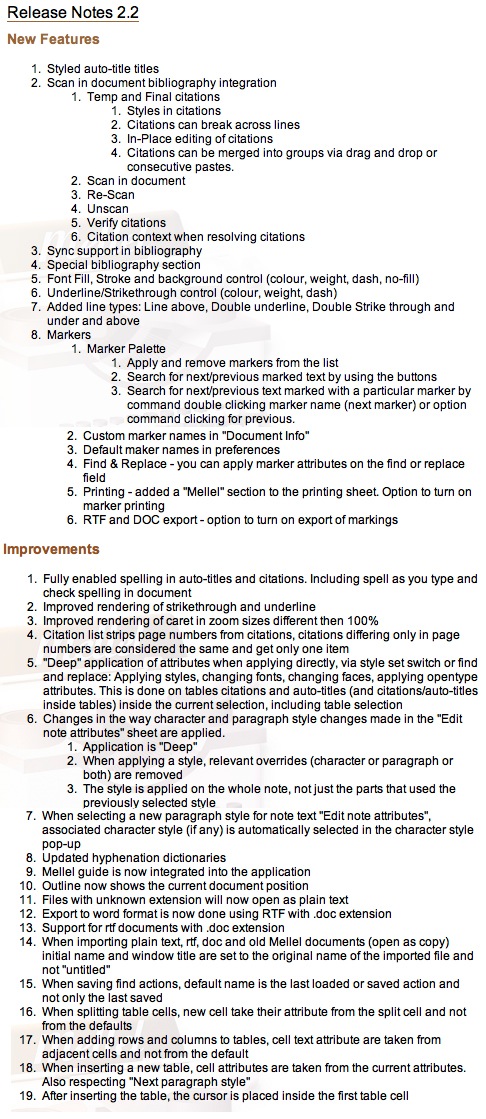
Logos Responds to TNIV Disclaimer
It's odd to me, because no such disclaimers exist for other translations. And note the wording doesn't just say that the TNIV is controversial; it says that it's particularly controversial. What exactly does that mean, anyway?SPECIAL NOTE: We understand, as does the publisher, that the TNIV is a particularly controversial Bible translation. Logos Bible Software does not endorse the TNIV, or any particular modern translation. We believe, though, that it is important to offer this translation in Libronix DLS compatible form for both its critics and supporters, and we would encourage you to look at it, as you would at any translation from the original, with a critical eye. Compare it to other modern translations, and, as you are able, to the original text. You may also wish to visit these two sites for more information supporting and criticizing this translation: http://www.tniv.info and http://www.no-tniv.com.
So last weekend, I took it upon myself to suggest to the fine folks at Logos that they take the disclaimer down. I first clicked on support, and then I clicked on "email support" which created an email addressed to tech@logos.com. Here's what I wrote:
Why is there a disclaimer on the TNIV?
What exactly is controversial about this translation--inclusive language? If this is the case, then why don't you also put the same disclaimer on the NRSV, NLT, the Message, the NCV and any other translation that employed gender inclusive language years before the TNIV.
I would ask you to remove the disclaimer. There's no reason to have it if you aren't going to include it on other translations that follow the same guidelines. It's a double standard and simply says to the customer, "Don't buy this Bible."
Thanks,
Rick Mansfield
Late yesterday, I got a response--and not just from Logos, from from Bob Pritchett himself--the president/CEO of Logos. Looking back at my initial email, I sure sound like I had a saucy attitude Saturday afternoon. I really didn't mean to come across that way. Heck, I thought some guy in Tech Support would receive it. I had no idea it would go all the way to the CEO.
Here's what Bob said (with his permission for me to quote him):
I agree that there are other translations that are similar in many ways to the TNIV; however they simply haven't generated the recent controversy that the TNIV has. (Probably because they either aren't as new, or aren't based on the best-selling modern translation, the NIV, about which people feel very strongly.)
The disclaimer is a response to the amount of controversy, argument, and advocacy (on both sides) we've heard from our users; that's why it links to both a supporting and critical site. If we had this much correspondence on another translation, we'd probably put a note on it, too.
Thanks for taking the time to share your thoughts,
-- Bob
I appreciate Bob responding to the email personally--I really do.
But I still don't understand the need for the disclaimer. I mean, when I bought my electronic copy of the TNIV from Accordance, there was no disclaimer on their site. In fact, on the Accordance site, one reads "The TNIV is an uncompromisingly accurate Bible translation in today’s language from the translators of the most trusted modern English translation, the NIV." However, back on the Logos site, one reads "According to Zondervan, "It combines uncompromising reliability, the clarity of today’s language, and the heritage of the most trusted translation, the NIV" (emphasis added). Kind of a "Well, that's what they say..."
I don't know. Like I said, it's just downright odd. Do we need the electronic equivalent of cigarette health warnings on Bible translations? Can't customers think for themselves? Granted, it's their company and they can put whatever they want on their web pages. But no other software company I know of is doing that. What if Zondervan said, "Well, it's our translation. Take down the disclaimer or not only will we withdraw the TNIV, we might as well withdraw the NIV (the best-selling modern translation), too. Lots of other software companies around."
And I still don't know--even after all this time--what really makes the TNIV controversial, let alone particularly controversial. Sure, it's an update to the NIV, "the best-selling modern translation...about which people feel very strongly." But the International Bible Society has promised that the NIV will be with us at least through the second throne judgement. So it's not like the NIV is in any real danger of being replaced by the TNIV. And as I said in the initial email to Logos, the inclusive language is not new. So what's all the fuss about?
You know, now that I think about it, the only high-profile folks I've ever heard make a real fuss about the TNIV are usually associated in one way or another with one of two other recent translations of the Bible--one of which I really, really like and one of which...well...I really d...
Could such objection to the TNIV be a conflict of interest?
And now that I'm really pondering things, didn't Logos partner last year with the folks from one of those recent translations to produce that...what's it called?....Reverse Interl....
Nevermind.
A Mac for 100 Grand?!
The mysterious "Product 7" is listed at Amazon.com as a computer made by Apple, Inc.
It gets five stars based on two separate reviews, and according to Amazon, it will be "in stock soon."
Shipping is free--as it should be for any computer that cost $99,999!
Seriously, I have no doubt that it's a hoax, but it's been on Amazon's site since the end of 2005! Since Ryan Jordan is looking for work, maybe he can be Amazon's new product reality checker.
My First Vista "Wow"

Tonight one of my students was struggling to get some assignments transferred from her new Acer laptop (bought just this week) to a flash drive that I handed to her. She muttered something about hating "this new Windows Vista," so I walked over to her desk to see if I could help. She had only booted the laptop a few minutes earlier, loaded her documents into Word, and was now trying to save them to my flash drive--which is supposed to be driverless on any system. What I saw when I looked at her screen was a total freeze up. The mouse pointer wouldn't move. I tried to alt-tab between applications. Nothing. I tried a control-alt-delete. Nothing.
As I held down the power button to shutoff her laptop, I would've been speechless had it not been for the one word that came to mind.
"Wow."
In the Mouth of the Gift Horse: An Extended Rant in High Def
Ahhhh...the Cable Company
1. Do I really need that set-top box to receive the HD channels?
Apparently not. I got $100 off the purchase of my LG plasma television for signing up in the store with Insight Communications for the HD channels. Now, this is a deal that I could have cancelled the moment I stepped into the parking lot. The problem? Both Best Buy and Insight told me that I absolutely had to have the set-top box in order to receive the HD channels.
I bought the television on Monday, but Insight wasn't coming to my house for the installation until Thursday. In the meantime, I plugged in the same cable that had been in my older RCA set into the new LG plasma. I then set the LG to scan through the available channels. First it registered all the regular cable channels that I'd been used to. Then I noticed that it was scanning through something called "Digital Cable." What do you know--it found the HD channels!
When the cable guy arrived on Thursday morning, I showed him that I was already receiving the HD channels without a set-top box. He emphatically told me that I was mistaken--that I was viewing the channel stretch out to fill the screen. To demonstrate that I was not doing that, I switched to the regular NBC affiliate and then I switched to the HD version. The latter even had an "NBC HD" logo in the bottom right. After still protesting a bit, he finally conceded.
I'm not a fan of set-top boxes. I think they are an extra way for cable companies to get more money out of its customers. When we first moved into our house the Cable company said we had no choice but to take one. After keeping it two or three weeks and not being overly excited by it, I determined that the cable plugged straight into the television worked just as well, except that I now couldn't order Pay-Per-View or Movies On Demand. Who cares. I forced the issue, took back the box and got my bill reduced by $10 every month.
For right night I'm keeping the set-top box that was supposedly necessary for my HD channels, but only because it has a DVR in it. I may decide to give it back and find my own personal DVR that I wouldn't have to pay an extra $13 every month.
2. Why didn't the cable company give me a manual with the set-top box/DVR?
I suppose because they don't want me monkeying with it. But it's got firewire and USB ports, a smart media reader and no telling what else. This device is just asking to be connected to my computer. Fortunately, I found a copy of the manual on the Motorola website, but it looks like they've changed the firmware. Regardless, the monkeying will commence as soon as I have some free time. I'd love to be able to remove HD video recorded on it, edit it on my Mac and burn it to DVD. I'll let you know how that works.
Further, not only was there not a manual with the set-top box/DVR, there weren't any instructions for recording television shows. Now, I've since discovered that it's quite easy--all I have to do is find the show I want to record on the online schedule, highlight it, and hit the record button on the remote. But why don't they just tell you that? I wasted a good bit of time trying to figure it out and making it a good bit more complicated that was necessary.
3. Why are the advertised HD channels so misleading?
On the HDTV page (click the HD Channels tab) of Insight's website, they offer this lineup of HD channels:
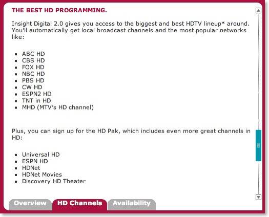
Now, the first set of bullets are what supposedly comes with the $13/month set-top box (which I've already determined that I don't necessarily need to get the HD basic lineup). The second set of bullets, called the HD Pak, comes with yet another $8/month fee. A lot of people opt for this HD Pak I've been told because it has ESPN HD with it. I'm not a big enough sports fan for this to matter to me; I'd probably be more interested in the movie and Discover HD channels.
However, I quickly noticed that I was not receiving the bottom three bullets in the first list: ESPN 2 HD, TNT in HD and MHD. Now, it's not that I necessarily wanted these channels, but it was the principle of thing thing since it was advertised and I was not getting them. But I had failed to note the little asterisk after the word "lineup" in the screen capture above. So I scrolled down and read this disclaimer:
* HDTV set, Basic Service, HD receiver (or Insight CableCard) required to receive all HD channels. Subscription to Classic service and at least 1 Digital Programming Pak (or Digital Standard/Choice) is also required to receive MHD, TNT in HD and ESPN2 HD. Not all programming available in all areas. © 2006 Insight Communications Company, Inc.
So I called the company up to ask about what I saw as misleading advertising. I mean doesn't it say, "You'll automatically get local broadcast channels and the most popular networks like..."? I suppose the key word here is like which can mean "similar, but not the same as." The woman I spoke to said that for me to get the three missing channels I would have to sign up for yet another package that would cost another $20/month. I asked her if she realized how misleading the Insight website is. She replied that she had not seen the website. I asked her if I could give her the URL, to which she replied that she had no desire to see it, I suppose implying a total apathy on her part that her company is misleading customers. I realize that often I should really just back down from a useless argument, but sometimes such deliberate obtuseness merely makes me push back more. So I asked to speak to her supervisor. After keeping me on hold for well over a half-hour, she came back on and said that if I would give her my phone number, one of her supervisors would call me back as they were all currently busy. That was two days ago and I've still heard nothing from them. I'm not sure if I can hold my breath much longer.
Are HD Channels Really That Great?
Yes and no. I've complained for years about the crummy picture offered by cable television. I've said over and over that if you live within range of a television station, a simple rabbit ear antenna on your television will give you a better quality picture than what cable can deliver. You just want get hundreds of other useless channels. Well, the six or so HD channels that I get are excellent quality, especially on my 42" screen. All of the other regular channels are still lousy, of course and now that I have comparison of the two on the same set, it just makes me a bit more resentful about the poor quality of standard cable television channels. I'm no television/cable technology expert, but I can't help wonder why it is that if they can deliver crisp HD pictures, they can't make all of them with quality images since they're all coming through the same cable.
If you've been having HD television envy realize a couple of things. First, most channels are not HD ready, and even if they are, not every television show is in HD. Even on the tradition three big networks, only two out of the three morning shows are in HD and none of the evening news shows are yet. And it seems that only the most popular of television shows are in HD, and sometimes I'm surprised to discover which ones are in regular 4:3.
Second, although the HD shows are very sharp and somehow it seems nicer to watch them in 16:9, you're not really missing out on a whole lot. All the action is still kept in the center of the screen for the benefit of the majority who still do not have HD sets. When are all channels supposed to move to HD--by 2009? I suppose that only after that deadline, directors will start to take advantage of the whole screen.
What's the Deal with HD DVD Movies?
Currently, I only own about three HD DVD movies. My regular DVD collection is fairly large, so I doubt that I will ever attempt to completely replace it with HD movies, unless that's just a multi-year goal. Regardless, from now on, I would prefer only to buy movies in HD. Also, I would consider replacing some of my favorite movies because HD DVD really is significantly more impressive than regular DVD. However, having said that, if I were to replace any movies, it would definitely be some of my favorites. What I've noticed though about a number of the HD movies (both HD DVD and Blu-ray) that have come out in the last few months is that they are movies only with no extras. Part of the reason I enjoy buying a DVD (as opposed to what will not doubt be an increasingly popular method of downloading them through legitimate sources) is the bevy of extra features such as deleted scenes, making of featurettes, etc. But take King Kong, for instance that came with my HD DVD add on drive. It contains only the movie with no extras at all. And if any movie ever called for extras, it would have to be King Kong. And although I know that HD movies take up more space on the disc than regular DVD movies, I'm assuming that there's lots of wasted space left on a disc that comes with only the movie.
As an aside, I said in my previous post about the HD format wars that I didn't have a clear format--that both HD DVD and Blu-ray technologies were superior to regular DVDs and I suggested that if anyone is torn, to merely flip a coin if HD movies are wanted now. However, to be honest, I suppose that now that I have an HD DVD player (which was bought not because I thought it was superior to the Blu-ray players, but simply because it was cheaper), I am rooting for that format to win. Universal's recent announcement of 100 planned exclusive releases for the year from both it's own back catalog and new movie releases concurrent in HD DVD and standard DVD is really a shot in the arm to this format.
Also, if you're holding out for the LG BH100 dual format player, keep in mind two things. (1) It's still cheaper to buy a regular HD DVD player and a regular Blu-ray player separately than to get the BH100. And (2) the BH100 won't access the HD DVD interactive features. It will essentially only play the movies. If you want a dual format player, I'd recommend waiting until the next round or until prices come down.
Why Is There Really No Such Thing as a Universal Remote?
I find it highly ironic that it takes me three remotes--all claiming to be universal remotes--in order to use all the features of my new HD setup. If I want to watch HD DVD movies, I have to use the Microsoft remote. If I want to use the DVR features, I have to use the remote from the cable company. If I want to access input modes or audio and video features of the plasma television, I have to use the LG remote. All three will change volume and turn my television on and off. But that's about as universal as it gets.
Okay, rant over. I originally thought this post would only take a couple of paragraphs. I'd be glad to entertain any conversation in the comments.
HD DVD vs. Blu-ray: In the End the Consumer Wins, But That Victory May Be Further Off Than We Imagine

With the gift card I received recently (see previous post), I bought an HD DVD drive that plugs into my Xbox 360. The drive is not for games, but simply for watching HD DVD movies. I didn’t buy it because I thought that HD DVD was better than Blu-ray; I bought it simply because as a $200 add-on, it is the cheapest way to watch high-definition movies today.
But my apathy toward which format is best surely puts me in the minority among high-def movie aficionados. If you ask people who care about this, they usually have taken a side and have a very strong opinion. This is on the level of Mac vs. Windows, Chevy vs. Ford, Democrat vs. Republican or Sunni vs. Shi'a.
According to who you ask either format has the superior picture and either format is outselling the other. Truthfully, it’s a great picture either way, and I don’t know if the human eye can tell a difference. One thing that Blu-ray discs have going for them is that they hold more data (50 gb) than the HD DVD discs (30 gb). But the truth is that no movie really needs the amount of space that either holds, even in high-def. At best, the promise of these new technologies means that we shouldn’t see as many multiple disc sets as we used to. A whole television series ought to fit on one or two discs for instance. But if anyone thinks bigger is better, Toshiba announced at CES a few weeks ago that they had developed a triple-layer HD DVD disc capable of holding more than the Blu-ray. Of course whether or not this triple-layer disc can be read on current HD DVD players is anyone’s guess because Toshiba didn’t say.
As I said, in the end the consumer will win because the picture quality really is significantly better than standard DVD drives. To compare, I played the HD DVD version of King Kong that came with my HD DVD drive. Then, I placed the regular DVD version Superman Returns in the player. I've always been pleased with the qualities of regular DVD's. But now I had seen "the look and sound of perfect" (the HD DVD slogan). I immediately put my copy of Superman Returns on eBay since there is a high-def version of it. The difference is that dramatic.
Often HD DVD vs. Blu-ray is compared to the VHS vs. Betamax format war of the late seventies/early eighties. I've always heard that Betamax was better, but I have no way of testing this assertion myself, so I'll just take everyone's word on it. In the end, even if VHS wasn't as good as Betamax, the consumer still won because we were now no longer tied to the airtime schedule of programs we wanted to watch. The consumer will win again this time because our entertainment experience will be increased; but contrary to what you might hear, it's not going to happen over night. If you've been putting off buying a player because you want to see which format will come out on top, you might just want to flip a coin and get one now.
Here's what I've noticed in my short-lived experience (less than a week) as an HD DVD owner: it's hard to find the HD DVD discs (and Blu-ray, too). The largest selection I've seen so far is at Best Buy, but you pay full price. At discount stores, they're few and far between. Wal-Mart doesn't carry them yet--at least not locally. Target has a small selection of a minimally equal amount of HD DVD and Blu-ray discs. Clubs like Columbia House don't carry either format yet. And you can't seem to rent them either. I went by both Hollywood Video and Blockbuster and neither one of them carried high-def discs. The guy at Blockbuster said that the chain was waiting to see which format came out on top. I told him it may be a long wait.
I've read a number of reports that say the format war will be over by the end of 2007. I have my doubts--let me explain why. What we're talking about here is the adoption of not just a new technology, but a replacement technology for video entertainment. In the VHS vs. Betamax war, I suppose a lot of it had to do with supply, price and marketing. But either technology worked with the televisions everyone had at the time. If I remember correctly off the top of my head, the DVD player was introduced around 1997, but because of its expense, folks didn't start buying them until around 2000 when they rushed to buy DVD copies of The Matrix on the sets that had come down in price.

But it's more complicated than price alone, and I don't see too many folks talking about this. When someone bought a VHS (or Betamax) player or a DVD player, it worked on their existing television. But high-def players require high-def televisions. Owners of high-def TV's are still clearly in the minority. The only way for sales of HD DVD and Blu-ray discs to increase is for more people to buy high-def televisions. But for that to happen, the prices must come down--significantly down.
Therefore the success of the new high-def formats are dependent on more than quality alone. They are dependent upon the adoption of high-def televisions. This isn't going to be solved anytime soon. It make take years.
This is why I've said that if you're undecided, flip a coin and pick a format. Many are touting LG's new combo HD DVD/Blu-ray hybrid player (BH100) as the answer to the problem. Actually it doesn't solve the format wars at all. Further, I'm not impressed with the machine. Besides its ridiculously high price (around $1200), recent word is that it cannot display the HD DVD logo because it is not fully compatible. Evidently, although it plays HD DVD video, it cannot access any of the interactive content on the discs.
Am I worried that the HD DVD format will lose and my investment in discs will be lost? No, not really. I would expect that I'm fine for at least five years or more, especially since Bladerunner, The Lord of the Rings Trilogy and the Matrix Trilogy (some of my favorite movies) are all slated for release on HD DVD. With that in mind, I'm good. And considering that it's still possible to buy old technology such as VHS players and even LP turntables, I'm not worried that I'll get stuck with a technology.
However, I'm very glad that I never got into Laserdiscs...
My FREE* Plasma TV
For Josh to get his MacBook Pro, he kept extremely detailed records in Excel spreadsheets regarding when he signed up for offers, how long the trial period was, when they confirmed his cancellation, etc. In the end, if a person sends back everything and participates in the offers only to the barest of minimums, he or she should be out somewhere about $100, which is not a bad investment that returns a $2,000 value (the price of Josh's MacBook Pro). I won't go into all his details, but I will point you to two very significant posts of his (especially if you want to try this yourself):
"How I Got a Mac for Next to Nothing"
"The Free Mac, Part II"
"Counting the Macs"
So, anyway, I decided back in the middle of November to try this myself. I didn't want a new laptop though--I'm still delighted with my black MacBook. However, if there's any luxury item out there that I'd never pay for on my own, it would have to be a high-def television. So I ran a google search for "high-def television" and found an ad from the same company Josh with which Josh participated for a "Gift Card for a $2,000 Plasma TV" (I'd give you the link, but it's now expired). I had to complete 18 offers, which although seemed like a lot, turned out in the end to be pretty manageable. Although I didn't keep a spreadsheet like Josh's, I did record all the same kind of details in a MS Word file that he had done. Plus I made PDF files of all agreements and emails confirming cancellations as I returned items. It took me about three weeks to complete all 18 offers. Then I was given a link to download a PDF file which I had to fill out with where to send my gift card and also tax forms since the card is worth $2,000.
The whole time I was working on this, I referred to it as "my scheme to get a free plasma TV." Kathy simply referred to it as my "scam" because she was skeptical till the end that it would actually work, especially with so little investment. Nevertheless, last Saturday I opened the mail to find a $2,000 Visa Gift Card in my name. Yeah, I know...I couldn't believe it either!
I talked it over with Kathy. Although the offer was for a gift card for a plasma television, technically we could do anything we wanted with the money because it was a generic Visa gift card. Heck, we could even withdraw the money from an ATM. Obviously, I knew there were lots of things we could do with $2,000 but Kathy (wonderful wife she is) said that I had wanted a television to begin with, I had worked hard to stay on top of the offers, and that I should stick to my original plan. So I set off Monday to get the television.
I'm absolutely delighted with the way everything has turned out. The television is great for high-def movies, games on the Xbox 360 and the handful of HD channels our cable service offers. I don't have surround sound, but the television has an audio mode that emulates it, and at the just right volume, our living room feels like a movie theater. This is the first television that I could honestly use to double as a CD music player as well.
In the end, I don't think I could have ever justified paying for something like this with hard earned money, even if I saved for it over time. But when someone says, "Here's $2,000--go get a plasma TV... Well, I just can't turn that down.
This really does work if you stay on top of it. See the links to Josh's posts above if you want to pursue it.
Waxing Nostalgic for Old Apple Hardware: The Irony of the iPhone
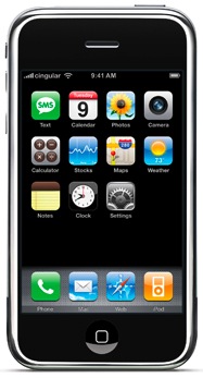
But it's ironic not just because Jobs would introduce yet another peripheral, but instead the irony lies in the kind of peripheral introduced. The new iPhone incorporates not just an iPod (really just an iPod nano) and a phone, but also a device that will contain calendar, contacts, and email much like the Apple Newton canned a decade ago by Jobs (although Newton holdouts are claiming that spec for spec the Newton does more). The iPhone also incorporates a 2 megapixel camera, even though one of the products killed by Jobs when he did away with the Newton was Apple's Quicktake Camera.
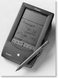
I have to admit that it's tempting to purchase a refurbished Newton from J & K, but it's hard to justify the $150 price on something that might end up becoming simply a collectable novelty than something of practical use. I carry my laptop with me everywhere as it is and sometimes wonder if I even need the PDA functions of my Treo.
Or maybe I haven't found them yet. Are there any secret Quicktake photographers still out there?
Haloscan Problems
I checked the Haloscan forums and others are having the problem, too, so hopefully it will be corrected soon.
While on the Haloscan site, I discovered that there's a new comment widget showing the most recent comments. I have included it in the sidebar on the left and will keep it there even after the problem is fixed.
I will also add an update to this post as soon as we determine the problem is fixed.
UPDATE 3:30 PM: Comments are no longer generating error messages and I am receiving email notification of new comments. Everything seems to be working.
What's In Your Accordance?
Nine years ago when I was cautiously considering the switch from Windows to the Mac, one of my biggest concerns was Bible software. At the time I was primarily using BibleWorks 3.5 on my Windows machines. In BibleWorks I had access to the Greek NT, Hebrew Bible, LXX, NASB with Greek and Hebrew dictionaries, and a couple of good lexicons among a few other modules. My main concern in switching to the Mac was finding equitable replacements for all the modules I was currently using. My hopes and fears were soon relieved when I discovered Accordance for the Mac. Not only could I do everything in Accordance that I was already doing in BibleWorks, I could do much more. In many ways my discovery of Accordance helped me make the final decision to take the plunge into the Mac world. And nine years later, if I were to list out top reasons for staying with the Mac, Accordance would be high on the list.
My initial purchase of Accordance and my first modules was made through the Gramcord Institute of which at one time Accordance was associated. The texts and modules listed below were not purchased all at once but have been acquired gradually over the last nine years. Oak Tree Software, the makers of Accordance have a very generous upgrade policy with many of the updates to the modules offered for free or at very reasonable prices. When Microsoft Office for the Mac is updated every three years or so, I have to think about where I'm going to find the money for an upgrade and plan ahead. I've never had such concerns with Accordance upgrades.
Below is a list of biblical texts I own, followed by other modules I've added. I'm actually not listing everything I have because a number of public domain works were included in some of my purchases. One day I'll make the time to weed out some of these modules that I never use, but the reality is that they don't really take up that much space.
Accordance Biblical Texts I Own:
American Standard Version
Bible in Basic English
Biblia Hebraica Stuttgartensia with Westminster Morphology
Bishop's Bible
Douay-Rheims Bible
Darby Translation
English Standard Version
Geneva Bible
Novum Testamentum Graece (Nestle-Aland, 27th Edition) with Morphological tagging
Greek New Testament: Textus Receptus with Strong's Numbers
God's Word Translation
Holman Christian Standard Bible
King James Version with Strong's Numbers
La Biblia de las Américas
Rahlfs Greek Septuagint
The Message
New American Standard Bible
New American Standard Bible (1995 Update) with Strong's Numbers
New English Translation (Including all notes)
New International Version with Goodrick/Kohlenberger Numbers
New Living Translation (first edition) [this module is no longer available]
New Living Translation (second edition)
New Revised Standard Version with Apocrypha
Revised English Bible
Today's English Version
Today's New International Version
World English Bible
The Holy Bible by Noah Webster
Weymouth New Testament in Modern Speech
Young's Literal Translation
Accordance Extra-Biblical Texts I Own
Kaufmann Mishna (grammatically tagged)
The Mishna: A New Translation by Jacob Neusner
Qumran Sectarian Manuscripts (Hebrew)
Qumran Sectarian Manuscripts: A New English Translation
An Index of Qumran Manuscripts
Works of Flavius Josephus (Greek) with Morphological Tagging
Works of Flavius Josephus (English) translated by William Whiston
Works of Philo (Greek) with Morphological Tagging
Works of Philo (English) translated by C. D. Yonge
Accordance Greek Reference Works I Own
A Greek-English Lexicon of the New Testament and other Early Christian Literature, 3rd ed. (BDAG)
Strong's Greek Dictionary of the New Testament
Greek-English Lexicon of the New Testament Based on Semantic Domains (Louw & Nida)
NASB Greek Dictionary
NIV Greek Dictionary
UBS Concise Greek-English Dictionary of the NT (Barclay Newman)
New Testament Greek, 2nd ed. (Gerald Stevens)
Accordance Hebrew Reference Works I Own
Koehler & Baumgartner Hebrew and Aramaic Lexicon of the Old Testament
Brown-Driver-Briggs Hebrew and English Lexicon of the Old Testament
Strong's Hebrew Dictionary of the Old Testament
NASB Hebrew Dictionary
NIV Hebrew Dictionary
Other Accordance Reference Works I Own
Accordance Bible Atlas
Accordance Timeline
Anchor Bible Dictionary
New International Encyclopedia of Bible Words by Lawrence Richards [this may no longer be available; I could not find it at the Accordance website]
IVP Dictionary of Biblical Imagery
IVP New Dictionary of Biblical Theology
IVP Dictionary of Jesus and the Gospels
IVP Dictionary of the Later New Testament and Its Developments
IVP New Bible Dictionary
IVP Dictionary of New Testament Background
IVP Dictionary of Paul and His Letters
IVP Pocket Dictionary Series (Theological Terms, Biblical Studies, Apologetics & Philosophy of Religion, New Testament Greek)
IVP New Dictionary of Theology
NIV Compact Dictionary of the Bible
NIV Compact Nave's Topical Bible
NIV Place Names
Accordance Bible Lands PhotoGuide
Accordance Dictionary of Place Names
Assorted Quotations (Compiled by David Lang of Accordance)
Accordance Gallery of Bible Art
Dictionary of Bible Difficulties (Gleason Archer)
IVP Hard Sayings of the Bible
IVP New Bible Commentary
IVP Bible Background Commentary: Old Testament
IVP Bible Background Commentary: New Testament
Zondervan NIV Commentary
Zondervan NIV Exhaustive Concordance
NIV Study Bible
Outlines of Bible Books (David Lang and Greg Ward)
IVP New Bible Atlas
Manners and Customs in the Bible (Victor H. Matthews)
Theological Journal Library Vols. 1-5
Theological Journal Library Vol. 6
And as mentioned above, this list does not include some of the dozens of public domain works that are also installed, a number of which are quite interesting. But when I look at this list, the most amazing aspect of it all to me is that I can carry ALL of it on my MacBook wherever I go. And even more amazing, my Accordance folder only takes up about 3GB of space, even with the all the works listed above. Simply incredible!
One More Thing About the Keynote...
AppleTV, iPhone, But Nothing Macintosh: Makes You Wonder if Macworld will be Changed to Appleworld?
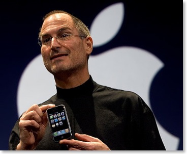
I, for one, have mixed feelings over the name change. As the keynote was going on yesterday, I was checking in online on some of the news sites to keep up since the streaming video wasn't released until much later. After wrapping up the iPhone presentation, I thought to myself, "Is that it? And if this is Macworld, why isn't there any reference to the MACINTOSH?!" And it looks like I'm not the only one who thought this was weird (see Paul Therrott's "About the Mac-less MacWorld [sic] Keynote" and Rob Griffith's "Expo Reaction: iDisappointed").
Don't get me wrong, I think the iPhone really is revolutionary (to use the word everyone else is describing it with). I would gladly trade my Treo for one and even jump from Sprint to Cingular (however, like a lot of folks, the high price [$499-599] is going to keep me away from the iPhone party). Nevertheless, my main interest in Apple is related to the Macintosh. As the iPod has risen in popularity, a lot of us Mac users have been a bit uncomfortable that the Mac has been a bit neglected in recent years. The recent Mac vs. PC ads have dissuaded some of this anxiety, but then yesterday Steve gives a keynote at MACWORLD and doesn't talk about MACS?!
The iPhone seems to be an amazing product. If you haven't watched the presentation of it via Quicktime, do so now. Apple is promoting it as combining the features of an iPod, mobile phone, and internet connectivity device. As for the phone features, they are saying it reinvents the phone. With 200 patents on this device, maybe so; and while I'd be glad to trade up from my Treo, this is far from being a perfect solution. The first detraction in my opinion is the small amount of memory for an iPod. This device comes in either four or eight gigabyte models because it is using flash memory. This isn't an iPod replacement--it's an iPod Nano replacement! I imagine that people will get very frustrated once they realize they have to be highly selective in choosing the music, video and pictures they carry on the device. And wait until software development begins, which is bound to happen since the device is running OS X. 4GB or 8GB is not going to be enough room to make people happy. Granted, the iPhone would have to be much thicker, but if Apple makes all these multimedia promises, then give us a 60GB drive in the thing for the love of Margaret!
Another problem with the iPhone is going to be its low 5 hour battery life for continuous use. Although I've got a Treo for which I access email, text messaging and the occasional email, I've never been inclined to play games or watch video because it runs down the battery. On normal use my Treo is good for a couple of days between recharges. But the iPhone is meant to be a media device in addition to being a mobile phone. Further, it's not going to be as with some devices that you can simply carry an extra battery--you won't be able to swap out batteries on the iPhone just like you can't on an iPod. Heavy users better be ready to simply carry a power supply with them.
And while that new "multi-touch" screen looks pretty nifty, it will drive those who abhor fingerprints downright crazy. The advantage of a stylus or mini-keyboard on most smart phones is that fingerprints are minimized.
Finally, the cost is going to be a major problem. This shouldn't be surprising because throughout Apple's history, they have not just made superior products, they have charged premium prices for them as well. While I'd love an iPhone, I already know it's out of my price range. The initial market for the phone is obviously aimed folks like me who use smart phones already. But that market is only so big. For this to really be successful, Apple has to aim for the iPod crowd, which is in the tens of millions. But how many will pay $599 for a phone when they can get a lesser-featured phone for free when they sign up for a new plan? I have no idea how much it costs to make the iPhone, but if they really want to take the world by storm with them, a $299 price would be much more reasonable. Maybe by the second or third generation, the iPhone will come down in cost and I will consider getting one.
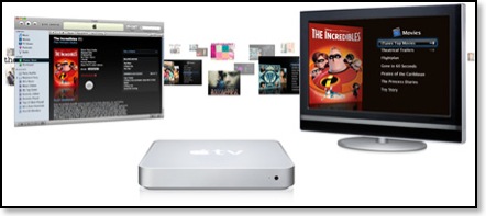
Back to the keynote... As a Mac user, I always look forward to the keynotes. There were a number of things related to the Mac that I was looking forward to hearing about that simply weren't addressed. This was surprising because had it not been for the AppleTV and the iPhone, they certainly would have been the main features of the keynote.
For instance...
Where was the demonstration of a mature, soon-to-be-shipped, Mac OS X.5 (Leopard)? Back during the summer Jobs told us that he was not revealing everything about Leopard yet because he didn't want Microsoft to copy everything in Vista. Well, Vista is out, so a lot of us were expecting a full demo of the new OS X.
Where was a preview of new features in iLife '07? Besides iMovie, iDVD, GarageBand (the last of which I have no use for), I was especially looking forward to seeing a newly retooled iWeb. I've said that if it addresses my complaints of the v. 1 shortcomings, I may very well convert this site over to iWeb.
Where was a preview of new features in iWork '07? iWork was slighted as it was in last year's keynote, in spite of the fact that it's a rapidly improving productivity suite from Apple. With last year's release, I completely abandoned any use of PowerPoint in the classroom in favor of iWork's Keynote which offers much more of a professional look in my opinion. Although I don't use Pages a whole lot, I've been using it more over the past year. Plus, the rumor is that a spreadsheet app will be added to the mix this year making iWork an actual competitor to Microsoft Office.
Speaking of which, where were demonstrations from third party Mac software developers such as Microsoft and Adobe? I would have guessed that someone from Adobe would have taken the stage to demo the next version of Photoshop which will feature a universal binary for much faster performance on Intel Macs. Also, I would have expected Roz Ho, general manager for Microsoft's Macintosh Business Unit to take the stage to promote the upcoming Mac Office 12, now re-christened Mac Office 2008 (even though it will be released in 2007).
I don't use all the apps in Office as much as I used to, but I do still use them, and would have liked to have seen such a demonstration which has been fairly standard in the past at these events. Instead, Microsoft was left to simply releasing its own press release and its own interview with Roz Ho. The main selling points of the new version of Office seem to be it's Open XML file format as well as new interface. Interestingly, from the pictures I've seen the new interface seems to borrow less from Office 2007 for Windows and more from Apple's own iWork suite.
Also, I might've expected someone from Intel to talk about upcoming processors, leading Steve to talk about the Mac's future road to technology. But nothing...nothing about Macs was said at all. It was all AppleTV and iPhone (and 3/4 were simply about the iPhone).
Maybe my misgivings about everything non-Macintosh from Apple is counter-productive. Certainly the success of the iPod has kept Apple a strong company and this feeds into Apple's ability to produce high-quality computers such as the MacBook I'm typing this on. And I suppose that Apple has to think about the future and diversity means greater security.
But wasn't there also a time when Apple produced computers, printers, cameras, scanners, a PDA (the Newton), and Jobs axed all the peripheral to get back to the roots of the company--the actual Macintosh computer. Am I the only one who remembers this? Maybe the difference is that products like the Apple Quicktake Camera weren't near as successful as the iPod and therefore put a drain on Apple's business. But I wonder if in five years or so we won't see another wave of product streamlining. I just hope that when it comes to it, it won't be the Mac that's lost in the shuffle.
First They Won't Let Us Browse the Stacks; Then They'll Turn Us Into Batteries and Throw Us Into the Matrix

The new library at Chicago State University has one ironclad rule: No students allowed in these stacks – only robots. Every book, CD, and DVD in the school’s $38 million facility is tagged with a radio-frequency ID chip. When a borrowed item slides through the return slot, the system identifies and sorts it. Human librarians shelve post-1990 materials in the traditional stacks and drop older stuff into file-drawer-sized bins. From there, it’s all robots – tall, forklift-style machines that run on tracks and stow the materials in a three-story-high storage facility. No Dewey decimals? No problem. The computer knows where everything is and can hustle the correct bin to the circulation desk for checkout.
And if the software crashes? “Libraries are highly networked,” says dean Lawrence McCrank. CSU’s database is backed up at the Online Computer Library Center in Dublin, Ohio, and the University of Illinois at Urbana-Champaign. “We were building databases with integrated retrieval before there were computers,” McCrank says. “They were called card catalogs.”
Robotic Librarians by the Numbers
- Top speed of CSU’s robotic librarians: 7 mph
- Average time for a robot to retrieve five books: 2.5 minutes
- Average time for a student to retrieve five books: 2 hours
- Capacity of CSU’s high-density storage: 800,000 volumes
- Robots making out in the stacks: 0
– Erin Biba
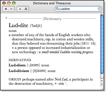
This is also why I favor the Dewey Decimal system which is a giant index of subject matter if you understand how it works. But even Library of Congress stacks have similar books together. But such random chance and serendipitous discoveries would be a thing of the past at robotic-only collections. Call me a Luddite if you will, but I just don't like it.
This is surely the first wave of the robotic revolt--taking away our ability to completely access knowledge and make chance discoveries. When you wake up one day and find that something just doesn't feel right about the virtual world you live in, be sure to take the red pill.
iWeb Revisited
Currently I use RapidWeaver, which overall I like, but I wish I could combine the best of RapidWeaver and the best of iWeb into one program. For instance, the creators of RapidWeaver have been promising a table generator for RW for the longest time, but it's never happened. Currently, if I want to create a table, I have to create it in DreamWeaver and paste the html code into RW. However, because iWeb uses the same objects created in Pages or Keynote, I could create a better-looking table in one of those apps and paste the object itself into iWeb.
Although I like iWeb--or at least the promise its features seem to give--my complaints against it are significant. I update my blog more than any part of my website, and at iWeb's release there was no ability to natively add comments or trackbacks. There's still no trackbacks, but in an interim release earlier this year, comments were added and I actually like their implementation better than the Haloscan comments I use on this site. Another big problem I had with iWeb was that it didn't allow for html snippits. So there's no way to add sitemeter, a blogrolling.com list, a YouTube video or even any of the occasional Amazon Associate ads that I place on here. Actually, there are a few third-party utilities that help with this, but they are all hacks in one way or another. And generally I don't like to add hacks to software or my OS because invariably if the original company updates the software, the hack is incompatible and causes problems.
iWeb also doesn't allow the creator to change templates which I find to be mind boggling. Even Blogger allows for a different template for any whim of a reason. The templates that come with iWeb are very creative, but none are exactly what I want. Of course, I haven't found a perfect template here in RapidWeaver, either. The current one I am using is a compromise.
However, with the coming year, hope springs eternal that iWeb will be updated to addresxxxxxxxxxxxs some of its shortcomings. iWeb isn't popular enough to get a lot of attention in the rumor mills, but Think Secret posted some info a few weeks back that seems to indicate that iWeb 2.0 will add a lot of the features that should be there already. If everything that has been rumored is true, I may very well switch to using iWeb instead of RapidWeaver for my site. That doesn't mean that I would every take down these pages because some of my posts have various links to them from elsewhere. But I would gradually recreate as much as I could of the blog and completely move over the other pages to iWeb.
In the meantime, I'm going to create a very scaled down "This Lamp iWeb Mirror Page" as a kind of experiment and so that I can become more familiar with the program. For every post I add here, I will also create a copy there and perhaps a couple of previous posts as well. My hope is that iWeb 2.0 will allow me to change templates because I really don't like the one I'm using in iWeb, but it will work best with my blog. If iWeb 2.0 doesn't serve my needs and I don't switch, I won't have put too much effort into my little experiment.
Link: This Lamp iWeb Blog Mirror
IE6/Windows Users: IE7 Is Available. Download It for the Love of Margaret

I have repeatedly urged Windows users to abandon IE6, which has not been significantly updated since 2001 and has not kept up with advances in Internet standards. And of course by security standards, IE6 has also been the clear loser. Over the past few months, I have continually had to "dumb down" my website so that IE6 users can make sense of it. .PNG graphics don't work correctly in IE6, and neither do cascading style sheets.
So, all that to say...if you are still using Windows Internet Explorer 6, welcome to 2003 because Internet Explorer 7 is now available for download and will bring you up to date with web standards that the rest of us have been using for awhile, including tabbed browsing and integrated RSS feeds.
IE 7 can be downloaded at http://www.microsoft.com/windows/ie/ and in the next few weeks will become part of the automatically downloaded updates in Windows XP.
Of course I still recommend you just get a Mac instead, but if you can't do that, at least use a modern web browser.
Update: IE7 has not even been out yet for 24 hours and a security flaw has already been discovered. IE7 is still better than IE6, but other options may be a better choice.
What He Said
“When you get past the schoolyard mentality and the stupid, ignorant prejudices,” you have heard people say, “what we have are two different operating systems that each work very, very well. Really, it’s not a matter of good or bad. It’s just a matter of personal preference.”
Those are very wise words. I have said much the same thing. But what I’ve endured over the past few months is the equivalent of a weeklong road trip with someone whose company you’ve always enjoyed, but never really known as a true friend. Windows has propped its bare smelly feet up on my dashboard and told me the story about how he was so hung over during his aunt’s funeral that he threw up into the coffin a little. His greasy hair has left smears on the inside of the window that no solvent can shift. He just sort of assumed that he could use my iPod, and during the one time he took a turn at the wheel, the battery was completely flat and I had to listen the story about the funeral a second time.
I made the switch from Windows to the Mac in 1998, and I've never looked back. In fact, I only wish I had been smart enough to do it sooner. That year--1998--I was serving as an associate pastor at a church where I was put in charge of creating worship slides in PowerPoint as we experimented with this whole new idea of using our projector instead of printed music for worship. I was attempting to use PowerPoint '97 in a fresh install of Windows '98 on a brand new Compaq computer that I had just purchased with my own money.
And it kept crashing.
And crashing.
And crashing.
And crashing.
I wasn't using any kind of fancy graphics--nothing extravagant at all--just the words for the songs. I was saving my file constantly because every two or three slides and the whole computer would freeze, filling the room with the blue glow of the Windows "screen of death." If you've ever used Windows for any period of time, you know this frustration. Yes, you do; don't deny it.
And I had set this computer up myself. Like Andy says in his article, I, too, was no slouch around Windows myself. Heck, I'd been using computers since I was 14 in 1982, starting with a TRS-80. I learned the ins and outs of MS-DOS, and I began using Windows at the 3.0 release (not the 3.1 update like everyone else). I had migrated up through Windows '95 and then finally Windows '98. And as that Compaq kept crashing, I thought to myself that there had to be a better way.
Like lots of hardcore PC users, I was very anti-Mac; and I looked upon the Mac crowd as a bunch of idiots who didn't really know how to use a computer. But as I looked at my alternatives, I realized that I should give this Mac thing a shot. So, in 1998, I ordered my first Mac--a 300 mhz "Wallstreet II" PowerBook with a 14" screen.
As I began to use the Mac, I was delighted to discover that although it could crash, too, it didn't do it near as much. The Mac was much more stable than any Windows machine I had ever used. And ironically, Microsoft PowerPoint for the Mac WAS MORE STABLE than Microsoft PowerPoint for Microsoft Windows. Go figure.
If you're a diehard Windows user, you may want to write me off as a Machead blowing smoke--just like I used to do. But I tell you that when it comes down to the bottom line of user experience--all things considered--the Mac simply works. Yes, OS X can crash, but I can't remember the last time it did. Can you, if you're a Windows user, remember the last time your XP machine locked up? Probably. Yes, sometimes there are problems with Macs such as the recent Macbook Random Shutdown fiasco, but often computer manufacturers often have initial problems with a new product. My experience with Apple over the past eight years was strong enough that I bought a new MacBook myself recently.
Unfortunately, I've had to keep a foot in the Windows world all these years since I switched. From 1999 to 2000 I worked part time as a computer network specialist for a consulting company in which 99% of our work was related to Windows machines. And when I taught high school, I also spent three of those years as administrator of the school network (three Windows servers and 140+ Windows clients). Plus, even since switching to the Mac, I've kept a copy of Windows loaded: first in VirtualPC, and now in Parallels Desktop. So I still use Windows now and then; I've been able to keep up.
But I still don't like Windows. All the time I spent working for the consulting company, and all the hours put in on the school network and fixing this or that problem with various Windows PCs always made me appreciate my Mac experience all the more. Even now when I have to use Windows for whatever reason, I just come away feeling a bit...well...a bit dirty.
And don't read me as as one of these anti-Microsoft Mac folks. I'm not anti-Microsoft. I have Microsoft software on my MacBook. Some of Microsoft's ideas are innovative and some of its technologies are robust. I've read two of Bill G's books, and I think he would be an interesting person to sit down and have a conversation with. But I think the whole Windows thing is a scam, and in the end I believe it was a bad idea to let MS Windows become the dominant OS platform. The Mac is not perfect either, and I don't agree with everything Apple/Steve Jobs does, but I'll take OS X over Windows any day because it just works. That's the bottom line of it all. I can sit down, use my computer to do what it's supposed to do, without it crashing, without worrying about viruses or spyware, without my system getting slower and slower as the weeks go by.
So when I read Ihnatko's article, I just had to say..."Yeah, WHAT HE SAID!"
Irony of Ironies: Britannica Won't Function on My New MacBook
In the end, I only had to reinstall two programs: Microsoft Office 2004 (I was getting an error message about missing files even though the software would function), and Symantec Antivirus (I know, I know--no viruses on a Mac; I'm just paranoid after working in the past as a system administrator).

Criminy. Don't tell David Ker about any of this.
Well, I've already removed the Britannica software from my Applications folder. There's no need for it to take up space if it can't be used. I'll dig through my CD's later. If I remember correctly, the CD I have can be loaded in either Windows or Mac OS X, and I did install Parallels Desktop yesterday to run the occasional Windows program (Parallels is much faster than VirtualPC ever was, I might add). But I don't know. Having to run Britannica in Windows somehow takes all the fun out of everything.
At least I still have my hardbound set which is platform independent.
Related Reading (in case you're just tuning in and don't know why this is ironic):
Is the Wikipedia the Hitchhiker's Guide to the Galaxy?
The Sum of Human Knowledge
Why Britannica Trumps the Wikipedia
The Wikipedia Is Not Enough
Martin Luther Was Excommunicated on this day and Why I Love the Encyclopedia Britannica
He REALLY Wants a Mac
Well, this post is regarding something similar. My former student Josh Clark is pulling a stunt just goofy enough that it might work out. I'm sure you've seen those ads for a free iPod or a free Mac. But if you've actually tried to get one, you have to sign up for a kabillion credit cards and clubs that I'm sure very few are persistent enough to actually get any free equipment.
So, Josh here--he's smarter than that. Why fool with the gimmicks when you can simply create your own? Josh is simply asking you give him a dollar to go to his Mac. Yep, one buck. And in return? Well you get your name on a list of contributors and that's about it. That and the assurance that you're helping out a gooberhead college student.
He's even got his own website, "IReallyWantaMac.com." On the site, Josh explains it this way:
The short story is: I really, really want a Mac.
The problem is this: I’m a poor college student. Ramen noodles, the whole bit. No way I can afford a new computer anytime soon.
The solution: I want as many people as possible to stop by this site and send me a dollar. If I get 1,868 people to do that, I’ll buy a Mac. I know, I’m crazy.
I believe there are a lot of generous people in the world. But also, it’s just a dollar. That’s the tax on a DVD movie. Your wallet won’t feel any lighter without it, but it would make a big difference for me.
How this all works: If you donate a dollar (or more) to the I Really Want a Mac fund, your name, city & state, and a link to your website will be posted on The List (unless you really don’t want it there).
The Mac he lists is a black MacBook, reasonably configured, so he's not being greedy. Basically, Josh needs about $1,800 to cover the MacBook, tax, and extended warranty (something I always recommend with portables).
Go to Josh's website and help him out. I can vouch for Josh that he's a good fellow.
And it's only a buck: www.IReallyWantaMac.com
The New Look of Leopard Previewed in iTunes 7?
The OS X Aqua interface has had a translucent candy-like appearance since version 1.0. Way back when Steve Jobs first showed it off, he said the interface looked so good, you would want to lick it. Well, I've never been into an OS that much, but Aqua did look good back in the day. Basically, it was a reproduction of the translucency in the original iMacs that had helped Apple regain a place of significance in the computer market. But gradually, the candy-colored look of Aqua has started to get old after five years. It has been lessened over time--the pinstripes, for instance, have been toned down or removed altogether from many applications.
So, after installing iTunes 7 and exploring all the new features, something else jumped out at me. Other than the standard red, yellow and green buttons in the top left corner, there's no translucency in the iTunes 7 interface at all. Compare versions beginning with the previous version 6:
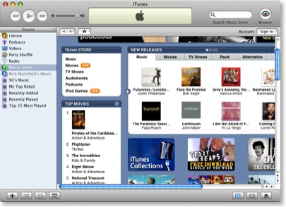
The most obvious example of translucency in the above image are the scrollbars, but the sign-in, play, forward, reverse, and home buttons are all translucent.
Now notice iTunes 7:
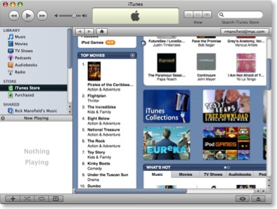
As I mentioned earlier, the only translucence in the interface is found in the buttons in the top left corner. None of the other buttons have a glassy translucence at all. Now if that were the only change, I might not have thought anything about it. But notice the scrollbars. The trademark translucent blue is gone, replaced by a shaded slate blue.
Now this is very interesting. Last month at the Worldwide Developers Conference, Steve Jobs remained oddly tightlipped about the upcoming version of OS X, codenamed "Leopard." He did show off ten new features, but said that he was keeping much of the new OS to himself for the time being so that Microsoft couldn't copy everything into the upcoming Windows Vista. At the time, this sounded simply like another jab at Microsoft from Jobs, but what if there really is something to it?
Consider this. It's no secret that Microsoft has always seemingly taken its cues from Apple in regard to its Windows interface. And in the new Windows Vista, translucency is everywhere. But it's not called "Aqua," of course--that would be too obvious. In Vista, the interface is called "Aero" (I'm not kidding). Here is a screen capture from Microsoft's own website:
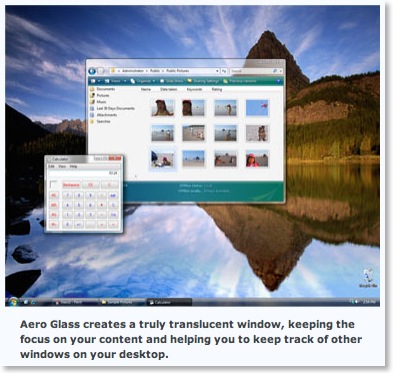
You can't blame Steve for wanting to keep some of the features in the next version of OS X secret until Vista ships. And wouldn't it be funny once Vista is released in all of its Aero translucency, if Steve simply declares the see-through look passé and removes it entirely in the final release of Leopard?
For Microsoft, that'd be like showing up to the dance in last year's dress.
Wouldn't that be a kicker?
Apparently, I'm not the only one noticing this. See "Aqua Is Dead, Long Live Aqua" at the Unofficial Apple Weblog.
Mellel 2.1 Released
I was fortunate enough to be privy to the beta builds over the last two or three weeks, so don't let the ".1" designation fool you--Mellel 2.1 is a major release. If you've got a Mac and you're engaged in academic writing, especially writing that incorporates foreign languages such as Greek and Hebrew, this is the word processor you need. Even the upcoming version of Word for the Mac will still be unable to allow you to enter right to left text for a language such as Hebrew.
From the Redler's press release a few hours ago:
For Immediate Release
Mellel 2.1 introduces XML format, superb find and replace, full screen mode, and more
Tel Aviv, Israel — August 28, 2006 —RedleX today released Mellel 2.1, a major update to the leading word processor for Mac OS X. Mellel 2.1 introduces several key important changes and features, including switching the file format to XML, top notch Find and Replace capabilities (full Regular Expressions support), Full screen mode, paragraph and character style palettes, and much more.
The update is free to all registered users of Mellel. The update is a for-pay upgrade for user who purchased Mellel more than 3 years ago. A free trial version is also available.
The most important change in Mellel 2.1 is the move to XML based file format. With this move, which took several months to implement, Mellel is moving to an open, standard, text based file format, that is much more economic in terms of file size, and opening the door to a slew of innovative options for formatting, import and export.
"The move to XML is important for many of our users because it frees them from any future worries," says Eyal Redler, CTO at RedleX. "XML-based file format are becoming the standard in word processing. Just about every serious word processor is moving in that direction or is already there. In addition, text in XML-based files will always be retrievable and easy to script and manipulate by Mellel, AppleScript or any other application," he adds. The new XML-based format will also make it easy to convert Mellel files to and from other XML-based formats such as those used by MS Word, Pages, FrameMaker, and more.
Another important in Mellel 2.1 is the completely rewritten Find and Replace feature, including full support for Regular Expressions (RegEx), find and replace by character formatting and styles, flexible search options, and more. "Regular Expressions is an insanely great, extremely powerful tool, but for most of the users it is completely useless, because it is simply too complex," says Guy Hivroni, cofounder and chief GUI designer for Mellel. "With Mellel's new Find and Replace we tried to make RegEx useful to mere mortals. No more cryptic codes, carets, slashes, asterisks, and so on. Everything is icon driven and clear, so even non-programmers-types can make use of it."
Mellel 2.1 is available for download now, from the servers listed below. The price for a single user license is US$49, Educational license is US$34.99, 5 Pack license (5 separate licenses) are US$99. A Boxed Edition of Mellel is also available for US$59 (including shipping costs).
For a complete of new features, improvements and bug fixes, please see the release notes at: http://www.mellel.com/releasenotes.html
Main New Features
- XML: Mellel 2.1 uses an XML-based file format, shrinking file size by up to 400 percent. The format is clear and cleanly separates content from formatting, making it easy to write convertors and otherwise manipulate files.
- New Find and Replace: Mellel's new Find and Replace option fully supports Regular Expressions, but with a much friendlier interface.
- Find by formatting and style: Mellel now supports find and replace by formatting and style.
- Full Screen mode: allowing you to move into full screen mode (no menus, palettes, window frames, etc.) which is WYSIWYG and zoomable.
- Find Expressions and Find Actions: You can now save expressions you've created and complete find action, and "play" them later on.
- FindSets: Allowing you to create sets of Find Action you can run all at once, completely formatting or reformatting a document in a matter of seconds.
- Paragraph Style palette: Offering you control over applying, creating, editing, saving, and deleting paragraph style.
- Character Style palette: Offering you control over applying, creating, editing, saving, and deleting character style.
- Equation editing round-trip: Mellel now support round-trip editing of equations created in MathMagic. The equation is kept "alive" and editable in MathMagic.
- Auto-title in-place editing: You can now edit auto-titles in-place.
• Mellel 2.0 Released
• Mellel Roadmap
• It's Official: No Right-to-Left Text in Word 12 and Why I'm Switching to Mellel
This Lamp: SITE INDEX
Enjoy.
Biblical Typography: Brian Sooy's Contribution to the History of the Printed Bible
A few weeks back when I wrote my review of the New Living Translation, I demonstrated how much more wordy the second edition is over the first by displaying Genesis 1 from both editions in parallel columns. Also making the second edition more text-heavy than the first, according to the NLT website, were the "Many marginal notes ... added to help the reader study manuscript differences and to show the relationship between a literal translation and the rendering in the NLT." All of this makes for a potentially larger Bible. In fact, between more words in the text and added marginal notes, the NLT2 is 10% longer than the NLT1!
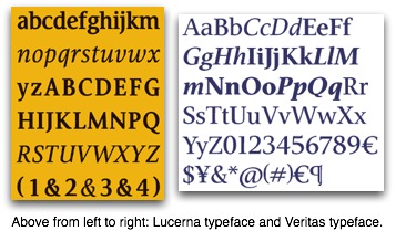
Like any design project, this one had a brief with some technical criteria, to help define and solve the design problem.
• Achieve a better character count (to maximize space and ultimately save paper)
• Eliminate artificial condensing of standard fonts (such as ITC Giovanni).
• Have visual similarities to ITC Giovanni, by Robert Slimbach.
• Make the font "stronger"
• Achieve as good as or better character count than ITC Weidemann or Century Old Style.
• Achieve better character count while maintaining readability.
Tim Botts said afterwards: "I was especially jazzed with the way the new One Year Bible turned out -- a 10% longer text in a stronger typeface -- yielding the same page count! To think we competed with Century OS and Weidemann -- and I think -- won."
We chose some key characters to design with similarities to ITC Giovanni - which Tyndale has been using for many Bibles, condensed 10% for space savings. This was also to show design management that the font would have that warm and friendly look that they had come to appreciate with Giovanni, and that they didn't want to lose. Overall Lucerna has its own character and visual appeal, with limited influence by ITC Giovanni.
So the font is a design solution to these technical and aesthetic considerations. Lucerna has indeed yielded printing/paper savings for Tyndale due to its space-saving design and should prove highly legible for the targeted demographic readers.

While recently visiting the history of the Bible exhibit, Ink & Blood (see my review here), Sooy had a surreal moment. As he toured through the antique Bibles, some of which resulted in martyrs' deaths, Sooy realized that he, too, had managed a contribution to the history of the English Bible:
What struck me the most as I stood looking at the Bibles, reading the stories of the translators, and considering their impact on history – is that nobody was trying to kill me (that I know of) or persecute me (other than the left-wing side of the political spectrum) for contributing to publishing a Bible.
It seemed to me to be a strange culmination of events: I had purchased my first Macintosh (The SE30) in 1990, and released my first typeface intended for Bibles in 1995 (Veritas). Seven years later, I began Lucerna, and the first Bibles typeset in it were released in 2004.
It's difficult to describe the sensation I had while standing in the middle of all this history. The Lucerna Project was significant both personally and professionally, and I am aware that I have been given the opportunity to contribute to the history of the Bible. But why me? I'll always be grateful for the opportunity.
Both the Lucerna and Veritas typefaces are clear and easy to read. These are much better than the narrowed fonts that are in some Bibles, especially thinlines. As I said at the beginning of this post, the Bible is a big book. I hope that publishers will remember that not every Bible coming off the press has to necessarily be a thinline or a compact Bible. There are lots of us out here who don't mind carrying a larger Bible if that means that the text will not be crowded and the pages will not be too thin to write our notes on.
I note that the Veritas font is available for purchase, but Lucerna is not. Veritas was created independently with Bibles in mind, but Lucerna was created under contract for Tyndale. Nevertheless, I wonder how easy it would be to use a font like Veritas (cost = $75) and simply print my own wide-margin Bible. The idea seems more appealing everyday...
For Further Reading:
• "From Genesis to Revelation: Lucerna"
• "From Parchment to Postscript" (Design Matters Blog)
• "Outreach Edition Font" (ESV Blog)
HT: "Picking the Font for the NLTse" (Andrew Dodson's Blog)
Photo of Brian Sooy borrowed from http://www.flickr.com/photos/69297311@N00/sets/654658/
A Message for Windows Users Who Visit This Lamp
If you're using Internet Explorer 6 for Windows (IE6), not only are you not seeing my website correctly, but you're probably missing out when viewing lots of other websites as well. Look for instance at the way my menu system is supposed to look:

But if you're using Internet Explorer 6 for Windows, you get this:

The problem is that IE6, a browser released five years ago, will not read .png graphics and CSS styles correctly even though they meet current internet standards. Sadly, IE6 does not meet current internet standards. Sometimes, graphics or tables that I include in a blog get pushed down below the last bit of text in my sidebar meaning that the IE6 user has to scroll down. When I posted my last entry I included a table, and because it was the top entry of my blog, any visitor to the site using IE6 either thought there was only one very short entry on the page or perhaps was smart enough to scroll down to see the rest.
So what are you going to do? If you are a Windows user, it's not your fault that Microsoft hasn't updated Internet Explorer in five years. But it is your fault if you choose to stay with a browser representative of old technology. I recommend that all Windows users do one of two things--either install the beta for MS Explorer 7 (which is actually quite stable) or download the Mozilla Firefox browser (better option). Who knows what else you're missing as you surf the internet by not using a modern browser?
Here's the deal--I'm no expert on these things, but I'm told that I could go in and supposedly edit the CSS style sheets and tweak them for IE6 users. But IE6 is old technology that will eventually go away.
Currently, according to the Sitemeter stats, IE6 users only make up about 47% of visitors to my site. That's way down from what it used to be. That number can only get lower, so I'm not going to tweak my site so that it will work for IE6 users. To me, that's a bit ridiculous even if they are the current majority. It's a shrinking majority.

By the way, if you're using a Mac browser such as Safari or Firefox to view this site, everything should be fine (unless you're using IE5). I find it very interesting that while supposedly Windows is supposed to have a 90%+ niche of the computer market, Windows users only account for 69% or so of the visitors to my site. Look at this Sitemeter chart:
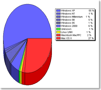
So don't just continue to look at the internet through scratched old dirty glasses. Download Firefox, the IE7 beta, or better yet, get a Mac.
For those who are interested, I am placing some thumbnails below that demonstrate how my website looks in different browsers. Click on any of them to get a fullscreen view.
THIS LAMP BY BROWSER THUMBNAILS (click on an image to get a fullscreen view).
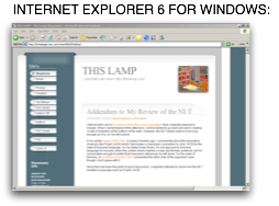
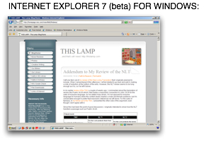
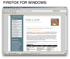

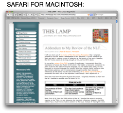
Logos Bible Software for the Mac Delayed Again?
In March of 2005 Logos Bible Software announced that it was porting its software including the massive Libronix Digital Library to the Macintosh. The original estimated ship date was to be by the end of the year. In fact, signs at the November 2005 ETS and SBL meetings sported the message, "Mac Lovers. It's Here." However, as is often the case when porting Windows software to the Mac, the project proved more daunting than originally thought and so the release date was pushed back to Spring 2006 with the statement, "We're confident that the product will be shipping by the time June 21 rolls around, and we know it will be worth the wait." Fair enough. These things take time, and whoever makes their initial ship date anyway?
Logos has an email list that Mac users can sign up for regarding updates on progress for the Mac version. Since the June 21 deadline is now less than a month away and because I had not heard anything from Logos about the Mac version either by email or on their blog in quite some time, I emailed them last week asking if there was any kind of update or if there was an official ship date yet. I was hoping to hear that the program would still ship by June 21. However, in an email I received from Kathy Burkleo from Logos Support on May 25, not even the ship date of June 21 was confirmed. Burkleo simply stated, "At this time we still do not have a definite release date for the Mac version as it has taken longer to produce than originally anticipated." Wow.
In an attempt to get clarification about the June 21 deadline, I emailed Burkleo back asking, "Last I heard, it was going to be in the Spring. Is this no longer a a target date (as we're a month away from summer)?" She responded simply with "Again, we have not been advised of a release date since it is taking longer than originally anticipated to produce the program."
The fact that Logos has been extremely silent about the Mac version in the last few weeks and Burkleo's inability to even confirm the release deadline leads me to believe that we may be waiting longer than June 21. If this date was still a realistic target, I would have thought that Burkleo would have confirmed it.
On one hand, that's okay with me as I'm not waiting on Logos for the use of their Bible software, proper. I've been an Accordance user since 1998 and have no plans to stop using it just because Logos releases its Mac version. However, Logos has an impressive library of electronic texts not available in Accordance. After the announcement of the forthcoming Mac version last year, I purchased a couple of electronic texts from them with their promise that I would be able to run them in the Mac version of Libronix as soon as it was released. I now have about four texts total, but I am forced to run them in the Windows version via VirtualPC which is never a pleasant experience.
Hopefully, Logos will update us soon about their upcoming Mac version.
Update 11 PM: As mentioned in the comments, I have confirmed that according to the Logos Mac page, the product has indeed quietly been postponed until this Fall.
The Wikipedia Is Not Enough

Douglas Groothuis has written a blog entry entitled, "Against Wikipedias (For Scholarship)."
Groothuis writes
Wikipedias are so much the rage that students are citing them in a philosophy papers. This occasioned a mini-sermon from me in one of my classes. The key excerpt was, “Never, ever, ever cite a Wikipedia in a philosophy paper.” Wikis (as they are abbreviated; our culture abbreviates everything) are unedited and unauthorized internet articles in which anyone can contribute, delete, or alter previous material. They are unregulated and ever-changing amalgamations, contingent configurations. Some of them—as least some of the time—may be well written and knowledgeable; but they lack any editorial protocol to insure decent material that conforms to standards. Thus, they are worthless as sources that one would cite in a paper or article of a scholarly nature.
I couldn't agree more. However, I would extend that not to just philosophy papers, but any papers. Further, I would extend the prohibition not just to the Wikipedia, but any encyclopedia. These are not adequate sources for a paper written at the college or graduate level.
That doesn't mean that I don't like encyclopedias, including the Wikipedia. I very much do. I have a link to the Wikipedia on the toolbar of my web browser. I use it all the time. Also, I have the entire Encyclopedia Britannica loaded onto my PowerBook, which I've written about on this blog before. I refer to it all the time to get initial information on a subject. Sometimes that information is all I need--I've been able to educate myself on something I didn't know about before or couldn't remember. But I wouldn't quote from it in a paper if the same information were available elsewhere.
The truth is that encyclopedias of any kind are merely starting points for research, not the end goal. A good encyclopedia will include a bibliography of major works about a subject. That's one reason I like the Encyclopedia Britannica. It gives me direction for further research. The downside is that all articles aren't as current as others. I use the Wikipedia for quick information on a subject, and to its credit, there are often valuable links or other sources listed at the end of the articles.
Encyclopedias were great sources for that 8th grade report on the marsupials of Australia, but they aren't adequate as a final source for information in serious research.
Why I Still Use a Zip Drive with My Mac

A few months back, I made a mistake. I walked into a Best Buy (should I just stop there?) and asked a clerk if they had any Zip disks. "No, we don't carry those anymore," he said. "They're old technology. What you need is a thumb drive."
Don't presumptious people aggravate you? What I need? What I need? "How would you possibly know what my needs are?" I asked.
He just kinda looked at me with a blank stare. "Umm... I guess I don't." Right.
What exactly replaced the floppy disk? The writable CD? The writable DVD? The USB flash drive? Network storage?
Well, it should have been the Zip disk. But Iomega messed things up. How? I'll tell you.
I remember a time in the early nineties when I had all my personal data backed up on 300 floppies. Second hard drives were too expensive for the average user as were CD burners which at the time cost about $1500. I still remember the local computer shop that would burn a CD with your data for you for $75! I actually took them up on this, believe it or not. One CD meant that I could chunk the 300 floppies and not have to remember which disk contained what. I think I shocked them when I brought in my shoeboxes of disks. They had advertized that they would load your disks for you. My 300 disks led to a new policy in which they would no longer do this, but send a tape drive home with you to grab your data. I don't know... $75 for a CD is mind boggling today. For that price I don't think that copying the files from my 300 disks was too much to ask.
Around that time I saw my first Iomega Zip drive. As described above, no regular computer user had his own CD burner at the time. But with the Zip drive, you cold fit 100 MB on one disk! That was the equivalent of almost 70 floppies. A few years later, Iomega would release a 250 megabyte model and today they sell a Zip drive that will write 750 MB onto a single disk which is slightly more than a standard CD.
So how come I'm the only one using them? I mean, really, I don't personally know anyone who uses a Zip drive anymore although Iomega still sells all three models.
In reality, the Zip drive should have replaced the floppy drive.
They are better than a CD because you can constantly write to them. Granted, you can use CDRW disks or create multiple burn sessions on a regular CD, but all of this is too much trouble. With a Zip disk, I can just continually throw files at it the same as I would any hard drive on my machine. In other words, I can write to it dynamically.
They're better than thumb drives in my opinion. Okay, actually, I think they are used differently. Thumb drives will do the same thing I describe in the paragraph above. However, the nice thing about a Zip disk is that I can write a category on a label and use different Zip disks for different purposes. I can't imagine having half a dozen flash drives, each for a different purpose (although I am sure there are some who do).
I keep a Zip 250 USB drive on my desk at school. Having seen too many hard drives die, I'm paranoid about losing the information I'm working on. As I've been writing the prospectus for my dissertation, I make backups to a Zip disk a couple of times a day. I back up the relevant documents and my bibliographical database. This will become even more important once I begin the actual dissertation.
At home I have a Zip 750 attached to the eMac. It's great for storing the original installation files for software that I've bought online. The other day I bought and downloaded Photoshop Elements 4. The installation download was a huge 450 MB. I pulled out the Zip disk that had Elements 3.0 on it, deleted that old version and copied the new one to it--in case I ever need to reinstall. Why not just copy this to a CD? Well, I can store lots of programs on there, add them whenever I want, and delete the old versions. I downloaded Quicken 2006 a few weeks back, too. I keep that installation file on the same Zip disk. In fact, I have two disks simply labeled "Programs." If I get a new version of a program, I can simply delete the old version off the disk. No need to burn a whole new CD. I have another disk that contains a kabillion Adobe fonts that I've collected over the years--especially from the time when I used to do graphic design. I don't want to get rid of these fonts, and occasionally I need to install one of them, but there's no need to keep them on my hard drive, so the Zip disk works nicely.
But I'm assuming that you don't use a Zip drive. And this is Iomega's fault. I see two reasons for the fact that Zip drives peaked a few years ago, but have declined ever since.
The first is that the media is too expensive. A 750 MB disk will cost you $15. And a 250 MB disk costs $12. Get this--a single 100 MB disk costs $9! Can you imagine? When the average 700 MB CDROM costs about 10¢, this makes no sense to the average consumer, regardless of the advantages I describe above. For that difference in price, the average user will simply burn that 39k Word file to a CD and throw it away after it's been transported.
Second, Iomega should have never made the user have to upgrade the drive just to read newer media. When I bought my first digital camera, the largest compact flash card was 256MB. The same card reader that read those CF cards will read the newer ones that are a gigabyte in size. Why Iomega didn't design the Zip drives to do the same thing as larger capacity disks were released is beyond me. Well, actually it's not. I suppose it was about money. But I think that's come back to bite them.
It's too bad. If Iomega had addressed the two issues above, I have no doubt that Macs and PC's would have come with a DVD/CDROM drive in one bay and a Zip drive in the second bay. And the Zip could have replaced the now defunct floppy drive a decade ago. It's not meant to be, though.
At least they work for me.
Even with Dual Boot, We Still Need VirtualPC
But what about VirtualPC? Is it now a dinosaur? Irrelevant? A product of the old pre-Intel PowerPC days? I don't think so, and I'll make my case as to why. And before you say it, no it's not because I don't have an Intel-based Mac yet.
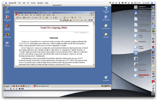
Above is a screenshot from my PowerBook with VirtualPC running in the foreground. VirtualPC allows me to run an occasional Windows-only program when I need to. Of course, it's always been slow, and even slower after the move to OS X. It's slow because on all PowerPC Macs, an Intel processor had to be emulated. Emulation makes everything slow. With Apple moving the Mac to Intel processors, there is great hope that VirtualPC will be updated so that a virtual Windows session will run at comparable speeds to a actual Windows PC. If there's no emulation bottleneck, VirtualPC should run quite respectably as long as the user has enough RAM.
However, some are seeing the new dual boot feature of Boot Camp as a sign that VirtualPC is no longer needed. Why do you need to run a virtual session of Windows if you can make your computer boot right into Windows?
Well, I'll tell you why.
VirtualPC is actually a fairly sophisticated program. I can drag files back and forth between the Mac finder and my virtual Windows desktop. I can copy and paste text and graphics between the two environments. I can save files directly from a Windows program to my Mac user account's documents folder. I can print from a Windows application and it goes into the same print que as my Mac applications. I can minimize or hide the Windows environment leaving it in standby mode until I need it. And the newest version of VirtualPC allows me to quit the program while saving the Windows session where it is, so that I don't have to boot it up from scratch next time I want to use it. It's really quite a mature program if you think about it.
But I wouldn't be able to have any of the functionality I've described in the paragraph above in a dual boot environment. If I needed to use a program in Windows, I would have to shut down Mac OS X and restart the computer in Windows. Once I complete that task, I have to shut down Windows and restart OS X. Is this progress?
Consider that back in 1990, before I had switched to the Mac, before I was even using Windows, I was a DOS user on a CompuAdd PC. I had two main programs that I used. One was WordPerfect 5.1 for DOS. The other was BibleMaster, a simple Bible software program that gave me access to the New American Standard Bible, which at that time was my translation of choice. Whenever I was working in WordPerfect and needed to access a passage from my Bible software, I had to save the file I was working in, close WordPerfect, and then run BibleMaster. If there was a particular passage I wanted to use, I had to save that passage as a text file, shut down BibleMaster, and then launch WordPerfect again where I would then import the text file. I would often go back and forth between the two programs quite a few times in one session. But each time, I had to shut one program down and then launch the other.
Without VirtualPC, we're a step back even from the old days of running one program at a time in DOS. Because in a dual boot environment, not only can I not use programs from Windows and Mac OS X at the same time, I also have to completely RESTART my computer just to go from one to the other. This is not progress.
A few weeks back, Microsoft committed publicly to updating VirtualPC for Intel Macs. I hope that today's announcement won't affect those plans. Boot Camp is significant for that switcher who's been living in the Windows world for his or her entire experience with computers. And it also will allow the PC gamer to buy a Mac or the Mac user to play a PC game. But for those who are doing significant work, who need to quickly go back and forth between a Windows and Mac environment, VirtualPC remains a necessary program.
Macs "Officially" Boot Windows, Too
In spite of the fact that I've been running Windows in VirtualPC ever since I switched to the Mac in 1998, everyone knows that it runs slow.

Pictured below is the startup disk selection in Mac OS X:
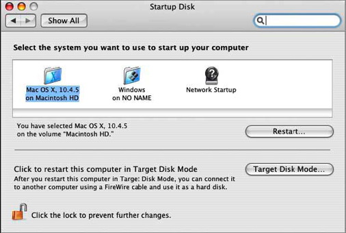
Pictured below is the startup disk option in Windows.
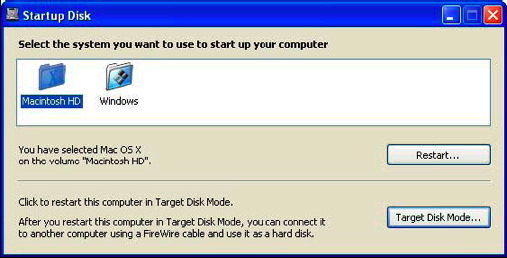
As of today, this dual-boot feature is only available on the MacBook Pro, iMacs, and Mac Minis. But as the entire line of Macintosh computers is moved over to the Intel processor, future Macs will have this capability, too. Keep in mind that Boot Camp is beta software. The final release will be included in Mac OS X 10.5 (code named "Leopard") later this year.
So, really now you can't even complain that Macs can't play your favorite game (you know who you are), can you?
Get a Mac.
Related Reading:
Apple's Boot Camp page
Apple: Windows on a Mac Is Here (c|net)
Apple's Boot Camp a "Game Changer" (MacNN)
iWeb: So Much Ingenuity, So Many Missing Features

In fact, I've created a little test site in iWeb using material from This Lamp. You can check it out yourself at http://web.mac.com/rmansfield/iWeb/Site/Welcome.html. Here is a screenshot of the blog page I made:
This object oriented, drag and drop ability is perhaps iWeb's greatest strength. It gives you a true WYSIWYG layout that is only limited by your own creativity. The included themes and templates look good by themselves, but you can completely rework them to suit your own tastes. Objects can be placed on top of one another. In fact, I find it interesting to watch the pages "build" when I view them in Safari. Masking tools are included as well so that only part of your images show or you can conform them to predesigned shapes. I currently use RapidWeaver for my website, and I can honestly say that iWeb beats RapidWeaver hands down in the abilities described above.
The interface for iWeb has more in common with Pages and Keynote than then other applications in iLife suite, right down to the Inspector. I've read elsewhere that iWeb was originally supposed to be included in iWork '06, but was switched over to iLife instead. Good idea. It will definitely get more exposure with iLife.
iWeb comes with a number of nicely designed themes and six basic template pages, although I'm not really sure that a welcome page is all that necessary on any site. On This Lamp, the default "home" page is simply my blog. However in the test iWeb site I created (see link above), I did make a welcome page for demonstration purposes.
iWeb seems to be most at home publishing to a .Mac account, but can actually publish to any server. However, certain features like the hit counters don't work outside of .Mac. Why that is I don't know, and unfortunately, you cannot currently add third party counters.
All in all, iWeb is an extremely powerful website building program that is simple and intuitive enough to use that anyone can have a website up and running in a very short period of time. Unfortunately, a number of glaring feature oversights will keep the more experienced website creator from forgetting that this is a version 1.0 program.
The most telling deficiencies are in the blogging template. And these lacking features will be enough to frustrate anyone who has blogged with other software. Here's the short list:
• No categories.
• No ability to incorporate comments or trackbacks, although some ingenious workarounds are starting to appear. See this description on Apple's discussion boards.
• No ability to include direct snippets of HTML code or edit the HTML code at all outside of opening the generated files in another program. However, any such hacked changes will be lost the next time you publish from iWeb. That means no blog rolls, no Google or Amazon ads, no third party counters, no sidebar polls, etc.
• No sidebars. Although some of the blog templates give the illusion of a separate sidebar or frame, essentially they do not.
However, iWeb has RapidWeaver beat by allowing blog entries to be viewed on their own page, thus creating true permalinks, something that RapidWeaver does not do yet (much to my frustration, RapidWeaver only designates unique entry ID's for blogs, but not true permalinks that direct to a separate page; I manually create the permlinks at the end of each blog).
Further, some basic templates that are available in the .Mac Homepage editor are missing such as a page for file downloads. Of course, you could always take an About Me page and clear the objects and then add links, but this would not be anywhere near the ease of the current .Mac Homepage implementation where you simply drop files in your iDisk's public folder. I've even kept this feature in RapidWeaver by adding a frame around my original Homepage file download template.
One important drawback...once you choose a particular template theme, you'd better like it because it can't be changed! This limitation doesn't make good sense to me, although I suppose it has to do with the fact that many of the elements inherent to a template are extremely specific to that theme. Evidently, they wouldn't transfer well to a different theme. However, I will freely suggest that one of RapidWeaver's strengths is that you CAN change your theme anytime and give your site a whole new look. But again, RapidWeaver themes will probably not have the number of elements available for editing or even deleting that iWeb does.
Whenever I look at software that duplicates the functions of an application I'm already using, I ask myself what it would take for me to switch. I mean I'm not beyond switching considering I moved 140+ blog entries last Fall from iBlog to RapidWeaver (of course now I am pushing 230 entries). The drag and drop design capabilities of iWeb tugs at my creative heart. However, the list of features described above is the dealbreaker for me.
I have no doubt that Apple will improve iWeb over time. Unfortunately, the only iLife program that gets any periodic attention throughout the year is iTunes because it makes money for Apple. Thus, I don't expect to see improvements to iWeb before January, 2007.
iWeb will be fine for most folks if none of those missing items are part of one's needs in a website. The ability to place hyperlinks and graphics are a tremendous improvement over the old .Mac pages, although sadly, a very elementary one. But if currently you have all your eggs in the .Mac Homepage template basket, consider moving to iWeb. Even with the lack of features that some of us can't live without, you'll still have one really good looking website.
Apple's New Slogan
"What's an Intel chip doing in a Mac? A whole lot more than it's ever done in a PC!"
The 2006 MacWorld Keynote: Viewing Between the Frames
I wasn't one of the fortunate ones able to sit in San Francisco to see and hear Steve live. I was one of the losers going back and forth between MacCentral and MacNN, constantly refreshing my screen for the updates. The video is now released in streaming Quicktime format, but too many people are hitting it and it's an exercise in frustration right now. Therefore, I'll write a few initial thoughts about today's revelations.
There was a lot of new information that Steve gave us, but as I read the updates, I felt like there was a lot we weren't hearing. This blog entry serves to "view between the frames" by giving you my speculation and hunches about some of what really was going on. I'm not trying to give an exhaustive examination of everything covered in the keynotes. There will be quite a few other sites doing that today. Here are just three three or so items that jumped out at me. If you agree or disagree, you're welcome to speculate with me in the comments below.

Second, anyone notice that the old comparisons between PowerPC processors and Intel processors are now officially a thing of the past. I mean the initial switch announcement surprised us anyway after we were told so many years that Macs with their PowerPC's were supposed to be so superior to Intel processors. And all those speed tests that made it look like Apple produced the fastest computers in the world! Now we're being told that the new iMacs are two to three times faster and the MacBook Pros are FOUR TIMES FASTER than the latest PowerBook revs. And if you go to Apple's site and look at the specs, these aren't even the fastest processors that Intel makes. Of course, the truth of it is that most currently manufactured processors are fast enough for the average application provided you have enough RAM and you aren't being slowed down by spyware and the Windows virus of the week. I'll be very interested to see what kind of specs are on whatever they call the replacements for the PowerMacs later this year. But now that the playing field has been leveled processor-wise between Apple and it's Windows cousins, processor speed comparisons will strictly be a thing of the past. But don't all of us Apple faithful feel like chumps now for believing what must've been a speed myth now that the new Macs are TWO TO THREE TIMES FASTER!
Third, is it just me, or does "MacBook Pro" seem like a clunky name? Is this just a bad take-off of the old WinBooks which was a take-off of PowerBook to begin with? How ironic. And will the iBook replacement merely be "MacBook" without the "Pro"? Like a friend of mine said, you'd think that with all of Apple's million dollar marketing geniuses, they could've come up with a better name than MacBook Pro.

What are your thoughts? Am I too suspicious or do you think there were a few corporate conspiracies in place, even if they were created just for the hype. Feel free to share your questions, thoughts, comments, and rebuttals.
Martin Luther Was Excommunicated on This Day and Why I Love the Encyclopedia Britannica
I have always loved encyclopedias. When I was a child I grew up with a set of 1967 World Book Encyclopedias in our house. These were bought the year I was born from my grandmother, who used to sell them to supplement her elementary school teacher income. I didn't just use them to plagiarize school reports like all the other kids; rather, I would sit and read them for hours, like a good book. Often I started with one article that I was interested in, but the "see also's" would take hold of me, and before I knew it, I was surrounded by stacks of the various volumes.

Kathy on the other hand, as a children's librarian hates the Encyclopedia Britannica because she says its reading level is too high, it doesn't have enough pictures, and it doesn't have enough pictures in color. Plus, she says, physical encyclopedia sets go out of date too quickly, and she's thrown away dozens of sets over her career (I shudder to even think of such things). Of course, I counter that we don't have children yet, so I don't want an encyclopedia set for them--I want it for myself. And going out of date isn't an issue because of yearbooks, not to mention the fact that most of my interests are of a historical nature and therefore, won't go out of date. She'll eventually counter with, "Well, we can't afford it right now," and I have no real argument for that one.
You're wondering when Martin Luther is going to come into this, aren't you?
Needless to say, she ordered it and gave it to me for Christmas. Maybe it was only $10, but it is one of my favorite gifts. I've already found myself lost in the "see also's," bounding from one article to the next, but this time without books stacking up around me. It's wonderful having it on my computer with so much information at my fingertips whether I'm online or not. Isn't this what computers were made for? I still want the print set one day, mind you (I'll fight that battle later), but for right now, the CDROM version of Britannica will do. In fact, it lets me install the whole thing on my computer, so I don't even have to carry the disks around.
So anyway, this afternoon I fired up it my to make sure I was right about brontosauruses never existing for my King Kong movie review (see the previous entry) and I happened to notice on the main interface that the "This Day in History" was all about Martin Luther's excommunication. Wow. I mean, how could this program even know I would be interested in such things? I know, I know...I'm sure it was just a random selection from history, but for a moment I felt as if the program had scoured my hard drive looking for things I'm interested in.
That led me to wonder what kind of article Britannica had on Martin Luther, so I looked him up. In addition to the main article, the software informed me that over 1900 articles made reference to Martin Luther, although undoubtedly many refer to Martin Luther King Jr. However, even with a quick sweep of the other articles I saw entries on "Conflict with Luther (from Leo X)"; "Relations with Luther (from Zwingli, Huldrych)"; "Worms, Diet of"; "Frederick III"; "Schmalkaldic Articles"; and hundreds of others.

I was curious as to the length of the article since it is hard to tell looking at a computer screen. So I copied and pasted it into a word processor. With a 12 point, single-spaced Arial font, it came out to 22 pages. That's not too bad for an encyclopedia article in my opinion. As for the information about the event in today's history that caught my eye, Professor Rupp had this to say:
In January 1521 the pope issued the bull of formal excommunication (Decet Romanum Pontificem), though it was some months before the condemnation was received throughout Germany. Meanwhile, the imperial Diet was meeting at Worms, and there was a good deal of lobbying for and against Luther. In the end, Frederick the Wise obtained a promise from the emperor that Luther should not be condemned unheard and should be summoned to appear before the Diet. This enraged Aleandro, who asserted that the papal condemnation was sufficient and that the secular arm had only to carry out its orders. It also alarmed Luther's friends, who did what they could to dissuade him. Luther was firm in his determination to go, and began the journey in April 1521, undeterred by the news, on the way, that the emperor had ordered his books to be burned. What was meant to be the safe custody of a heretic turned out to be something like a triumphal procession, and when Luther entered Worms on April 16 he was attended by a cavalcade of German knights and the streets were so thronged as to enrage his enemies.
The Decet Romanum Pontificem is indexed so as to link to the Luther article and to the article on Leo X.
Thanks for my gift, Kathy, and letting me get lost in the "see also's" once again...until we get the print version one day....
Bookends Review in December SBL Forum

Bookends is a bibliographic reference management program that I use myself and recommend on my Links of Interest page. My primary reason a few months back for choosing Bookends over similar programs for the Mac such as Sente or Endnote was the SBL Journal glossary that Zacharias compiled for Bookends. This glossary is now included with every copy of Bookends.
Links:
Danny Zacharias' review of Bookends.
Danny Zacharias' website: Deinde.org.
Bookends Reference Management and Bibliography Software from Sonny Software
Mellel Roadmap

Just to clarify things a bit: Yes, we do intend to make Mellel a viable alternative to FrameMaker; No, we have absolutely no intention to make it a DTP machine.
I think that with Mellel 2.0 we've reached our initial target -- making Mellel a good, solid word processor.
From here on, we plan to move along the three fronts we've defined:
A. "For scholars" -- adding tools that will make Mellel an even better tool for scholars, especially better bibliography integration, index, cross-references, more notes options, etc.
B. "For long document" -- ...in addition to the options mentioned above, a better solution for "book" management, image<>text relations and perhaps a bolder move into the track-changes and re-purposing of text.
C. "For writers" -- this is the area where I think we have the most to contribute in terms of bringing something completely new into the fray. All the tools available now simply don't do the job -- either dedicated "project" tools and/or book writing and "brain storming" or "outlining" tools are all thinking about it the wrong way, I feel. We'll have something interesting to say here too in 2006.
Posted to RedleX (Yahoo Groups) 12/5/2005
Here are some of my past blog entries referring to Mellel:
- It's Official: No Right-to-Left Text in Mac Word 12 (and Why I've Dumped Word for Mellel) [11/18/2005]
- Mellel 2.0 Released [11/14/2005]
- The Myth of Limited Software Choice for the Mac [9/17/2005]
Mellel website: http://www.redlers.com
My First Experience with "iTunes TV"

So Thursday morning, with the smell of roasting turkey in the air, I checked a couple of times to see if Wednesday night's Lost episode "Collision" was available yet. It wasn't. I don't know exactly what time it was finally made available, but in the Central Time Zone, where we are this week, it did not show up in the iTunes Music Store until after noon, and after we were stuffed with a Thanksgiving meal.
It was easy enough to download. As soon as I clicked on the "Buy Episode" button, it was on its way to my PowerBook. However, I noticed it moving ever so slowly. Then, I remembered that I was the smart guy who had advised my mother-in-law to get the "cheaper" low-bandwidth DSL from BellSouth because I didn't figure she'd ever need anything as fast as my cable internet connection at home. The file for the episode is right at 195 MB. The DSL connection I had here only gets around 145 kbps, which is only a little bit better than the old ISDN connections. It took about two hours for the video to download. No problem; I needed a nap anyway. Too much tryptophan in my lunch...
This evening Kathy and I watched our downloaded episode of Lost. Here are my initial thoughts about the experience...
First, this kind of video-on-demand is the future. I don't know whether it will be done from a computer or a set-top box, or an integration of the two, but the day is soon coming where you'll think to yourself, "Hmm...I'd like to watch that episode of the Andy Griffith Show where Goober eats Aunt Bee's prize-winning apple pie," and you'll just download it to watch at will. Hopefully, it won't take two hours.
Second, the quality wasn't that bad. It's not high resolution, but at full screen on my 17" PowerBook, it was at least as good as my cable TV signal at home--although that's not saying much. Cable quality stinks these days. However, why wasn't it the widescreen version like the episodes from season one on the DVD set? Regardless, I'm going to assume that quality will improve as technology improves. We are in the early days of this kind of thing.
Third, there are huge advantages to watching television this way, because there are no commercials. I don't watch a whole lot of TV, but if I did, I would have to download it like this or tape it ahead of time because commercials are such a huge waste of time. But this works. Every time the screen went black for two seconds where the commercial would have been, I said to Kathy, "Commercial...look, NO commercial!"
And finally, my only REAL criticism is WHY THE HECK CAN'T I BURN THIS TO DVD? In spite of the fact that watching it was adequate on the PowerBook, I have no desire to watch an entire episode of anything on a computer. Yes, it was a novelty a few years ago when computers, especially laptops first had that ability. And I used to take DVDs on trips with me to play on my Powerbook, but when was the last time I did that? Can't remember. I really would rather watch a TV show on a TV! The inability to burn video that I have legally paid for to watch in the privacy of my own home is absolutely asinine. It's NOT illegal under any interpretation of copyright laws. If I can burn television shows I've recorded through other methods to DVD for my own personal, not-for-sale, not for public exhibition use, then it's legal for me to burn this to DVD and watch it on my television instead of my computer. If I can burn songs I've downloaded from the iTunes Music Store to CD, then what's the real difference with television shows?
Oh, I know, I know... you're supposed to download the show to your video iPod and then you can plug it into your television and watch it from there. For Job, Apple, and the movie and television industry, having a convenient, yet controlled avenue of video distribution was crucial as a justification for putting video capabilities on the iPod. But there's a much greater market out there for video on demand such as this than just for those with video iPods.
This is my only real complaint, but it is a BIG ONE. This isn't "FairPlay"; it's "Constrain-the-Customer-Because-We're-Paranoid-About-Piracy-Play." Has anyone hacked this yet? Whoever does gets my full support.
If you haven't checked out the video download abilities yet from the iTunes Music Store, overall, I recommend the experience if you don't mind limited selection and the inane limitation to only using your computer (or video iPod) for viewing. However, I am going to optimistically assume that both of these restrictions are temporary...
Converting from iBlog to RapidWeaver
It's Official: No Right-to-Left Text in Mac Word 12
First, my source for this news is Rick Schaut himself (whom I respect very much), a software design engineer in Microsoft's Mac Business Unit (MacBU). On October 28, I emailed him asking if right-to-left (RTL from this point on) text was finally going to be available for Mac Word version 12, presumably to be released sometime in 2006. This was his reply:
At present, it doesn't look as though right-to-left text rendering will be in the next release of Mac Office. The reasons are somewhat complicated to explain, but they stem from differences between Windows and the Macintosh with respect to low-level APIs that provide context-based glyph substitution and the ability to get glyph-based (as opposed to character-based) measurements. At present, the only way we can do RTL in Mac Word would break the line-layout compatibility between Mac Word and Win Word.
I'm really ticked about this. In spite of the fact that Word for the Mac has been around longer, the Windows version of Word already has this ability in its current version. As much as I hate to admit it, I think I can honestly say for the first time WinWord has a leg up on MacWord. There I said it. Let lightning strike where it may.
For me this means that using Mac Word for writing a dissertation in the field of biblical studies is out of the question. I'll explain why in a minute. But it's not just folks in biblical academia who are left out in the cold. Anyone needing to compose text from right to left--whether it's modern Hebrew or even Arabic--can't use Mac Word. Nor can anyone use it who works with any Ancient Near Eastern language, most all of which are RTL. Word for Windows has had this ability since the release of Office 2003.
Let me give you a taste of the problem. First, of all, if you want to compose text in Hebrew, you can forget it because Hebrew is a RTL language and text that flows in this direction is not supported by Mac Word. Further, Unicode text pasted into a Word document does not display Hebrew correctly either. There are a number of advantages to using Unicode fonts. Read the Accordance Unicode page for more information or Joe Weak's Unicode introduction for biblical scholars. However, the greatest advantage to me is that Unicode fonts are generally cross platform. I should be able to give a document containing Greek or Hebrew text to a person using a Mac or Windows without worrying whether or not he or she has the same Greek and Hebrew fonts which has always been an issue in the past.
But I can't use Mac Word for any of this. The problem is that text that should look like this:
comes out looking like this when I paste it into MS Word 2004 for the Mac:

It's utterly unusable. Therefore, I've had to find an alternative, which is Mellel. Overall, I like Mellel, especially v. 2. But I really have sour grapes about being forced to switch software after using Word, first in Windows and then on the Mac, for the last fourteen years.
I'm not going to erase Word from my Mac. Granted, I've got thousands of Word documents that I've created over the years. Even though there is a Word import feature in Mellel, it's not always 100%, especially with the more complex documents. But what it does mean is that new documents get created in Mellel from now on.
The good news is that Mellel is extremely solid and built from the ground up to be a word processor for academic use. It's ability to handle unicode fonts, switch on the fly to RTL text direction, integration with bibliographic software like Bookends, extremely powerful outlining and styles features, and, of course, long document support make it a scholar's dream, regardless of the exact field. See the full feature list for yourself.
If you haven't tried Mellel yet, I encourage you to download the demo. Regardless of your requirements in a word processor, you may find that Mellel actually suits most of your needs best. Plus, the developers at RedleX, the makers of Mellel, are extremely accessible through their forums, and open to new feature suggestions. In fact, they ask for them. That's better than anything I've ever received from the other guys...
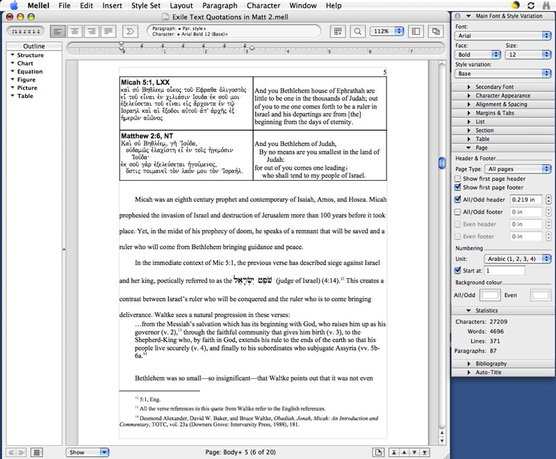
Above: Mellel 2.01 in all it's glory.
Mellel 2.0 Released
• Hyphenation
• Columns and section styles
• Improved RTF support
• Keep with next and Keep options (think widow and orphan controls on steroids)
• Space at top of page/column
• Table frames line type
• Document setup: Added inside/outside margins and background color
• Page style colour: Added colour options to page styles
• Navigating: Page up and Page Down keyboard navigation
• Dictionary access (Tiger only)
• View options: Several additions
• Find special codes: Some additions
• Moving tabs: You can now move the end margin beyond tabs.
• Restart Note options: Now with every page range or section too.
Visit the Mellel site to get the full list of improvements and new features.
There are actually quite a few more improvements than this, but these were the biggies. If you're not familiar with Mellel, you probably are thinking, "Big deal. Word's done all that for years." Yes, you're right, but what you don't know is what Mellel was already capable of including the best handling I've seen of unicode fonts on the Mac, and especially for me, Greek and Hebrew typefaces. Mellel's ability to use right to left languages such as Hebrew are far superior to most word processors, especially on the Mac platform. Further, Mellel integrates well with bibliographic/citation software such as Bookends or Sente which is crucial for academic writing.
With the more mainstream features added in the 2.0 release, Mellel is now set to be the best word processor on the Mac not just for academic writing but for any standard user. There is a bit of a learning curve for using Mellel because it was built from the ground up as a word processor that was not simply trying to be a less expensive alternative to Microsoft Word. Therefore, it doesn't do everything like MS Word does. Many of the "standard" word processing procedures have been rethought. However, the downloadable user manual is very straightforward, and the average user can be up and running in a short while.
Although I was part of the beta test for version 2.0, I wasn't able to contribute too much because it hit in the middle of my preparing for comps. But I've been using the beta for the past three weeks for everyday use and I found it to be incredibly stable. With the final release of the product, it should be even more solid now. For any of my fellow classmates at SBTS, I have also contributed a term paper template that adheres to the SBTS/Turabian style guide. It is available in the downloads section at the Mellel site.
Although the price for Mellel has gone up with version 2.0, it is still a bargain at $49.99 regular price and $34.99 academic price. Users of previous versions (such as myself) were able to upgrade for free.
I'm working on a post for later this week that gives more detail as to why I've dropped MS Word after 13 years and switched to Mellel for serious writing. Keep watching this space.
One Thing I Love About Computers...
The Miserable State of Tech Publishing

My first computer was a TRS-80 Color Computer in 1982. I've always been an avid reader (as some of you know), and as long as I've used computers, I've subscribed to and read a wide variety of computer magazines over the years. In the eighties, even as a teenager, I had subscriptions to magazines such as Personal Computing and Family Computing, neither of which are still in publication. Later, I subscribed to PC Magazine, PC World and PC/Computing (the latter of which is no longer in print). When I switched to the Macintosh platform in 1998, I subscribed to MacWorld and MacToday. I still get both, but MacToday transformed into MacDesign and now Layers. When my subscription to Layers expires next year I won't be renewing since it has lost its primary Mac focus. The Adobe-colored substance on Scott Kelby's nose doesn't impress me.
A lot of the tech magazines, across all platforms, have not adjusted well to the internet. With tech websites updating their information hourly, it's impossible for tech magazines to deliver anything like news in the truest sense of what the word means. And unfortunately, the publishers haven't figured out how to adapt. I still have a handful of the old Personal Computing magazines from a couple of decades ago. The difference between the depth of the stories back then and what exists now is amazing. Current magazines focus on short articles that often feel more like advertisements than real tech journalism. Tech magazines today could adapt by focusing on in-depth analysis and comparisons, interviews with industry figures and innovators, commentary, and help and tips columns (the latter of which is the only real value to me in a magazine like MacWorld). These kinds of foci are not overly dependent upon "breaking news" which has dominated tech publishing for so long.
Last Wednesday, Chris Howard wrote a piece called "Is the Web Killing the Computer Magazine?" As a follow-up the next day, Charles Moore responded with "Are Computer Magazines Going the Way of the Dodo?" I responded to Mr. Moore's article and he published my thoughts and those of others on Friday.
For those of you who may have missed that, I have reproduced my email below (slightly touched-up from the original).
Re: Are Computer Magazines Going the Way of the Dodo?
From Rick Mansfield
Your column got me going. I posted in the comments (twice!), but I wanted to make sure you saw it, so I'm pasting it below:
I agree that Mac magazines (and any computer magazine for that matter) is at a disadvantage because they really can't do "news" anymore. By the time it's in print, it’s no longer NEWs.
However, that doesn’t mean that computer magazines couldn’t adapt. What could they offer? They could offer exclusive opinion and in-depth analysis that’s not available on the web, at least not for a certain period of time. A long (i.e. in-depth) article reads better in my arm chair than on my computer screen for me.
But what's happened to Mac magazines? Take MacWorld for instance. Compared to the issues published ten or fifteen years ago, it's anemic. I know that advertising can play a role, but the articles themselves have been dumbed down. They don’t have the depth that they did years ago; there's not near as much detail in their analysis.
And regarding MacWorld, what happend to the columns? There’s no more David Pogue, no more Andy Ihnatko. Dig through your stacks and find an old issue of MacUser. They had great columns that weren’t afraid to say negative things about Apple or the computer industry when deserved. When was the last time you read anything negative about Apple in MacWorld? Conflict of interest--Apple advertises in MacWorld.
Remember when Dvorak used to write a column for MacUser? How mad everyone would get at him? When was the last time an article in MacWorld Magazine stirred your passions? And speaking of which, if MacWorld was supposed to "incorporate" MacUser as the covers said a few years ago, whatever happened to that?
And how come the Brits still have MacUser and we don't? Is the American market smaller than the British market for a Mac magazine? I doubt it. And how come the British MacWorld magazine is TWICE the size of the American edition? And why do they have different (and often better) articles?
Oh, I think there’s still a place for a Mac or tech magazine, but unfortunately, there's no vision among American publishers.
And one more thing now that I’m ranting on MacWorld… why do they feel like they have to mislead their readers when it comes time to re-subscribe?
The standard price for a MacWorld subscription is $19.95. If you are a subscriber, about six months into your subscription, they send you a renewal notice with a bill for $34.95! I guess they think you won’t be paying attention or you won’t remember how much you paid last time and you’ll just write a check and send it in. I’ve both emailed and called about this practice which I think is dishonest and manipulative. I've yet to get a satisfactory explanation. They just always offer to renew for $19.95. I can’t get it across to them that their giving me a lower (original price) offer is NOT the point.
I was so ticked that when my subscription was about to run out a few months ago, I decided not to re-subscribe--even at the $19.95 price. I figured if I saw an issue on the stands that I felt I really needed, I'd buy it then. Heck, they put their best stuff on line anyway.
So at the final week before my subscription was about to run out, would you believe they sent me a "professional discount offer" for $12.95?
At that price, I took it.
The Cold War Between Microsoft and Apple Heats Up
If you have nothing better to do, first read this:
"Microsoft's Executives Discuss Apple Competition."
Then read John Welch's take on the above and also his analysis of where Microsoft's Mac Business Unit (MacBU) now fits in with Microsoft's reorganization (it's now in the Home and Entertainment Division along with the XBox): The MacBU at the Crossroads .
Then read Rick Schaut's response to John Welch (and make sure you read the comments for more tit for tat between Welch & Shaut). Schaut is a programmer for MacBU, specifically working on MS Word for the Mac: "Goin' Down to Rosedale."
Unfortunately, too much of the Mac's perceived survival still depends on Microsoft and to a lesser extent, Adobe, neither of whom (from my perspective) seem to care a whole lot about the Mac's survival. A lot may happen in the next two years...
The Myth of Limited Software Choice for the Mac

"Word processors" hanging out on my PowerBook (from left to right):
MS Word , Mellel , InDesign , Pages , AppleWorks , TextEdit
When I first began debating about switching to the Macintosh platform in 1998, I asked a friend of mine who was a longtime Mac user if there were any major disadvantages. He explained to me that the downsides to the Mac platform revolved around fewer games and less software choice for standard applications. To illustrate, he said, "You're not going to have a dozen different word processors to choose from like you do with Windows, but if you use Microsoft Word, then you're just fine since it's available for both Windows and the Mac."
Since then, when I've been asked the same question, I have echoed my friend's example. Of course even then, it was a bit of a non-issue. For the average user of 1998 or today, MS Word became the dominant choice for word processing years earlier.
And then today, I came across an interesting website that lists all word processors for Mac OS X. How many would you guess there are? Three? Six? A dozen?
Try 67. That's SIXTY-SEVEN.
Now, granted, the apps listed are of differing abilities ranging from something like Adobe InDesign to simple text editors with MS Word in the middle, but 67 is a mind boggling number. And that doesn't even include an application like iBlog that I'm using to write this blog entry. iBlog is basically an WYSIWYG HTML editor with simple content management system software built in. But I'm not going to write a letter home to Mom in it, so it can't really count as a word processor. But something like InDesign can. Granted, it's geared much more to advanced layout and design uses, but I have seen such software used by secretaries for correspondence. Yes, it's overkill, but it works.
I was curious to know how many word processing applications I have on my PowerBook (which is what I'm writing this on). I found at least six as shown in the graphic above (I think that's more than what I had in my Windows days, for the record). I would even count TextEdit which comes with Mac OS X even though it is not in the list of 67. But it has basic formatting features (bold, italics, etc.) and the ability to save in RTF, Word and even WordXML formats, so I think that counts.
As a side note, lately I've been using Mellel , a word processor geared toward academic use from a company out of Israel. It handles unicode Greek and Hebrew exported from Accordance better than any word processor I've ever seen. And it's built-in bibliographic tools make it the ideal word processor for academic writing on the Mac. Mellel doesn't do everything yet that I need it to do, but the developers have promised most of the features I care about in upcoming updates.
Now, before my Windows-using friends counter that although there are 67 Mac word processors. there are a kabillion Windows word processors... Fine. I know. Yes, I assume that there are more for Windows. But the average person uses ONE, maybe two. Out of 67 for the Mac, I assume that most people can find what they are looking for.
Windows Vista (Still in Beta) Already Susceptible to Viruses

Where do your viruses want to go today?
Report are in that exploits have already been discovered and viruses have already been created for Microsoft Windows Vista. In case you don't know, Windows Vista is the next version of the Windows operating system currently projected to be available for purchase in the fourth quarter of 2006. You may have heard it referred to earlier under its codename, Longhorn. A couple of weeks ago, beta versions (preliminary releases for testing purposes) were released to software developers. Hackers got their hands on these early releases, too, and new viruses have already been written that specifically target this new version of Windows a year and a half before it is even set to be released!
Windows Vista, when launched at the end of 2006, will be the first version of Windows to be released since 2001 when Windows XP debuted. There are currently over 130,000 computer viruses aimed at Windows users.
Now contrast that with using a Mac. The beta version of Mac OS X was released to the public in the Fall of 2000 and the first commercial version appeared in 2001. There have been four successive major upgrades to the Mac operating system since. And how many viruses to date? NONE.
While the average Windows user wages a constant battle against viruses and spyware, and while the average Windows computer IS infected by one or the other (ever wonder why your "new" computer is running so slow?), Macs are virtually virus and spyware free. I say virtually because technically, you as a Windows user could email me a message with a virus attached. Once I received it, yes, there would technically be a virus on my computer. However, a Windows virus will NOT execute on a Mac, so it's dead weight.
Yes, I do run antivirus software on my Macs just in case there ever is a real Mac virus, but to date (five years since the release of the OS X beta), there hasn't been one. All my antivirus software ever detects is occasionally when one of you Windows users sends me a virus in an email. My software deletes it so that I don't accidentally forward it back to one of you Windows users who would then really be infected.
Many defenders of Windows will say that Macs are virus free because there aren't as many of us. That's partly true, but it's party a red herring. If all things were equal, there should be significantly less viruses on Macs than on Windows computers. However, remember that there are NO viruses for Mac OS X. That's because the two operating systems work differently. Viruses and spyware are in reality little programs running on your computer. On a Mac, a program cannot be installed without the direct intervention of the user by typing in a password. Therefore, there is no way that a virus can install itself onto a Mac without a user's knowledge. Yes, there have been occasional security holes in the Mac OS, but these have been plugged fairly quickly resulting in no viruses to date.
If you are a Windows user it's imperative that you run antivirus software and that you update it daily. However, there is a better solution than that. Walt Mossberg of the Wall Street Journal said it best in his column, "How to Protect Yourself from Vandals, Viruses If You Use Windows," when he wrote the following:
Opting out: The single most effective way to avoid viruses and spyware is to simply chuck Windows altogether and buy an Apple Macintosh. Apple's operating system, Mac OS X, is harder for the criminals to infect, and the Mac's market share is so small that hackers, virus writers and spies get little thrill, financial gain or publicity from attacking the platform.
I switched over from Windows to the Mac in 1998. To the rest of you who are still hesitant to jump in, all I can say is "Come on in--the water's fine..."
Hades Freezes Over: Apple Releases a Mouse with Right-Click Ability

In 1983 with the introduction of the Apple Lisa and then in 1984 with the release of the Macintosh, a mouse on a computer was something of a novelty. That's hard to imagine today. But I started using computers in 1982, and I never touched a mouse until around 1990 (I wasn't a Mac user back then). And, of course, Apple didn't invent the mouse, but they can be credited with the first computer company to sell a computer (to the average consumer) that required its use. In effect, Apple made the mouse mainstream. However, earlier prototype mice had multiple buttons. But the decision was made at Apple that since the mouse was a new technology (remember--this was the early eighties) for the consumer, that simplicity was the best solution. One button was simple enough--just click.
That seems logical enough, until you realize that it was 21 years ago when the first moused-based Macs came out. And in the two decades since, there's never been more than one button on any mouse manufactured by Apple. Now, if you're a Windows user (as I assume most of you reading this are), this probably sounds crazy to you. And believe it or not, I agree. When I first switched platforms to the Mac in 1998, one of the first things I added to my new computer was a third-party two-button mouse. Over the years, I've used mice made by Microsoft, Logitech, and others. I've tried to like the Apple mice that have come with my Macs. They look really cool (except for the original iMac puck mouse), but I need my ability to right-click. This is even weirder when you realize that Apple introduced contextual menus for right-clicks around 1998 to the Mac OS, even though they were only selling one-button mice. I guess it was a way to appease users who wanted to use mice with two buttons (which was just about everyone).
So enough with the history lesson. Rumors of a two button mouse "soon to be released" from Apple have been flying around since I first started using a Mac, but nothing ever materialized until today. This morning, Apple introduced it's most radical mouse redesign since 1984, The Mighty Mouse.
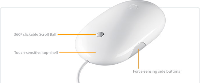
I still think it's crazy that the PTB at Apple took so long to create a multiple-button mouse. However, in the Mighty Mouse, they have compromised between their own stubbornness and the needs and wants of more sophisticated (i.e. most) users. The new pointing device still has all the simplicity of a one-button mouse. In fact, it still looks like a one-button mouse. But the ability to right-click comes from the touch-sensitive top shell. If you apply pressure on the right side of the mouse, it acts as a right-click.
But the aspect of the new Mighty Mouse that really sets this mouse apart is the 360° scroll ball (as opposed to a scroll wheel). I've got one of the newer PowerBooks that comes with 360° scrolling on the trackpad. This is especially handy in a program like Photoshop when you have an image enlarged and you want to move it around diagonally. 360° scrolling is something most folks will find very useful once they give it a try.
Apple's release of the Mighty Mouse couldn't come at a better time. The last two mice I've used on my desktop Mac (currently an eMac) have worn out. Both were from DVForge , and I had chosen them because they had the look and form factor of the recent mice from Apple, but came with two buttons and a scroll wheel. However, neither have held up that well. The current one randomly double-clicks when I single-click causing me to occasionally delete two email messages instead of one, among other things.
Therefore, with the announcement and release of the Mighty Mouse this morning by Apple, I put my order in. By this evening, I received confirmation that it's already shipped. Not too shabby.
Sprintual Warfare
Okay, so about a month ago, I attempted to order a new phone to replace Kathy's phone because it was no longer holding a charge and the battery wasn't replaceable. SprintPCS is the service that we use. I've had the same number and account since 2000 which is pretty long for staying with a cell phone service. There's nothing in particular about Sprint that I really like. Their service is not outstanding in my opinion. In fact, after recent circumstances, they've sunk even lower in my mind.
Originally I stayed with Sprint because I didn't want to change my phone number. Kathy and I don't have a separate home phone. We don't need one. We just have our cell phones, and we're on a plan that allows us to share our minutes.
Only in the last year or so has it been possible to take your number with you. You would think that because a customer can now switch a whole lot easier to another company that cell phone providers would work harder to keep their customers. Evidently not.
Incident #1. So Kathy and I picked out a phone for her to replace her old one. According to the SprintPCS website and TWO representatives I talked to on the phone, the phone we picked out DID qualify for a $150 rebate. I guess I made the mistake of calling on a Saturday to place the actual order. The SprintPCS customer service rep I talked with told me that some of their computers were down, but she could renew my contract for two more years (requisite for the rebate) and then she would take down my order by hand and a salesperson would contact me within 24 hours.
I waited much longer than 24 hours, so I called SprintPCS on Monday to check on the order. The person with whom I spoke said that there was no order in their system at all. Great. So I placed the order again. A few days later when I downloaded recent Amex transactions into Quicken, I happened to notice that I had been charged TWICE for the phone. So I called Sprint and they removed one of the charges. The person I talked with said he didn't know why we had been charged twice. There was only one order for a phone in their system.
A few days later, UPS dropped off TWO phones--in separate boxes with separate purchase order numbers. I left one unopened and took it back to UPS. A less-scrupulous person could have made a nice little profit on eBay.
Incident #2. Within a couple of days of getting Kathy's new phone and setting it up, I sent in the rebate form. I followed their instructions to the letter. Yesterday, I decided to check the status of the rebate online by going to http://sprintrebates.com. I found a tidy little screen saying that they had received my rebate form, but the phone did not qualify for the rebate. I don't get angry easily. In fact, I consider myself to have a pretty high threshold, but I could feel my face turning red as I looked at the words on my eMac screen. I read them again. And again.
So I called Sprint. They gave me a separate number for the rebate division. I explained to the rebate rep my situation--that I had been told by two of their salespeople and I had read on the website that this particular phone qualified for a rebate. I suggested that we would not have even ordered this phone had it not come with a rebate. He never gave me an explanation. He just said that he was approving me for a rebate and that I should have it within 30 days. I hit the refresh button in the Safari web browser, and sure enough--I was now approved.
Incident #3. As I was trying to sort out the rebate issue yesterday, my monthly SprintPCS bill came in the mail. It was roughly five dollars over its normal fee. In spite of the extra flyer that came with the bill extolling the benefits of Sprint's new simplified bill, I could not understand where the extra five dollar charge came from. Plus, to complicate matters more, the bill included the transactions for the new cell phone including the double charges and the removed charge. This was in spite of the fact that I had handled the phone purchase on my American Express. For that reason, I felt like the phone purchase was none of the Sprint bill's concern.
Nevertheless, because I couldn't figure out where the extra $5 charge came from, I got to call Sprint yet again. I explained to the customer service rep the situation--that I couldn't figure out where the extra five dollar charge came from. He asked for a minute to look over my bill. When he came back, to my amazement, he informed me that he didn't know where it came from either. Neither one of us could figure out exactly what I was supposed to be paying an extra five dollars for. And he works there for the love of Margaret! In the end because I stumped him, he decided to give me a $5 credit on my bill.
Companywide Incompetence
Okay, in each of the above instances, the issues were resolved to my satisfaction, but my satisfaction level with Sprint is extremely low right now. I don't understand how a company can operate like that. I ran into incompetence at every level of service in simply trying to get a new phone.
Granted, the rebate offers are a bit of a racket. Most companies and stores that offer mail-in rebates on products are selling the items at or slightly below their cost. They make money from the fact that the average person, although intending to send the rebate in, either never gets around to it or procrastinates it until the offer is expired. But I can't possibly imagine that it's company policy at Sprint to reject all rebates and hope the customer doesn't call. I would think they could get into serious trouble for that.
No, I just think SprintPCS has major issues that it needs to resolve on both the employee level and the process level. Obviously, there are some folks who are simply asleep at the wheel, figuratively speaking, in the offices at Sprint.
And I haven't even mentioned yet that every time you call SprintPCS you have to first go through Claire (or is it Marcia? I don't remember), the automated answer-girl-bot in order to speak to a real person. "She" is supposed to understand basic words and commands and forward you to the right line or account information. However, I usually get from her the phrase, "I'm sorry. I didn't understand what said" or something to that effect. To which I usually say, "That's because you are a machine--you're not real." To which she says again, "I'm sorry. I didn't understand what you said." To which I start pressing the zero button and rambling about needing to speak to an actual human being to whom "she" finally transfers me.
I've heard that lots of customers aren't thrilled with Claire. In fact, at one point I heard Sprint was going to cut back on its use of her for that very reason. Well, she's still there. She just doesn't introduce herself to you by name anymore.
Remember those old Sprint commercials with the pin dropping demonstrating the sound clarity the company supposedly provided? What about a clarity of service? I don't hear that Sprint pin dropping anymore. All I hear is "I'm sorry. I didn't understand what you said."
The Best Video You've Ever Seen
Desktop Video advanced to the next stage yesterday with the release of QuickTime 7 . The new version of QuickTime comes standard with Mac OS X: Tiger which debuted on April 29. Owners of previous versions of Mac OS X were able to download Quicktime 7 for free, and Windows users will still have to wait a few days. Users can upgrade to Quicktime Pro , which allows you to save video off the internet and edit Quicktime files without having to first load it into another program such as iMovie or Final Cut Pro . You can also view Quicktime files full screen with the full version. The Pro upgrade will cost you $30, but it is arguably worth it for the reasons just mentioned.
The most exciting thing about QuickTime 7 is a new video technology called H.264 . This allows you to play high definition video on your computer and the results are absolutely stunning. H.264 is explained on the Apple website with the following description:
H.264 delivers stunning video quality at remarkably low data rates, so you see crisp, clear video in much smaller files. Chosen as the industry standard codec for 3GPP (mobile multimedia), MPEG-4 HD-DVD and Blu-ray, H.264 represents the next generation of video for everything from mobile multimedia to high-defintion playback. Numerous broadcast, cable and video conferencing groups consider H.264 the video codec of choice for their deployments.
Currently, on the QuickTime movie trailer website, there are a handful of new high-definition movie trailers available for download. QuickTime 7 is required for viewing. I took a screenshot (pictured above) of the Batman Beyond hi-def trailer playing on my Powerbook, but the picture doesn't do it justice at all.
If you've been impressed by the video quality of DVD's over VHS, this will blow you away. H.264 is actually four times the resolution of current DVD video. You won't find this level of video playback in Windows Media Player or RealPlayer (at least for the moment).
All this paves the way for video download services. Imagine downloading current movies the same way you can currently download songs from the iTunes Music Store . You could purchase (or perhaps rent) a movie (old or recent), download it over a broadband internet connection, and burn it to a recordable DVD to watch in your living room. Or you could just watch it on your laptop while on the road. H.264 represents the convergence of high definition video quality and smaller file size.
I wouldn't recommend investing in brick and mortar movie rental stores from this point on...
____________________________________________________________________________
Corrected at 5:28 PM. Thanks to those who emailed me.
The Reality Behind the Myth: Jeff Raskin Was More "Initiator" than Creator of the Mac

Above: Jef Raskin in 1999 with a miniature model of his Canon Cat.
I'm really not meaning to speak ill of the dead. I intend this to be more of a history lesson than anything else. Today, I got an email from one of you informing me of this news: "The creator of the Macintosh died today. I thought you'd want to know."
Well, I already knew about Jef Raskin's passing at the age of 61 over the weekend. And to be honest, I think it's tragic that he died so young (yes, 61 now seems young to me). However, I have to differ with his being called the "creator" or even the "father" of the Macintosh as is being thrown around today on some of the news sites. I'd Rather think of him as the initiator of the Mac. If there's a father of the Mac, it has to be Steve Jobs who took Raskin's concept and pushed it into the product released in 1984.
To be honest, I've never been a huge fan of Raskin. I've seen him in interviews and read some of his ideas, and I've always found him to be a bit of grump with narrower vision than a lot of people claim.
Raskin was an Apple employ who came up with the idea to make a computer based upon research done at Xerox P.A.R.C. , and he was the one who gave the machine its name, but he left only one year into development (they spent about four years developing the Mac as opposed to IBM's nine months developing the kludgy PC). Evidently, Jeff Raskin and Steve Jobs differed on crucial issues. Jobs picked up on Raskin's concept, but had much greater vision for it. Raskin didn't want to include a mouse, but Jobs did for instance. Raskin wasn't so much concerned with a true graphical user interface like you have on both Macs and Windows machines today, but rather he just primarily wanted an inexpensive computer (his vision was $500 finally met this year with the introduction of the Mac Mini ) that was easy to use.
After Jobs took over Raskin's Macintosh project, Raskin left Apple. He eventually went to work for Canon where he developed a computer closer to his original vision, the Canon Cat . Only about 10,000 ever sold, and if you've ever seen one, you will be glad--even if you're a Windows user (since your GUI is based on the Mac's GUI)--that Raskin's full vision didn't pan out. The Canon Cat seemed more like a glorified typewriter with a CRT displaying a user interface, and it was primarily aimed at secretaries. If Raskin had been able to fully develop his original Macintosh vision at Apple, the Mac as we know it would not exist today, Apple would be out of business (since it was the Mac that kept them in business after the Apple II ran its course) and if you're a Windows user the computer you are looking at right now would be radically different since there would be no Mac GUI for the folks at Microsoft to copy.
Bill Gates of Microsoft and a lot of other folks have tried to imply that the Mac interface was not all that unique--that everything part of the original Mac was stolen from Xerox. However, that's not quite true. Yes, the folks at Xerox P.A.R.C came up with the concepts of a bitmapped display, the mouse as a navigational unit (based upon prototypes by Doug Engelbart ) and pull-down menus. But it was the folks at Apple who gave us what we have today with things like overlapping windows and the entire desktop metaphor: icons representing "files" that are kept in "folders" or deleted by dragging to a "trashcan." These concepts basic to every mainstream GUI (whether Mac, Windows, or the various UNIX/Linux desktops) were all original with the first Mac operating system in 1984. These specific concepts cannot really be attributed to Raskin since he left Apple before they were developed at Apple.
In recent years, Raskin has been very critical of both the Windows and Macintosh interfaces claiming that computers are still too difficult to use. He is correct on that point, but I think we've come a long way. Raskin published his vision of a computer interface for the future in 2000 with his book The Humane Interface: New Directions for Designing Interactive Systems .
See also...
- For more information on Jef Raskin and his ideas, go to http://jefraskin.com .
- For more information about the creation of Macintosh, go to http://folklore.org or read Andy Herzfeld's book, Revolution in the Valley .
- For more information about the history of the graphical user interface and the creation of the Macintosh, read Insanely Great: The Life and Times of Macintosh, the Computer that Changed Everything by Steven Levy.
You Are Without an Excuse: Get a Mac
See that box above? That's the computer. Yep, the whole thing. Meet the new Mac mini . It debuted at MacWorld in San Francisco on Tuesday. It costs only $499, and so now you are without an excuse.
Everything plugs into the back. This is a great machine if you already have a computer (and who of you doesn't?) because you don't need to buy a new monitor, keyboard, or mouse. Even if you have a Windows machine, your peripherals can be plugged into the back of the Mac mini. In fact, if you are a Windows user, you are one of the primary targets that Apple is aiming for with this computer. Lots of you have had Mac-envy for years, but you've been afraid to take the plunge. Well, at $499, this is the lowest-priced Mac ever made.

I would imagine with the Mac mini being so small (6.5" x 6.5" x 2" and under 3 lbs.), some people will treat it almost like a laptop. Keep a monitor, keyboard, and mouse at work and another set at home and just take your computer back and forth. It will fit into a bag or backpack and you can transport it back and forth.
For those of you who are skeptical, let me make my pitch...
The majority of you reading this are doing so from a Microsoft Windows-based PC. Odds are that right now as you read this, every site you visit on the internet (including this one) is being transmitted to a third party who is selling that information to marketers. You have to update your computer everyday downloading updates from Norton Antivirus, McAfee and the like to make sure you aren't infected with viruses and worms. You have to run Ad-Aware to remove the spyware that the majority of Windows machines like yours are eat up with. Microsoft sends out near-weekly updates to WindowsXP because after three years, they still haven't really completed the operating system.
Well, guess what? On my Apple Macintosh computer, I don't have to do any of that. Yes, there are occasional OS updates from Apple, but not near the number that come from Microsoft. And yes, I do have anti-virus software on my Mac, but guess what...in seven years of being a Mac user (I switched from Windows in 1998 after one crash too many) I have never had one of my Macs infected with a virus. I run anti-virus software because it's better to be safe than sorry, but I've never been infected. Yes, some of you have sent me viruses via email after your Windows computer was infected, but those viruses don't affect the Mac operating system. It's like bullets bouncing off Superman's chest.
I've had the Mac PowerBook I'm writing this blog on for a couple of years. A couple of months ago, just as a precaution and because I was kinda curious, I downloaded and ran a program that looks for spyware, trojans, and dataminers (the hidden software that send information about your internet habits to other companies). It didn't find ONE single instance of such a program on my computer. NOT ONE. I need you to understand the significance of this. If you are a Windows user, there are so many vulnerabilities in your OS, that you can't run a Windows computer for ONE WEEK without having dozens of such programs on your computer. Don't believe me? Download Ad-Aware right now and check. If you've had your PC for a while and you've never run a program like this, don't be surprised to find hundreds of these little parasitic programs. And you wonder why your computer runs so slow these days? As a Mac user, I don't have to worry about these things. They just don't affect me.
I referred above to having one crash too many when I used to be a Windows user. I remember trying to create a presentation in Microsoft PowerPoint running on Microsoft Windows98 and every few slides I built, the computer would crash (this also happened to Bill Gates last week at CES ). Finally, I had enough. After a lot of research I found out that PowerPoint (and the rest of MS Office) began on Macs and then was ported over to Windows a few years later. I made my switch to the Mac. I use programs like PowerPoint and Word for the Mac everyday. Unlike Bill Gates last week, I don't remember the last time PowerPoint crashed or locked up on me.
In case you misunderstand me, I am not anti-Microsoft. I think Microsoft makes some great software and I use Microsoft Office 2004 everyday. I just don't like Microsoft operating systems, that is, Windows of any flavor.
Windows on "IBM-compatible" PCs was an afterthought when Apple refused to license the Mac OS to PC companies (this was around 20 years ago, believe it or not). Windows is and always has been a cheap, clunky knock-off of the Mac operating system. The Mac OS, however was built from the ground up to be a graphical operating system. If you are into digital photography or video editing, the Mac is hands-down the platform for such things. Windows PC's can't even come close.
Simply put, creative people use Macs. Granted, we're talking about machines here, but Apple makes computers that tend to inspire people. They are elegant...practically works of art. This includes not only the hardware, but the software and the entire user experience. Think about it for a minute.... every once in a while, you are driving down the road and you can spot the Mac users by the little Apple decal on their vehicle. When was the last time you saw a Windows sticker on a car? When was the last time someone told you he was passionate about his Dell?
And granted, the Mac mini is not the most powerful computer Apple makes--not at this price point. However, I will tell you that it has a faster processor than any of the three Macs I have regular access to, and I wouldn't consider any of my Macs slow--not like the chug, chug, hard drive grinding PC's that I sit at every now and then when I am trying to help someone with their Windows machine.
There's no reason not to switch to the Mac. Windows XP hasn't been upgraded since 2001 (unless you count the plethora of patches, critical updates, and service packs). The Mac has had three major upgrades in that amount of time.
Software is not an issue. Microsoft Office (Word, Excel, PowerPoint) is available for the Mac. Microsoft makes this suite for Mac users and believe it or not, they are more stable on the Mac (where they originated) than on Windows computers. File compatibility is not an issue. I send Windows users Word documents created on my Mac all the time, and they open them just fine. And they send me documents created in Excel or Word for Windows and they open on my Mac without a hitch.
The future of the company is not an issue. Apple reported yesterday to the highest quarterly earnings in their entire history . And whereas companies like Microsoft had a drop in stock prices over the last year (Microsoft was 3% down for the year), Apple is up around 185% (look for the stats at the end of this CNBC video clip to see for yourself).
You know for the longest time, the only real excuse folks had was that Apple computers were just more expensive. I had to give you that one, although I would have been quick to point out that you get what you pay for. Mac users tend to get more life out of their computers and replace them less frequently because they are so well-built and long-lived.
However, now with the Mac mini, starting at $499, you don't even have the cost excuse anymore. The price is right. Stop wasting time and get a real computer. Get a Mac.
One final note: Priced as is, the Mac mini comes with only 256 MB of RAM. These days, I recommend both Mac and Windows XP users get at least 512 MB of RAM. With computer memory, more is always better. The base-model Mac mini is $499 ($479 for students and teachers) and upgrading it to 512MB of RAM will up the final cost to $574 ($546 for students and teachers). Either way, it's still bargain-basement prices. GET A MAC.
Update: Firefox and A9
Well, to update you on both of those items, I give you this short blog. Today (November 9) the Mozilla Foundation has released the official final version of Firefox. The previous one was a "preview release," but you can now download the final program--at least the 1.0 final release.
Also, if you go to A9.com , they have released (a few days ago) an A9 toolbar that works with Firefox. Now, you can install the A9 toolbar, and then customize Firefox to remove the Google search window since it will no longer be necessary with the new Firefox toolbar in place.
Firefox and the A9 Toolbar is available for Windows, Linux and Mac OS X (shown below). The A9 Toolbar does not install any spyware on your system like some toolbars.
ABOVE: Firefox 1.0 with A9 Toolbar installed and Google search removed.
Three New Internet Tools You Should Know About
If you keep up with trends in technology, if technology is your thing, okay...if you're a geek, none of this will be new to you. However, I assume that most of my friends, family and co-workers who occasionally stop here, aren't all of those things. Therefore, this information may be of benefit to you.
There are three recent internet tools that I think everyone who uses a computer (and I guess that's anyone reading this) ought to know about: GMail, Firefox, and A9.

If you've ever been a user of an internet-based email service such as Yahoo or Hotmail, you're thinking right now, Forget it. I have to delete my messages because I keep going over my limit. That's pretty easy with a 2Mb Hotmail limit. Well, that's another great thing about GMail--they give you a whole GIGABYTE of space for your email. Email takes up very little space. With a gig of space on their hard drive, you could store thousands, possibly tens of thousands of messages. In fact, one of the catch phrases from GMail is "Never delete a message again."
GMail has the standard features you would want in an email provider. They filter out a good bit of the spam (not all of it, but most of it), they allow you to create folders to organize your messages in (although you really don't need to since you can search them so easily), and you can create an address book of the people with whom you regularly correspond. Something you probably haven't experienced in email though is sorting your conversations in a thread. If you have ever used an internet newsgroup, you may be familiar with the idea of threaded messages where you see one continuous conversation in one window. This is helpful if you have ever emailed a person back and forth quite a few times over a fairly brief period. GMail can show you the entire conversation one one handy screen.
So what's the catch? Well, there are about three from my count. First, the reason Google is doing this all for free is because they want to sell you stuff. No live person is monitoring your messages, but the AI in their software is scanning your emails for keywords. Relevant (in the mind of their software) advertisements will show up to the right of your messages. If this doesn't bother you, no big deal. But if it gives you the creeps to think of anyone--even a computer--scanning your correspondence, you may want to look elsewhere for your email.
The second catch is that GMail is considered to still be in beta testing. What that means is that what you see is not the final product. It may have bugs. Feature sets may change. I haven't used it enough to know if this is a real issue, but anything in beta can be tricky sometimes.
Third, right now GMail is by invitation only. You can't go to their website and just sign up. However, invitations are pretty easy to come by. In fact, if you want to try out the service, email me at rick.mansfield@gmail.com and I will send you an invite.
Am I using GMail as my main email account? No. I still like my dotMac service, but I'll hold onto the account just in case (just like I do with rmansfield@hotmail.com and rick_mansfield@yahoo.com--they're there in case I ever need them). But one postive to come from GMail is that all the web-based email providers have upped their limits. So if you use Hotmail or Yahoo's mail service and you recently got your limit raised for free, now you know why.
_______________________________________________________________

First, a quick history. My first experience truly using the World Wide Web was in 1994 using a little internet browser known as Mosaic . I would connect to a closed computer network called CompuServe and then launch Mosaic to visit only a handful of beginning websites. In fact, back in those days, whenever I even heard that a company or organization had a website I would quickly investigate it through Mosaic. It was okay, but not great. Then a company called Netscape created a web browser that really was pretty good. So for a brief--very brief--while, if you surfed the internet, you probably used Netscape. And get this...you even paid for it. I think it was about $30, but I'm not sure and I'm not going to look it up.
When Microsoft released Windows95 in...ummm...1995, it did not contain a web browser. That's right--NO Internet Explorer. Instead, they put an icon for it's new closed computer network, MSN, right on the desktop. In conjunction with the release of Windows95, Bill Gates "wrote" a book called The Road Ahead . I have the book. It was inspiring to read then and laughable to read now (due to the speed with which technology changes and technology predictions that often do not come to pass). In this book, Gates shows to what depths he initially missed the Internet boom with the release of Windows95. He clearly says in the book that the Internet would NOT be the Information Superhighway that everyone was talking about. He didn't say what it would be, but my hunch is deep down he thought/hoped that it was be MSN.
But very quickly, the Internet DID become the next big thing and Gates looked up and saw that Netscape--A NON-MICROSOFT ENTITY--was the dominant means of access to it. So Microsoft rushed Internet Explorer 1.0 and gave it away for free. Thus the "Browser Wars" began between Netscape and Microsoft. However, Microsoft was destined to win since it was a large enough company to develop, market and give away the product completely for free.
Well, you know what happened. Microsoft won the war. Netscape just about folded until AOL bought them not too long ago. They eventually fired the remaining staff and it is little more than a subsidiary company that provides inexpensive dialup, a bloated version of the original browser and other odds and ends.
But what happened after Microsoft won the browser war? They got lazy. Think about it for a second. The last major release of Microsoft Internet Explorer--version 6.x--was in 2001. They hardly update it any more at all except to plug a security hole. If you are a Windows user (and most of you are), then you are guaranteed to have spyware on your computer and most of you have one or more viruses. A large part of the blame for this can be laid at the feet of the weak security programmed into Internet Explorer.
Meanwhile, a large number of the original Netscape programmers got together and formed the Mozilla Foundation . If you go to their website, you will find that they actually have quite a few browsers, email clients, and calendaring programs that they are working on. They release them all in their early stages (betas) and let you, the user, test them and give feedback. One shining star of the bunch that has just recently gone from beta to Preview Release 1 is Firefox.
Firefox is everything you want in a browser and so much more. Here is a quick list of why you should download it and dump Internet Explorer:
1. It's SECURE. What that means to you is that it keeps spyware OFF your computer.
2. It BLOCKS POP-UPS much better than Internet Explorer which only recently added that feature in the WindowsXP Service Pack 2.
3. It has TABBED BROWSING. Tabbed browsing is the best thing to come along to using the internet in years, literally. Rather than opening up multiple browser windows to clutter up your screen and taskbar, you create tabs in one window and you can easily go back and forth between various sites. Look at my example below:
Tabs are easy to create. Simply type Ctrl-T (Windows) or Cmd-T (Macintosh) and a new tab appears in your window. Notice in my example above, I have pages open at GMail, Mozilla, A9, and my blog. Much easier than looking for the right window to select, I simply click on the tab. This is an incredibly fast way to browse through multiple websites or even different pages in the same website. The rumor had been that Microsoft was going to include tabbed browsing to Internet Explorer with the release of Service Pack 2. However, this did not materialize.
4. GOOGLE SEARCH built right into the top-right corner of the screen.
5. It's FASTER.
6. It's constantly being UPDATED as opposed to mere security patches as in the case of IE 6.
The ironic thing is that after everyone thought the browser war was over, Firefox is starting to gain quite a few converts and is starting to eat away at Internet Explorer's dominance. And this has been done by ex-Netscape programmers. Isn't that just the ultimate revenge?
Lot's of folks are recommending you switch for the sake of security for your computer. Get this...even Salon.com which is owned by Microsoft recommended you use Firefox over Internet Explorer (although I can no longer find the link for the article...Coincidence?). Even the folks at US-CERT (United States - Computer Emergency Readiness Team), a division of the Department for Homeland Security, have recommended using Firefox over Internet Explorer (and if the government says it, it has to be true...).
Firefox is available for Macintosh, Windows, various flavors of UNIX and even obscure operating systems like the BEOS and OS/2 (does anyone still use either of those anymore?).
I've been buying books from Amazon.com since about 1996. According to the little tab called "Rick's Store" when I visit their site, I've bought 296 items from them over the years. Should I even tell you that? When I was in school in the late nineties, I spent so much money with them on my textbooks that they used to send me Christmas gifts such as coffee mugs. That's not too shabby.
Anyway, the cool thing about Amazon is that they know me. When I click on that little "Rick's Store" tab, they have recommendations waiting for me--books in which they think I will be interested. At first this was hit or miss. But in the last few years, they are usually right on target. How do they do this? Well, first they keep track of everything I buy. Then they compare those items to things that other people bought who bought the same books I did. Does that make sense? It's really not a complicated concept, but it is very profound. Plus, a fairly new feature when I look at their recommendations is my ability to to say "No, I'm not interested in that book" or even check a box indicating I've already bought it (perhaps a local vendor). The more I buy from them and the more I tweak their suggestions, the better their suggestions are. I guess I should take my list of 2000+ books in my library and enter them all into the Amazon database and then just automatically buy anything they recommend. Okay, Kathy wouldn't let me do that.
Anyway, the smart folks at Amazon have designed a search engine that does something similar. Think about this for a second. Have you ever run a search on Google and had to scroll through entry after entry to find exactly what you were looking for? Well, what if someone applied the cross-comparisons technique at Amazon to a search engine. That's exactly what the folks at Amazon have done with their new A9.com search engine. After you log in to A9, they keep track of your searches. You can even save your searches to a diary (in case you didn't finish searching and need to search some more).
The more you use the search engine, the better it knows you. It pays attention to what you are searching for and which links you are clicking on. That's pretty nifty in my book.
Now, of course, rumor has it that Google is about to do something similar with it's search engine. That may be true, but for right now, A9 is the best search engine around in my opinion. Give it a try.
GMail Accounts

Don't know what GMail is? Stay tuned. Later this week, I will be posting a new blog entry, "Three Recent Items of Technology You Should Know About."
User-Friendly Identity Theft
Criminal attempts to steal your identity on the internet are getting more and more sophisticated. Take for instance an email I received a few minutes ago.
In this email, which according to the return address came from eBay, I was told that my account had been compromised and until I verified my identity, I would not be allowed to make any transactions on the site.
Take a look at this message closely:

If you want to compare the originators of this email to counterfeiters, these guys are professionals. Even I thought this was real at first. And actually, I've had faked eBay emails before, where they asked for my account information, but they were obvious fakes. But not this one. All of the links in this email will actually take you to the the genuine ebay website (http://www.ebay.com) with the exception of ONE. If you click on the "Need Help" link in the top right hand corner, it takes you right to a genuine eBay help screen on their website.
So, according to the letter, if I want to begin using my eBay account again, I have to click on the link, http://signin.ebay.com/aw-cgi/eBayISAPI.dll?Verify. But when I click, it doesn't take me to eBay. This is just merely linked text that actually takes me to another site. When I clicked this link in the email, this is what I got:
This looks like, I'm officially on the eBay website. The average person may not even notice that the URL is not right. Notice that although the URL has the word, "eBay" in it twice, I've actually been taken to a website called "pornosin.com."
If a person attempts to login, thinking they're on the eBay site, they will unwittingly give away their login name and password to these creeps. What that means is that someone can offer an item for sale on eBay under your name, collect the money, and then never deliver the goods which probably didn't exist anyway. Pretty scary, huh?
Well, actually, it gets scarier. Let's say someone gets this email who is not an eBay member (the senders don't really know; they're just sending them out to every email address they have). Let's say someone who is not a member decides to go with the option on the left and sign up for a new eBay membership. Then you're taken to THIS SCREEN:

This is SO scary. All someone needs to steal your identity is your Social Security number, your birthday, and your mother's maiden name. On the above form, not only are you giving that information to these scum, but you're also giving them a gold key to your credit card and your bank account. They would have your accounts wiped out in a matter of minutes.
I really feel for people who fall for this kind of stuff. It can happen to anyone, but especially if you aren't being extra careful. So what can you do to make sure you aren't being duped? Start with these steps:
1. If you get a message like this, never click on the link and then give away personal information on a website it takes you to. If you have an account with eBay or some other company that you feel is in jeopardy, go directly to that website. If possible, dig through the contact screens for an actual phone number so that you know you are talking to a real person and verify anything that sounds out of the ordinary.
2. Never send personal information such as credit cards, social security numbers, banking information in an email. Never. Not even to someone you know. It's VERY easy to intercept mail.
3. Check your credit report regularly--one or two times a year. A couple of weeks ago, I paid about $30 to see what my credit report looked like from all three of the main bureaus. This is the quickest way to see whether or not anyone has stolen your identity. Fortunately I didn't see any indication that someone is pretending to be me, however I did come across a number of mistakes on the report which I am now in the process of correcting.
4. Finally, when you get something by way of internet that you know is definitely a scam, file a complaint with the FBI at http://www1.ifccfbi.gov/index.asp
In fact, guess what I have to do RIGHT NOW...
Stupid Computers...
A few days ago, a conduit was created for the iBlog software I use to write these blogs to allow me to create a "MoBlog." A moblog is short for mobile blog. What it meant was that I could take a picture from my phone, add a few comments, and email it to an address that would integrate it into this blog. Sounds nifty in concept, but I never could get it to work correctly, even with the help of the friendly folks at Blogsnaps.com .
In trying to get it to work--long story cut short--my iBlog software froze up (I even flashbacked to my days of using Micro$oft Windoze) and I had to terminate the program. When I restarted it again, ALL my blog entries were gone. I've tried since the weekend to get help with this, but Tech Support is in India, and I have been able to exchange one email a night with a tech guy from Lifli Software over the last three days. Convinced they weren't going to be able to help me anyway because the files no longer existed on my hard drive, I gave up and this afternoon just copied and pasted the blog entries back. I was able to do that because all the blogs were on the web from the last time I posted.
What seems stupid to me is that I can't turn it around backwards and recreate the blogs in my software from what is on my website. Seems simple enough to me, but evidently it doesn't work like that. Regardless, everything is back in place. I believe I got all the dates right and the categories right. However, the text is too large and so are my category icons. If I figure out how to fix those, I will.
PageMaker: 1984-2004, R.I.P.
You know, "cut and paste" used to literally mean just that: cut and paste. When I was in college (1986-1990) my friends who were getting graphic design degrees were still creating layouts the old-fashioned way with scissors and tape. I remember talking with one of my friends who was majoring in graphic design about the potential of actually using a computer to create layouts. She was very skeptical. She felt that computer-aided graphic design (we actually were calling it desktop publishing a the time) was just a passing fad. Ha.
I had this conversation to begin with because just a few days earlier, I had been blown away by my first glimpse of what a computer could do in this area. It was late summer, 1989 and I was given a newsletter by a Chinese friend of mine. He wanted me to read his newsletter that detailed the horrible things done by the Chinese government to the student rebellion in Tiananmen Square. Although I was very interested in the subject matter of his newsletter, I was more amazed that he was claiming ownership of one of the most professional-looking newsletters I had ever seen. There were no graphics, but the text was laid out so well and professionally, I was sure he had used a printing press. Then I found out that he had done this on a computer, and I just couldn't believe it.
A little background. In 1984 Apple released the first Macintosh computer. It was significant because it was the first commercially available computer with a graphical user interface (the same kind of interface you use on a computer today regardless of what kind of computer you use). Although the computer was released at the beginning of 1984, it took a few months before software started showing up for the platform. But even then what the Mac needed was a "killer app"--a software package that would cause people to buy the computer just so they could use it.
The next year was significant for the Macintosh and graphic design in general because in 1985, Apple released the first commercially available laser printer, the Laserwriter, and Aldus software released what would become the Mac's killer app: PageMaker 1.0. This changed everything because for the first time a person could create a document that looked the same on the computer as it looked when it was printed (I mean if you never created a newsletter using WordPerfect for DOS, you just can't appreciate this fact). Plus, with the LaserWriter, you could print a crisp, clean, professional-looking copy. With a Mac, a LaserWriter and Aldus PageMaker, a person essentially had his or her own print house for only a fraction of what it would have cost before.
I can't overstate how much PageMaker changed everything. I was very interested in these things myself, although I was an English major, not a graphic design major. And by the early nineties, even though I had no formal training, I was able to use PageMaker (albeit on a Windows machine) to do real graphic design and become my major source of outside income while I pursued my masters degree (in theology, not graphic design).
In 1994, Adobe merged with Aldus. Adobe already had the second killer app for the Macintosh: Photoshop. This should have been a marriage made in heaven, but it wasn't. To make a long story short, Adobe dropped the ball. In the mid nineties, QuarkXPress became the dominant graphic layout program for designers. Although PageMaker was still a very powerful program, it was falling further behind in development than Quark. In fact, now the average book or magazine you will hold in your hands has been created digitally on a Mac using QuarkXPress (Even Microsoft, the developer of Windows, has a Mac-based PR department for all their books, manuals and advertisements).
By the late nineties, Adobe was faced with a choice--beef up PageMaker to bring it up to par with Quark or create a new product. You would think it would have been easier to just retool PageMaker, but by that time, PageMaker had earned a reputation for being inferior to Quark. The name itself carried a negative image among designers (that's in spite of the fact that most professional print houses will still accept PageMaker files to this day).
So Adobe made the decision to create a brand new product from scratch. It was created to be a "Quark-killer." It's called InDesign and is now in its second major release. Quark still has the majority of designer's hearts, but InDesign is quickly catching up having gained momentum because Quark waited so long to update its software to run natively in Mac OS X which it only recently did.
In the meantime, Adobe tried over the past two or three years to reposition PageMaker as a "business design application." This is in spite of the fact that it was originally created for professional designers. They added toolbars in attempt make it easier to use. However, I've observed the average secretary try to use PageMaker and it is essentially too difficult for them to use. A secretary doesn't have time to learn how to use PageMaker to really make use of it and justify its price. Since the average office uses Windows machines anyway, I usually recommend a program like Microsoft Publisher for such needs.
By the way, PageMaker has become so neglected that version 7 (the current and last release) really only added the aforementioned toolbar to version 6.5 that had been released way back in 1997!
So that brings us to yesterday. Yesterday (January 5, 2004), Adobe released a press release that said they were discontinuing development for PageMaker on all platforms. And to give incentive to PageMaker users to upgrade to InDesign, they are releasing a special InDesign CS PageMaker edition that includes special plug-ins to InDesign that will make it easier for PageMaker holdouts to transition their work to InDesign.
So PageMaker is dead. Finished. No more. The final chapter has been closed for the program that changed everything for graphic designers everywhere...the program that helped create the entire electronic design industry.
The death of PageMaker should feel more significant, but it has been so neglected by Adobe for so long that it seems like a poor animal put out of its misery at this point.
For what it's worth I have been using InDesign for specialized graphic design projects (which I don't do all that much anymore anyway) for the last three years. Yes, I, too, quit PageMaker for InDesign a while back, but I felt like I should upgrade to the better product, not the neglected product. I didn't need the 7.0 toolbar anyway!
Mars and the Missing Spirit
According to the latest reports, NASA is in a quandary because there has been no real contact from the Mars rover Spirit in 24 hours. Is this any surprise? How many of these modules have we sent to the Red Planet that didn't even get as far as the Spirit has? I mean most of them mysteriously disappear upon descent it seems.
So after all the stunning color pictures, where is the Spirit?
Okay, can I say what no one else is willing to say even though we're all thinking it? We really know why the Spirit and all other rovers and probes have immediately or eventually failed...one word...MARTIANS
I've read Bradbury , and they do not want us there. NASA should get a clue and save their money for George's new moon base...


