


OS X
Nifty [Stupid] Leopard Tricks: Screen Sharing to Infinity
02/05/2008 11:24 Filed in: Technology
Mac OS X Leopard has a nifty feature for those who have a .Mac (dot Mac) account called "Back to My Mac." This allows you to access any of your files or even share a screen with any other computer on your network, or on any of your .Mac accounts, even if you are on a different network.
I carry most of my current work on my MacBook, but occasionally when I'm working at home, I prefer to use the iMac and simply start up a screen-sharing session back to my MacBook. So recently, I wondered what would happen if I started up a screen share on each Mac to the other Mac. Here is my result (click on the image to see a larger version):
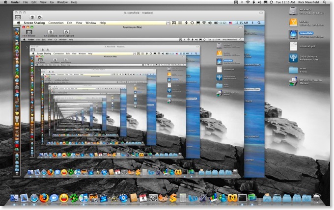
I carry most of my current work on my MacBook, but occasionally when I'm working at home, I prefer to use the iMac and simply start up a screen-sharing session back to my MacBook. So recently, I wondered what would happen if I started up a screen share on each Mac to the other Mac. Here is my result (click on the image to see a larger version):
|
Nifty Leopard Tricks: Windows Machines on the Network Have a Blue Screen of Death
10/29/2007 11:19 Filed in: Technology
In the new Macintosh Leopard finder, Windows machines showing up on the network are represented as a CRT monitor with a blue screen of death.
Here is a screenshot taken of computers on the SBTS library's wifi network. The very top machine listed under shared is a Mac which if highlighted shows an OS X aqua background. But the rest of the computers are Windows machines and if you look closely at the one I selected you'll see it's representing the dreaded blue screen of death indicating a system failure of some kind..
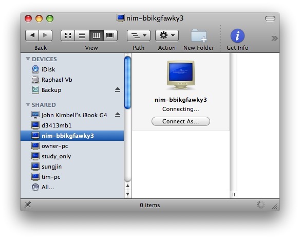
Paul Thurrott calls this "lame and childish" and says that it's hubris on Apple's part since a bug in the installation of Leopard caused some folks to get a blue screen of their own. Personally, I find it simply to be an amusing and friendly jab at Microsoft from Apple. But then again, my installation went smoothly
Oh, and contrary to what the screen above shows, I did NOT connect to someone else's computer. I wouldn't do that without permission!
Here is a screenshot taken of computers on the SBTS library's wifi network. The very top machine listed under shared is a Mac which if highlighted shows an OS X aqua background. But the rest of the computers are Windows machines and if you look closely at the one I selected you'll see it's representing the dreaded blue screen of death indicating a system failure of some kind..
Paul Thurrott calls this "lame and childish" and says that it's hubris on Apple's part since a bug in the installation of Leopard caused some folks to get a blue screen of their own. Personally, I find it simply to be an amusing and friendly jab at Microsoft from Apple. But then again, my installation went smoothly
Oh, and contrary to what the screen above shows, I did NOT connect to someone else's computer. I wouldn't do that without permission!
Nifty Leopard Tricks: Cover Flow
10/27/2007 19:10 Filed in: Technology
No, I'm not going to offer a review of Leopard. Those are everywhere, and they're mostly positive. I will say that my installation of the OS went smoothly and have had no issues doing the things I normally do on my Macs.
Check out the Cover Flow view of Biblical Illustrator files below. Be sure to click on the image to see it full size.
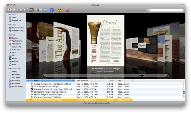
Way cool!
Check out the Cover Flow view of Biblical Illustrator files below. Be sure to click on the image to see it full size.
Way cool!
Leopard Guided Tour
10/22/2007 11:52 Filed in: Technology
I highly recommend viewing the 25 minute Mac OS X Leopard Guided Tour. Even if you're not a Mac user, you should check it out to see what you're missing. Just try not to feel too sorry for yourself
And if that's not enough, check out Apple's page of 316 new features in Leopard.
And if that's not enough, check out Apple's page of 316 new features in Leopard.
10 Days to Leopard
10/16/2007 19:54 Filed in: Technology
Apple's website has now been updated allowing us to see even more details about the new OS, including what they are counting as 316 new features. Not all of these features are earth-shattering, and some have appeared in various forms on the Linux or Windows platforms, but the release is significant nonetheless.
Final requirements for the new OS are as follows:
- Mac computer with an Intel, PowerPC G5, or PowerPC G4 (867MHz or faster) processor
- 512MB of memory
- DVD drive for installation
- 9GB of available disk space
- Some features require a compatible Internet service provider; fees may apply.
- Some features require Apple's .Mac service; fees apply.
In case you Mac users didn't catch it, G3 processors have been completely cut from the list of computers that will run the lastest OS X, as well as certain G4's such as my Cube which I'm about to put on Craig's List anyway.
I've already been asked if I'm going to stand in line for my copy of Leopard. Well, I'm not, although that would certainly be a fun thing to do. However, ever since the eighties when I began buying software, I've usually been able to receive academic discounts. If I wasn't a student, I was a teacher. If I wasn't either, Kathy was one or the other, so I've always had such access. However, I was disappointed that the academic price of Leopard is only $116, a mere 10% off the regular price of $129. In the past new releases have been $79. I know that folks who pay full price regularly will have no sympathy, but I find it ironic that during Apple's most successful time in the history of the company, they've become the most stingy in their pricing.
The image below shows off the new desktop in Leopard. Notice the new "stacks" feature meant to keep your desktop uncluttered. what I find interesting is that there are no icons on the desktop at all, not even an icon for the main hard drive.
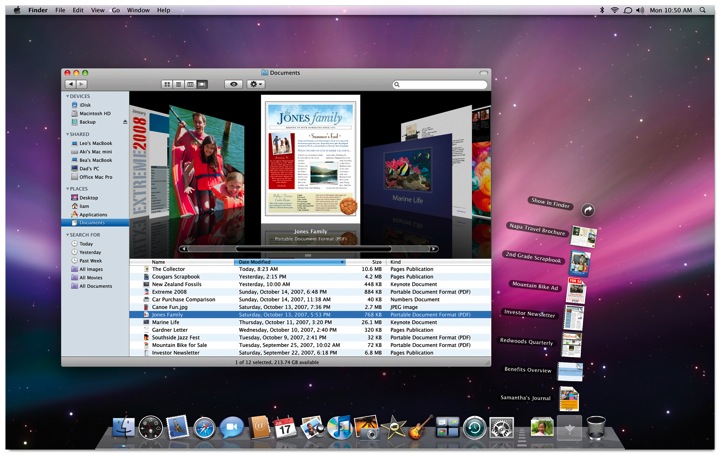
If this is the new default desktop, personally I hope that it can be customized. I'd prefer to have an icon for the hard drive and any other files or application aliases I choose to park there. If memory serves, the original OS X public beta in 2000 did not have a desktop hard drive icon either, but demand from users made Apple change this by the final release in the Spring of 2001. I think Unca Steve just likes clean desktops and wants all of us to appreciate the same. In general, I clean mine up every two weeks or so and either file or delete stray icons. Nevertheless, I'd prefer to have the option for a messy desktop if I want it. A desktop in which a person cannot add any icons at all reminds me of Windows 3.x in which the user could only change the desktop picture.
I'm very intrigued by some of the new features that work with the .Mac service. One of the most valuable aspects of .Mac for my needs is the ability to sync calendars, address books, email, web bookmarks, keychains, and more on any Mac in which I have a login. Even if I am going to use someone else's Mac for a temporary amount of time, I can create my own login, add my .Mac info and within minutes, all my personal information is included on the new machine. Leopard adds further functionality such as syncing dock items, dashboard widgets, notes, and system preferences.
I'm also intrigued by the new "Back to My Mac" feature described as "Connect to any of your Mac computers at home from any Mac on the Internet. Your home computers appear in the shared section of the sidebar. Just click and you’re in." That's really helpful since the 160 GB hard drive on my MacBook gets pretty crowded. Now, I'll be able to leave files on my desktop machine at home and access them from any place I have internet access.
In case you haven't guessed by now, I tend to be an early adopter with these kinds of things. Yes, I know there's always room for disaster, but I backed up all my personal files just this week, and I never add hacks to my system that often are the cause of problem upgrades. Apple's promised to deliver Leopard on the afternoon of the 26th. My MacBook will updated within the hour. If you don't hear from me for a few days afterwards, you can just assume that everything blew up.
The New Look of Leopard Previewed in iTunes 7?
09/12/2006 20:57 Filed in: Technology
Today, Apple released iTunes 7 which is one of the most significant updates since the software was first introduced. You can read about all of the new features at any of the standard Mac news sites. But there's another feature that is easily overlooked.
The OS X Aqua interface has had a translucent candy-like appearance since version 1.0. Way back when Steve Jobs first showed it off, he said the interface looked so good, you would want to lick it. Well, I've never been into an OS that much, but Aqua did look good back in the day. Basically, it was a reproduction of the translucency in the original iMacs that had helped Apple regain a place of significance in the computer market. But gradually, the candy-colored look of Aqua has started to get old after five years. It has been lessened over time--the pinstripes, for instance, have been toned down or removed altogether from many applications.
So, after installing iTunes 7 and exploring all the new features, something else jumped out at me. Other than the standard red, yellow and green buttons in the top left corner, there's no translucency in the iTunes 7 interface at all. Compare versions beginning with the previous version 6:
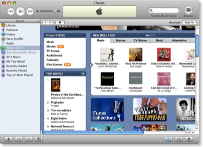
The most obvious example of translucency in the above image are the scrollbars, but the sign-in, play, forward, reverse, and home buttons are all translucent.
Now notice iTunes 7:
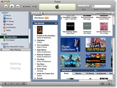
As I mentioned earlier, the only translucence in the interface is found in the buttons in the top left corner. None of the other buttons have a glassy translucence at all. Now if that were the only change, I might not have thought anything about it. But notice the scrollbars. The trademark translucent blue is gone, replaced by a shaded slate blue.
Now this is very interesting. Last month at the Worldwide Developers Conference, Steve Jobs remained oddly tightlipped about the upcoming version of OS X, codenamed "Leopard." He did show off ten new features, but said that he was keeping much of the new OS to himself for the time being so that Microsoft couldn't copy everything into the upcoming Windows Vista. At the time, this sounded simply like another jab at Microsoft from Jobs, but what if there really is something to it?
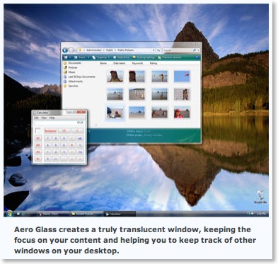
Consider this. It's no secret that Microsoft has always seemingly taken its cues from Apple in regard to its Windows interface. And in the new Windows Vista, translucency is everywhere. But it's not called "Aqua," of course--that would be too obvious. In Vista, the interface is called "Aero" (I'm not kidding). Here is a screen capture from Microsoft's own website:
You can't blame Steve for wanting to keep some of the features in the next version of OS X secret until Vista ships. And wouldn't it be funny once Vista is released in all of its Aero translucency, if Steve simply declares the see-through look passé and removes it entirely in the final release of Leopard?
For Microsoft, that'd be like showing up to the dance in last year's dress.
Wouldn't that be a kicker?
Apparently, I'm not the only one noticing this. See "Aqua Is Dead, Long Live Aqua" at the Unofficial Apple Weblog.
The OS X Aqua interface has had a translucent candy-like appearance since version 1.0. Way back when Steve Jobs first showed it off, he said the interface looked so good, you would want to lick it. Well, I've never been into an OS that much, but Aqua did look good back in the day. Basically, it was a reproduction of the translucency in the original iMacs that had helped Apple regain a place of significance in the computer market. But gradually, the candy-colored look of Aqua has started to get old after five years. It has been lessened over time--the pinstripes, for instance, have been toned down or removed altogether from many applications.
So, after installing iTunes 7 and exploring all the new features, something else jumped out at me. Other than the standard red, yellow and green buttons in the top left corner, there's no translucency in the iTunes 7 interface at all. Compare versions beginning with the previous version 6:
The most obvious example of translucency in the above image are the scrollbars, but the sign-in, play, forward, reverse, and home buttons are all translucent.
Now notice iTunes 7:
As I mentioned earlier, the only translucence in the interface is found in the buttons in the top left corner. None of the other buttons have a glassy translucence at all. Now if that were the only change, I might not have thought anything about it. But notice the scrollbars. The trademark translucent blue is gone, replaced by a shaded slate blue.
Now this is very interesting. Last month at the Worldwide Developers Conference, Steve Jobs remained oddly tightlipped about the upcoming version of OS X, codenamed "Leopard." He did show off ten new features, but said that he was keeping much of the new OS to himself for the time being so that Microsoft couldn't copy everything into the upcoming Windows Vista. At the time, this sounded simply like another jab at Microsoft from Jobs, but what if there really is something to it?
Consider this. It's no secret that Microsoft has always seemingly taken its cues from Apple in regard to its Windows interface. And in the new Windows Vista, translucency is everywhere. But it's not called "Aqua," of course--that would be too obvious. In Vista, the interface is called "Aero" (I'm not kidding). Here is a screen capture from Microsoft's own website:
You can't blame Steve for wanting to keep some of the features in the next version of OS X secret until Vista ships. And wouldn't it be funny once Vista is released in all of its Aero translucency, if Steve simply declares the see-through look passé and removes it entirely in the final release of Leopard?
For Microsoft, that'd be like showing up to the dance in last year's dress.
Wouldn't that be a kicker?
Apparently, I'm not the only one noticing this. See "Aqua Is Dead, Long Live Aqua" at the Unofficial Apple Weblog.