


Biblical Typography: Brian Sooy's Contribution to the History of the Printed Bible
A few weeks back when I wrote my review of the New Living Translation, I demonstrated how much more wordy the second edition is over the first by displaying Genesis 1 from both editions in parallel columns. Also making the second edition more text-heavy than the first, according to the NLT website, were the "Many marginal notes ... added to help the reader study manuscript differences and to show the relationship between a literal translation and the rendering in the NLT." All of this makes for a potentially larger Bible. In fact, between more words in the text and added marginal notes, the NLT2 is 10% longer than the NLT1!
Like any design project, this one had a brief with some technical criteria, to help define and solve the design problem.
• Achieve a better character count (to maximize space and ultimately save paper)
• Eliminate artificial condensing of standard fonts (such as ITC Giovanni).
• Have visual similarities to ITC Giovanni, by Robert Slimbach.
• Make the font "stronger"
• Achieve as good as or better character count than ITC Weidemann or Century Old Style.
• Achieve better character count while maintaining readability.
Tim Botts said afterwards: "I was especially jazzed with the way the new One Year Bible turned out -- a 10% longer text in a stronger typeface -- yielding the same page count! To think we competed with Century OS and Weidemann -- and I think -- won."
We chose some key characters to design with similarities to ITC Giovanni - which Tyndale has been using for many Bibles, condensed 10% for space savings. This was also to show design management that the font would have that warm and friendly look that they had come to appreciate with Giovanni, and that they didn't want to lose. Overall Lucerna has its own character and visual appeal, with limited influence by ITC Giovanni.
So the font is a design solution to these technical and aesthetic considerations. Lucerna has indeed yielded printing/paper savings for Tyndale due to its space-saving design and should prove highly legible for the targeted demographic readers.
While recently visiting the history of the Bible exhibit, Ink & Blood (see my review here), Sooy had a surreal moment. As he toured through the antique Bibles, some of which resulted in martyrs' deaths, Sooy realized that he, too, had managed a contribution to the history of the English Bible:
What struck me the most as I stood looking at the Bibles, reading the stories of the translators, and considering their impact on history – is that nobody was trying to kill me (that I know of) or persecute me (other than the left-wing side of the political spectrum) for contributing to publishing a Bible.
It seemed to me to be a strange culmination of events: I had purchased my first Macintosh (The SE30) in 1990, and released my first typeface intended for Bibles in 1995 (Veritas). Seven years later, I began Lucerna, and the first Bibles typeset in it were released in 2004.
It's difficult to describe the sensation I had while standing in the middle of all this history. The Lucerna Project was significant both personally and professionally, and I am aware that I have been given the opportunity to contribute to the history of the Bible. But why me? I'll always be grateful for the opportunity.
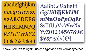
Both the Lucerna and Veritas typefaces are clear and easy to read. These are much better than the narrowed fonts that are in some Bibles, especially thinlines. As I said at the beginning of this post, the Bible is a big book. I hope that publishers will remember that not every Bible coming off the press has to necessarily be a thinline or a compact Bible. There are lots of us out here who don't mind carrying a larger Bible if that means that the text will not be crowded and the pages will not be too thin to write our notes on.
I note that the Veritas font is available for purchase, but Lucerna is not. Veritas was created independently with Bibles in mind, but Lucerna was created under contract for Tyndale. Nevertheless, I wonder how easy it would be to use a font like Veritas (cost = $75) and simply print my own wide-margin Bible. The idea seems more appealing everyday...
For Further Reading:
• "From Genesis to Revelation: Lucerna"
• "From Parchment to Postscript" (Design Matters Blog)
• "Outreach Edition Font" (ESV Blog)
HT: "Picking the Font for the NLTse" (Andrew Dodson's Blog)
Photo of Brian Sooy borrowed from http://www.flickr.com/photos/69297311@N00/sets/654658/