iPhone Bible App Roundup: 08/09/07
08/09/2007 11:28 Filed in: Technology | Faith & Reason
[This post was supposed to go up July 28 originally, but RapidWeaver has consistently crashed four times while I'm writing it. Perhaps it has to do with the large number of graphic files. I don't know, but this is becoming increasingly frustrating.]
About three weeks have passed since I wrote my first iPhone Bible app roundup. Yet in that very short span of time, four new iPhone Bible offerings have been made available. In this post I will offer short reviews of each of these apps.
While looking at these apps, I began to notice some similarities in interfaces. I discovered that a number of them are based on the "iPhone User Interface" (iUI) created by Joe Hewitt. This interface is similar to the color and design of some of the Apple-based apps on the iPhone such as the Mail app and the list view in the iPod app. Of course, it's not just Bible apps that are using the iUI; a quick look at the iPhone Application List shows that lots of folks are using it. This is in spite of the fact that Hewitt himself has called the interface a bit boring. Personally, I like the simplicity of Hewitt's interface because I immediately know how to use any app created with it.
Also, I want to point out that although I used screen captures from my MacBook for the last roundup, from this point forward, I will be using a camera to take pictures of the screen to give a better idea of what these apps look like on an actual iPhone (with one exception below). The downside of that is that the images will not be as clear as the previous ones. That is not to say that these apps are not clear on the actual iPhone, but rather that it is just extremely difficult to take a picture of the screen on an electronic device. I did finally figure out that I should turn off my flash though.
iPhone Bible (NAB)
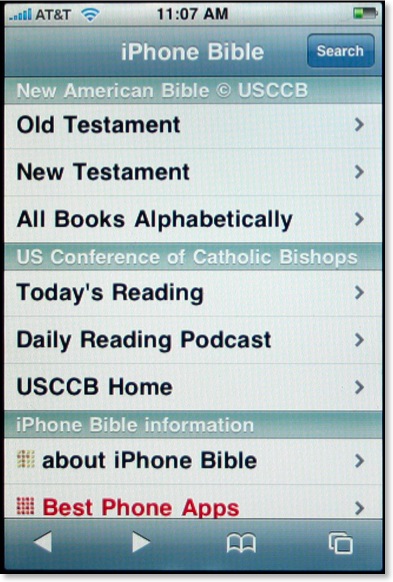
I was initially intrigued when I first heard of the iPhone Bible (does this mean they now have control of that name?) because it would be the first iPhone Bible app to include the deuterocanonicals/apocrypha. Using Hewitt's aforementioned iUI, the opening screen of the iPhone Bible is both clear and colorful. Using a similar method we've seen elsewhere, the user selects Old or New Testament, which leads to the appropriate books of that testament (plus preface and section introductions), chapter numbers, and finally the full text of the selected chapter. That's where the surprise comes.
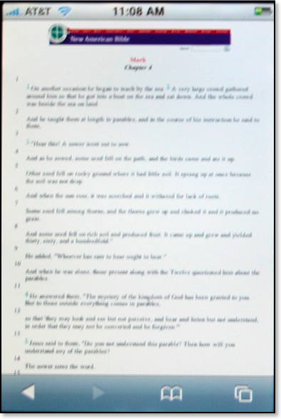
The biblical text for the iPhone actually comes from the already existing NAB pages from the United States Council of Catholic Bishops website. What that means is that these pages are not already formatted to a mobile device such as the iPhone and as demonstrated above, can be barely read at first. To see the text better, the user has two options. First, the iPhone can be turned sideways:
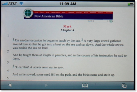
This is helpful, but still not a perfect solution. Another option of course is to simply do the iPhone multi-touch pinch resulting in text as large as desired:
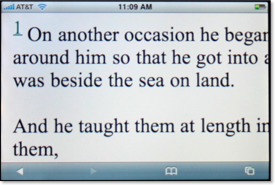
Yes, Steve said we'd have the actual internet on the iPhone, but it's not always as practical as it sounds. Even with the text enlarged, this is still not an ideal solution for reading large sections of Scripture as one would constantly have to move the page around to see the entire text.
The NAB iPhone Bible is a great idea, but it suffers from the inherently small text that renders from the original USCCB pages. There is no search function built into the iPhone Bible, but there is a search available upon arriving at the USCCB pages. However, the user will want to restrict searches to the entire Bible because by default the entire site is searched. This was certainly a good idea, but perhaps the developers could get permission to reformat the NAB text specifically for the iPhone and other mobile devices.
The Net Bible
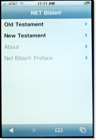
Soon after I got my iPhone, I thought to myself how incredible it might be to have the NET Bible with all 60,000 notes literally in the palm of my hand. I contacted the folks at Bible.org to suggest they offer a NET Bible iphone app, but they were already well ahead of me as they had already been considering the very same thing. The NET Bible for the iPhone also uses Hewitt's iUI, and the navigation to a particular passage of the Bible is similar to the one described above.
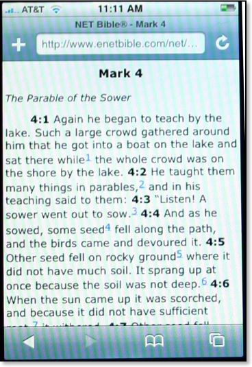
In my last set of reviews, I praised iBibleSpace for the best interface of any iPhone Bible app so far. That evaluation remains so far, but I can say that the NET Bible has the best layout of text of any of the Bible apps so far. Not only are all formatting features (italics, bold, etc.) retained from the original NET Bible, but also the text is large and not crowded. There are spaces before and after section headings so that the text does not run together. Note the blue numbers above. These are links to the NET Bible's 60,000+ textual notes. The folks at Bible.org have thought through the implementation of these notes quite well because when the user seeks to access the NET notes, an entirely separate page is launched. This allows the user to flip back and forth between the text and the notes without having to wait for a page to load from the internet.
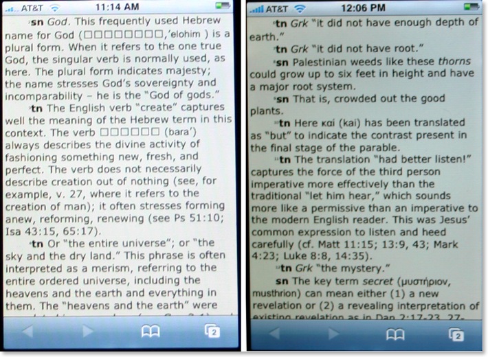
However, a current limitation of the iPhone causes a problem in the NET Bible notes as well. Compare these two screens below--notes from Gen 1 on the left and Mark 4 on the right:
[Note: the actual screens of the NET Bible notes are the same color. The images above just reflect my poor photography skills.]
As I mentioned in a previous post, Hebrew does not show up correctly yet on the iPhone. So notice on the left image which contains notes from Genesis 1, that square boxes appear where Hebrew text displays in the original. There are other places where the boxes show up in place of Hebrew, such as the section headings in Psalm 119 and references to Sinaiticus in the NT notes. However, on the right screen, with notes from Mark 4, the Greek word μυστήριον appears correctly. I would recommend to the NET Bible team that for right now they do nothing to "fix" this text. The iPhone will have to include Hebrew as the phone is marketed internationally. One would assume that the addition of Hebrew and other international fonts will be included in a later iPhone software update. I should also point out that the since I took these shots, the superscript numbering at the beginning of each note has been enlarged.
The NET Bible on the iPhone will no doubt be very beneficial to many iPhone users, including myself. Like a lot of these apps, there's no search feature as of yet. I might also throw out a challenge to the programmers to create a window that has the biblical text on top and the notes on bottom (or side to side if the phone is turned). Regardless, this is a good and needed beginning.
God's iPhone (GWT)
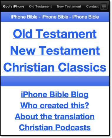
[Note: the above image was taken as a screenshot off my MacBook because the opening screen has changed so dramatically since I first took my photographs.]
God's iPhone was created by Israel Anderson of New Zealand. This Bible app uses the lesser known, but still very good, God's Word Translation of the Bible. This project is not yet complete, but so far, Anderson has made available the entire New Testament and parts of the Old Testament (Genesis, Exodus, and Psalms). Also Anderson has added a section for Christian classic (presumably public domain) works. The first entry made available is A. W. Tozer's Pursuit of God.
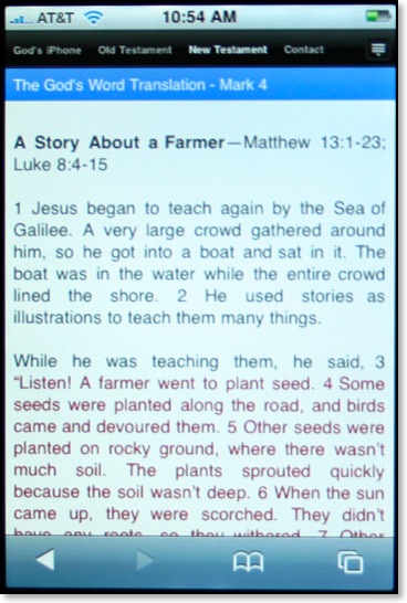
I'm assuming that Anderson has used RapidWeaver's new iPhone template for his Bible app. As a RW user myself I've played around with this template in hopes of eventually offering a Greek NT for the iPhone (but I'm not sure how legal this is since the NA text is copyrighted). The RW iPhone template includes a drop down menu seen in the icon at the far right of the image above. Anderson has opted not to take advantage of this leaving all menu items on the screen. This is just as well because I've found it difficult to make selections with this menu in my own tests.
As seen in the image above, text is clear and well spaced, but I can't help thinking it would be easier to read if the text were not displayed using full justification. Studies have shown that full justification, while looking neat and orderly, is actually harder to read because it makes it harder for the eyes to find the next line.
Regardless, God's iPhone has an easy to use interface and has the distinction of being the only way to view the GWT on the iPhone. There is no search function yet, but it is still a work in progress.
ESV Mobile
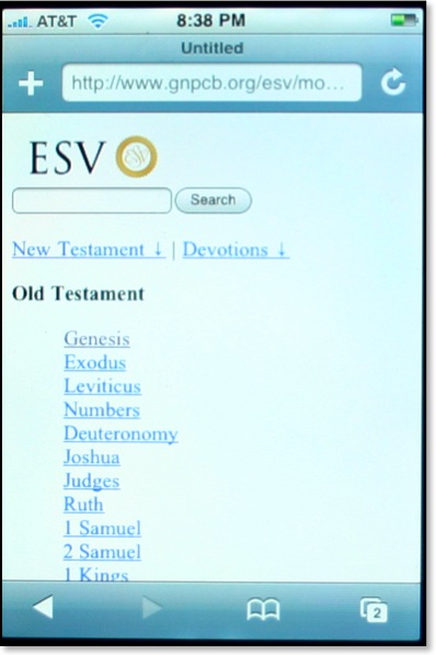
I've found the community of ESV users to be quite savvy when it comes to the internet and most things technological. They tend to be forward thinking and embrace new technologies quicker than those who sponsor competing translations of the Bible. Crossway, the publisher of the ESV has updated their mobile site making it more iPhone friendly. This now makes three separate iPhone apps that use the ESV (iBibleSpace uses the ESV by default and 3onesix allows for the ESV by including the abbreviation before a search). Crossway is distinguished as being the first major Bible publisher as of this writing that has offered a method of reading the Bible to iPhone users.
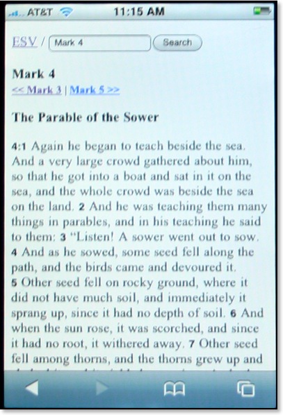
A very helpful feature of the ESV Mobile site is the inclusion of a search feature on every screen. The text is formatted with plenty of space, perhaps even better than iBibleSpace which tends to run headings and text together and use a verse by verse format. Oddly however, the text itself when viewed on the iPhone is serifed in spite of the fact that when I look at it on my MacBook it is sans serifed. I'm not sure what font is being used, or if one is specified at all, but I would think a sans serifed font like Arial or Helvetica would be much easier to read not only on the iPhone, but other mobile devices as well.
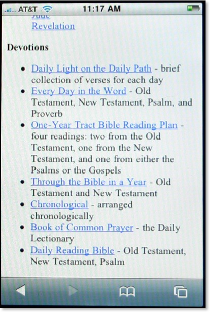
The ESV Mobile site also offers a variety of daily devotionals/readings as well. Like I said in my review of iBibleSpace, I can't imagine reading a devotional from my iPhone (or even a full daily reading of the BIble), but others may be more so inclined.
If you hear of an iPhone Bible app, or an iPhone app related to biblical studies, be sure to let me know and I'll mention it here on This Lamp.
About three weeks have passed since I wrote my first iPhone Bible app roundup. Yet in that very short span of time, four new iPhone Bible offerings have been made available. In this post I will offer short reviews of each of these apps.
While looking at these apps, I began to notice some similarities in interfaces. I discovered that a number of them are based on the "iPhone User Interface" (iUI) created by Joe Hewitt. This interface is similar to the color and design of some of the Apple-based apps on the iPhone such as the Mail app and the list view in the iPod app. Of course, it's not just Bible apps that are using the iUI; a quick look at the iPhone Application List shows that lots of folks are using it. This is in spite of the fact that Hewitt himself has called the interface a bit boring. Personally, I like the simplicity of Hewitt's interface because I immediately know how to use any app created with it.
Also, I want to point out that although I used screen captures from my MacBook for the last roundup, from this point forward, I will be using a camera to take pictures of the screen to give a better idea of what these apps look like on an actual iPhone (with one exception below). The downside of that is that the images will not be as clear as the previous ones. That is not to say that these apps are not clear on the actual iPhone, but rather that it is just extremely difficult to take a picture of the screen on an electronic device. I did finally figure out that I should turn off my flash though.
iPhone Bible (NAB)

I was initially intrigued when I first heard of the iPhone Bible (does this mean they now have control of that name?) because it would be the first iPhone Bible app to include the deuterocanonicals/apocrypha. Using Hewitt's aforementioned iUI, the opening screen of the iPhone Bible is both clear and colorful. Using a similar method we've seen elsewhere, the user selects Old or New Testament, which leads to the appropriate books of that testament (plus preface and section introductions), chapter numbers, and finally the full text of the selected chapter. That's where the surprise comes.

The biblical text for the iPhone actually comes from the already existing NAB pages from the United States Council of Catholic Bishops website. What that means is that these pages are not already formatted to a mobile device such as the iPhone and as demonstrated above, can be barely read at first. To see the text better, the user has two options. First, the iPhone can be turned sideways:

This is helpful, but still not a perfect solution. Another option of course is to simply do the iPhone multi-touch pinch resulting in text as large as desired:

Yes, Steve said we'd have the actual internet on the iPhone, but it's not always as practical as it sounds. Even with the text enlarged, this is still not an ideal solution for reading large sections of Scripture as one would constantly have to move the page around to see the entire text.
The NAB iPhone Bible is a great idea, but it suffers from the inherently small text that renders from the original USCCB pages. There is no search function built into the iPhone Bible, but there is a search available upon arriving at the USCCB pages. However, the user will want to restrict searches to the entire Bible because by default the entire site is searched. This was certainly a good idea, but perhaps the developers could get permission to reformat the NAB text specifically for the iPhone and other mobile devices.
The Net Bible

Soon after I got my iPhone, I thought to myself how incredible it might be to have the NET Bible with all 60,000 notes literally in the palm of my hand. I contacted the folks at Bible.org to suggest they offer a NET Bible iphone app, but they were already well ahead of me as they had already been considering the very same thing. The NET Bible for the iPhone also uses Hewitt's iUI, and the navigation to a particular passage of the Bible is similar to the one described above.

In my last set of reviews, I praised iBibleSpace for the best interface of any iPhone Bible app so far. That evaluation remains so far, but I can say that the NET Bible has the best layout of text of any of the Bible apps so far. Not only are all formatting features (italics, bold, etc.) retained from the original NET Bible, but also the text is large and not crowded. There are spaces before and after section headings so that the text does not run together. Note the blue numbers above. These are links to the NET Bible's 60,000+ textual notes. The folks at Bible.org have thought through the implementation of these notes quite well because when the user seeks to access the NET notes, an entirely separate page is launched. This allows the user to flip back and forth between the text and the notes without having to wait for a page to load from the internet.
However, a current limitation of the iPhone causes a problem in the NET Bible notes as well. Compare these two screens below--notes from Gen 1 on the left and Mark 4 on the right:

[Note: the actual screens of the NET Bible notes are the same color. The images above just reflect my poor photography skills.]
As I mentioned in a previous post, Hebrew does not show up correctly yet on the iPhone. So notice on the left image which contains notes from Genesis 1, that square boxes appear where Hebrew text displays in the original. There are other places where the boxes show up in place of Hebrew, such as the section headings in Psalm 119 and references to Sinaiticus in the NT notes. However, on the right screen, with notes from Mark 4, the Greek word μυστήριον appears correctly. I would recommend to the NET Bible team that for right now they do nothing to "fix" this text. The iPhone will have to include Hebrew as the phone is marketed internationally. One would assume that the addition of Hebrew and other international fonts will be included in a later iPhone software update. I should also point out that the since I took these shots, the superscript numbering at the beginning of each note has been enlarged.
The NET Bible on the iPhone will no doubt be very beneficial to many iPhone users, including myself. Like a lot of these apps, there's no search feature as of yet. I might also throw out a challenge to the programmers to create a window that has the biblical text on top and the notes on bottom (or side to side if the phone is turned). Regardless, this is a good and needed beginning.
God's iPhone (GWT)

[Note: the above image was taken as a screenshot off my MacBook because the opening screen has changed so dramatically since I first took my photographs.]
God's iPhone was created by Israel Anderson of New Zealand. This Bible app uses the lesser known, but still very good, God's Word Translation of the Bible. This project is not yet complete, but so far, Anderson has made available the entire New Testament and parts of the Old Testament (Genesis, Exodus, and Psalms). Also Anderson has added a section for Christian classic (presumably public domain) works. The first entry made available is A. W. Tozer's Pursuit of God.

I'm assuming that Anderson has used RapidWeaver's new iPhone template for his Bible app. As a RW user myself I've played around with this template in hopes of eventually offering a Greek NT for the iPhone (but I'm not sure how legal this is since the NA text is copyrighted). The RW iPhone template includes a drop down menu seen in the icon at the far right of the image above. Anderson has opted not to take advantage of this leaving all menu items on the screen. This is just as well because I've found it difficult to make selections with this menu in my own tests.
As seen in the image above, text is clear and well spaced, but I can't help thinking it would be easier to read if the text were not displayed using full justification. Studies have shown that full justification, while looking neat and orderly, is actually harder to read because it makes it harder for the eyes to find the next line.
Regardless, God's iPhone has an easy to use interface and has the distinction of being the only way to view the GWT on the iPhone. There is no search function yet, but it is still a work in progress.
ESV Mobile

I've found the community of ESV users to be quite savvy when it comes to the internet and most things technological. They tend to be forward thinking and embrace new technologies quicker than those who sponsor competing translations of the Bible. Crossway, the publisher of the ESV has updated their mobile site making it more iPhone friendly. This now makes three separate iPhone apps that use the ESV (iBibleSpace uses the ESV by default and 3onesix allows for the ESV by including the abbreviation before a search). Crossway is distinguished as being the first major Bible publisher as of this writing that has offered a method of reading the Bible to iPhone users.

A very helpful feature of the ESV Mobile site is the inclusion of a search feature on every screen. The text is formatted with plenty of space, perhaps even better than iBibleSpace which tends to run headings and text together and use a verse by verse format. Oddly however, the text itself when viewed on the iPhone is serifed in spite of the fact that when I look at it on my MacBook it is sans serifed. I'm not sure what font is being used, or if one is specified at all, but I would think a sans serifed font like Arial or Helvetica would be much easier to read not only on the iPhone, but other mobile devices as well.

The ESV Mobile site also offers a variety of daily devotionals/readings as well. Like I said in my review of iBibleSpace, I can't imagine reading a devotional from my iPhone (or even a full daily reading of the BIble), but others may be more so inclined.
If you hear of an iPhone Bible app, or an iPhone app related to biblical studies, be sure to let me know and I'll mention it here on This Lamp.
|


