iWeb: So Much Ingenuity, So Many Missing Features
01/26/2006 00:31 Filed in: Technology
How many web design software packages have I used over the years? Probably more than I haven't used. In the past I've used FrontPage (both Windows & Mac versions), PageMill, GoLive, Dreamweaver, .Mac Homepage templates, iBlog (if that counts) and currently RapidWeaver. While programs like GoLive and Dreamweaver are incredibly powerful, I admit I'm lazy. I'm a sucker for website templates that allow me to create a consistent look and feel and get pages up and running with the utmost speed. Therefore, I was immediately interested in iWeb, the new addition to Apple's consumer-level media suite, iLife '06.
In fact, I've created a little test site in iWeb using material from This Lamp. You can check it out yourself at http://web.mac.com/rmansfield/iWeb/Site/Welcome.html. Here is a screenshot of the blog page I made:
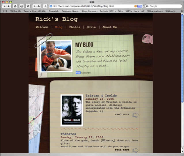
What's cool about iWeb is that it's entirely drag and drop. See the cool little objects on the borders like the ticket stub or the map? These are totally removable. You can drop something else in if you want. The picture at the top of me and Bessie can be changed to any picture simply by dragging another picture from the finder or from the media browser (shown to the right). Even the text that says "My Blog" is totally editable and becomes a graphic (similar I suppose to WordArt in MS Office) when published to the web. Buttons for email, counters, and "Made on a Mac" can be added to any page. On my test site, I added them to each page, but to be honest, they look out of place.
This object oriented, drag and drop ability is perhaps iWeb's greatest strength. It gives you a true WYSIWYG layout that is only limited by your own creativity. The included themes and templates look good by themselves, but you can completely rework them to suit your own tastes. Objects can be placed on top of one another. In fact, I find it interesting to watch the pages "build" when I view them in Safari. Masking tools are included as well so that only part of your images show or you can conform them to predesigned shapes. I currently use RapidWeaver for my website, and I can honestly say that iWeb beats RapidWeaver hands down in the abilities described above.
The interface for iWeb has more in common with Pages and Keynote than then other applications in iLife suite, right down to the Inspector. I've read elsewhere that iWeb was originally supposed to be included in iWork '06, but was switched over to iLife instead. Good idea. It will definitely get more exposure with iLife.
iWeb comes with a number of nicely designed themes and six basic template pages, although I'm not really sure that a welcome page is all that necessary on any site. On This Lamp, the default "home" page is simply my blog. However in the test iWeb site I created (see link above), I did make a welcome page for demonstration purposes.
iWeb seems to be most at home publishing to a .Mac account, but can actually publish to any server. However, certain features like the hit counters don't work outside of .Mac. Why that is I don't know, and unfortunately, you cannot currently add third party counters.
All in all, iWeb is an extremely powerful website building program that is simple and intuitive enough to use that anyone can have a website up and running in a very short period of time. Unfortunately, a number of glaring feature oversights will keep the more experienced website creator from forgetting that this is a version 1.0 program.
The most telling deficiencies are in the blogging template. And these lacking features will be enough to frustrate anyone who has blogged with other software. Here's the short list:
• No categories.
• No ability to incorporate comments or trackbacks, although some ingenious workarounds are starting to appear. See this description on Apple's discussion boards.
• No ability to include direct snippets of HTML code or edit the HTML code at all outside of opening the generated files in another program. However, any such hacked changes will be lost the next time you publish from iWeb. That means no blog rolls, no Google or Amazon ads, no third party counters, no sidebar polls, etc.
• No sidebars. Although some of the blog templates give the illusion of a separate sidebar or frame, essentially they do not.
However, iWeb has RapidWeaver beat by allowing blog entries to be viewed on their own page, thus creating true permalinks, something that RapidWeaver does not do yet (much to my frustration, RapidWeaver only designates unique entry ID's for blogs, but not true permalinks that direct to a separate page; I manually create the permlinks at the end of each blog).
Further, some basic templates that are available in the .Mac Homepage editor are missing such as a page for file downloads. Of course, you could always take an About Me page and clear the objects and then add links, but this would not be anywhere near the ease of the current .Mac Homepage implementation where you simply drop files in your iDisk's public folder. I've even kept this feature in RapidWeaver by adding a frame around my original Homepage file download template.
One important drawback...once you choose a particular template theme, you'd better like it because it can't be changed! This limitation doesn't make good sense to me, although I suppose it has to do with the fact that many of the elements inherent to a template are extremely specific to that theme. Evidently, they wouldn't transfer well to a different theme. However, I will freely suggest that one of RapidWeaver's strengths is that you CAN change your theme anytime and give your site a whole new look. But again, RapidWeaver themes will probably not have the number of elements available for editing or even deleting that iWeb does.
Whenever I look at software that duplicates the functions of an application I'm already using, I ask myself what it would take for me to switch. I mean I'm not beyond switching considering I moved 140+ blog entries last Fall from iBlog to RapidWeaver (of course now I am pushing 230 entries). The drag and drop design capabilities of iWeb tugs at my creative heart. However, the list of features described above is the dealbreaker for me.
I have no doubt that Apple will improve iWeb over time. Unfortunately, the only iLife program that gets any periodic attention throughout the year is iTunes because it makes money for Apple. Thus, I don't expect to see improvements to iWeb before January, 2007.
iWeb will be fine for most folks if none of those missing items are part of one's needs in a website. The ability to place hyperlinks and graphics are a tremendous improvement over the old .Mac pages, although sadly, a very elementary one. But if currently you have all your eggs in the .Mac Homepage template basket, consider moving to iWeb. Even with the lack of features that some of us can't live without, you'll still have one really good looking website.
In fact, I've created a little test site in iWeb using material from This Lamp. You can check it out yourself at http://web.mac.com/rmansfield/iWeb/Site/Welcome.html. Here is a screenshot of the blog page I made:
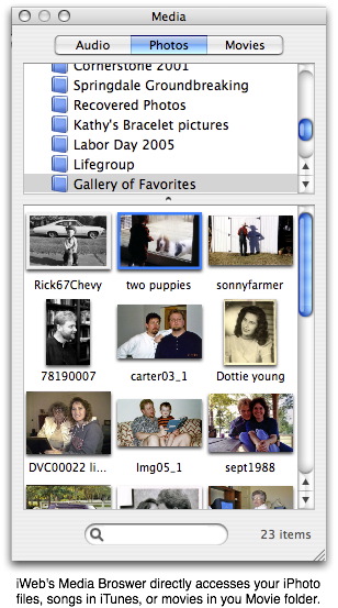
What's cool about iWeb is that it's entirely drag and drop. See the cool little objects on the borders like the ticket stub or the map? These are totally removable. You can drop something else in if you want. The picture at the top of me and Bessie can be changed to any picture simply by dragging another picture from the finder or from the media browser (shown to the right). Even the text that says "My Blog" is totally editable and becomes a graphic (similar I suppose to WordArt in MS Office) when published to the web. Buttons for email, counters, and "Made on a Mac" can be added to any page. On my test site, I added them to each page, but to be honest, they look out of place.
This object oriented, drag and drop ability is perhaps iWeb's greatest strength. It gives you a true WYSIWYG layout that is only limited by your own creativity. The included themes and templates look good by themselves, but you can completely rework them to suit your own tastes. Objects can be placed on top of one another. In fact, I find it interesting to watch the pages "build" when I view them in Safari. Masking tools are included as well so that only part of your images show or you can conform them to predesigned shapes. I currently use RapidWeaver for my website, and I can honestly say that iWeb beats RapidWeaver hands down in the abilities described above.
The interface for iWeb has more in common with Pages and Keynote than then other applications in iLife suite, right down to the Inspector. I've read elsewhere that iWeb was originally supposed to be included in iWork '06, but was switched over to iLife instead. Good idea. It will definitely get more exposure with iLife.
iWeb comes with a number of nicely designed themes and six basic template pages, although I'm not really sure that a welcome page is all that necessary on any site. On This Lamp, the default "home" page is simply my blog. However in the test iWeb site I created (see link above), I did make a welcome page for demonstration purposes.
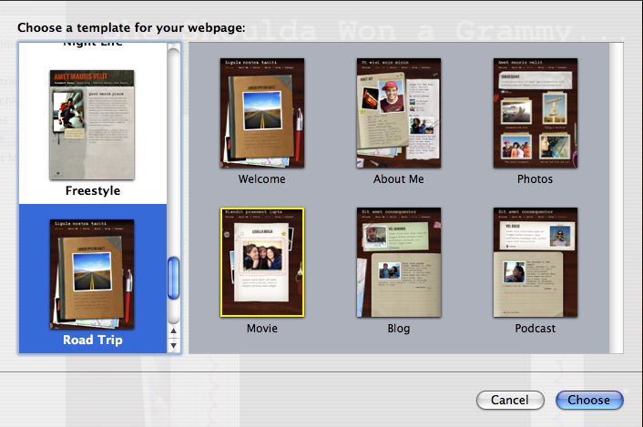
iWeb seems to be most at home publishing to a .Mac account, but can actually publish to any server. However, certain features like the hit counters don't work outside of .Mac. Why that is I don't know, and unfortunately, you cannot currently add third party counters.
All in all, iWeb is an extremely powerful website building program that is simple and intuitive enough to use that anyone can have a website up and running in a very short period of time. Unfortunately, a number of glaring feature oversights will keep the more experienced website creator from forgetting that this is a version 1.0 program.
The most telling deficiencies are in the blogging template. And these lacking features will be enough to frustrate anyone who has blogged with other software. Here's the short list:
• No categories.
• No ability to incorporate comments or trackbacks, although some ingenious workarounds are starting to appear. See this description on Apple's discussion boards.
• No ability to include direct snippets of HTML code or edit the HTML code at all outside of opening the generated files in another program. However, any such hacked changes will be lost the next time you publish from iWeb. That means no blog rolls, no Google or Amazon ads, no third party counters, no sidebar polls, etc.
• No sidebars. Although some of the blog templates give the illusion of a separate sidebar or frame, essentially they do not.
However, iWeb has RapidWeaver beat by allowing blog entries to be viewed on their own page, thus creating true permalinks, something that RapidWeaver does not do yet (much to my frustration, RapidWeaver only designates unique entry ID's for blogs, but not true permalinks that direct to a separate page; I manually create the permlinks at the end of each blog).
Further, some basic templates that are available in the .Mac Homepage editor are missing such as a page for file downloads. Of course, you could always take an About Me page and clear the objects and then add links, but this would not be anywhere near the ease of the current .Mac Homepage implementation where you simply drop files in your iDisk's public folder. I've even kept this feature in RapidWeaver by adding a frame around my original Homepage file download template.
One important drawback...once you choose a particular template theme, you'd better like it because it can't be changed! This limitation doesn't make good sense to me, although I suppose it has to do with the fact that many of the elements inherent to a template are extremely specific to that theme. Evidently, they wouldn't transfer well to a different theme. However, I will freely suggest that one of RapidWeaver's strengths is that you CAN change your theme anytime and give your site a whole new look. But again, RapidWeaver themes will probably not have the number of elements available for editing or even deleting that iWeb does.
Whenever I look at software that duplicates the functions of an application I'm already using, I ask myself what it would take for me to switch. I mean I'm not beyond switching considering I moved 140+ blog entries last Fall from iBlog to RapidWeaver (of course now I am pushing 230 entries). The drag and drop design capabilities of iWeb tugs at my creative heart. However, the list of features described above is the dealbreaker for me.
I have no doubt that Apple will improve iWeb over time. Unfortunately, the only iLife program that gets any periodic attention throughout the year is iTunes because it makes money for Apple. Thus, I don't expect to see improvements to iWeb before January, 2007.
iWeb will be fine for most folks if none of those missing items are part of one's needs in a website. The ability to place hyperlinks and graphics are a tremendous improvement over the old .Mac pages, although sadly, a very elementary one. But if currently you have all your eggs in the .Mac Homepage template basket, consider moving to iWeb. Even with the lack of features that some of us can't live without, you'll still have one really good looking website.