1989 Was a Great Year for Hot Dogs
Meanwhile, I figured that some of you might get a kick out of this picture of Kathy and me from 1989. A college buddy of mine sent this to me tonight, and I'm not too proud to share it.

Click on the picture to get a larger view (if you're up for that kind of thing).
This Lamp Is Not Moving (Sorry for the Confusion)
So, I apologize to all the folks who reset their links and subscriptions. I promise not to do this again anytime soon.
But for right now, everything is staying right here.
NLT Update: August 2007
This past week I received correspondence from Kevin O'Brien, Director of Bibles and Bible Reference at Tyndale House Publishers. Although there is no timetable at the moment, the folks at Tyndale are evidently considering taking an existing edition of the New Living Translation and making a wide margin Bible out of it.
O'Brien's question to me, and one that I'm passing on to you is, "Is there is a specific edition of the NLT that you would prefer to see used for such a Bible?" Leave your thoughts in the comments. I'll make sure to pass them on.
_________________________________________________________________
I also heard from Laura Bartlett, who is a marketing manager at Tyndale. Some of you may remember my review of the NLT Premium Slimline a few months back. Although overall, this was a nice text edition of the NLT with a readable font, but it was marred by text that was way too close to the inner margin. It's hard to read without pressing the Bible flat in the middle.
Well, Laura tells me that there's a new NLT Personal Size Large print coming out that includes a larger font (12 pt.) and an inside margin that is a tenth of an inch wider than the previous edition. This might not sound like much, but it's enough to make the Bible much more usable than the earlier edition I reviewed. The new NLT Personal Size Large is also a good bit thicker than the other edition (2128 pages vs. 1560 pages!).
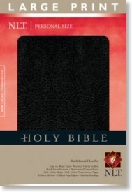
ISBN-13: 978-1-4143-1405-1 Hardcover
ISBN-13: 978-1-4143-1401-3 Bonded Black
ISBN-13: 978-1-4143-1402-0 Bonded Burgundy
ISBN-13: 978-1-4143-1403-7 LeatherLike Black
ISBN-13: 978-1-4143-1404-4 LeatherLike Burgundy
ISBN-13: 978-1-4143-1871-4 LeatherLike Brown/Tan
To access a PDF sampler of the new NLT Personal Size Large Print Bible, click here.
Laura also mentioned the new Discover God Study Bible:
Our big new deal in NLT Bibles right now is the Discover God Study Bible. The premise is that it’s the only study Bible in which the notes all focus on the person of God, what he has revealed to us about himself in the Bible, and how we can be in relationship with him. It’s not primarily for new believers, which the title can imply. Most of the notes are from Bill Bright’s ministry. It has an innovative topic system that some people are calling the “Thompson Chain of the 21st Century.
And then finally, Laura told me about an upcoming product that sounds extremely interesting. Unfortunately, it didn't make it into the Fall catalog, so I can't talk about it...yet.
iPhone Bible App Roundup: 08/09/07
About three weeks have passed since I wrote my first iPhone Bible app roundup. Yet in that very short span of time, four new iPhone Bible offerings have been made available. In this post I will offer short reviews of each of these apps.
While looking at these apps, I began to notice some similarities in interfaces. I discovered that a number of them are based on the "iPhone User Interface" (iUI) created by Joe Hewitt. This interface is similar to the color and design of some of the Apple-based apps on the iPhone such as the Mail app and the list view in the iPod app. Of course, it's not just Bible apps that are using the iUI; a quick look at the iPhone Application List shows that lots of folks are using it. This is in spite of the fact that Hewitt himself has called the interface a bit boring. Personally, I like the simplicity of Hewitt's interface because I immediately know how to use any app created with it.
Also, I want to point out that although I used screen captures from my MacBook for the last roundup, from this point forward, I will be using a camera to take pictures of the screen to give a better idea of what these apps look like on an actual iPhone (with one exception below). The downside of that is that the images will not be as clear as the previous ones. That is not to say that these apps are not clear on the actual iPhone, but rather that it is just extremely difficult to take a picture of the screen on an electronic device. I did finally figure out that I should turn off my flash though.
iPhone Bible (NAB)
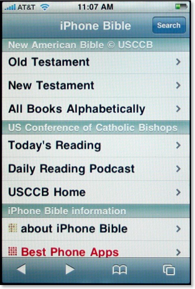
I was initially intrigued when I first heard of the iPhone Bible (does this mean they now have control of that name?) because it would be the first iPhone Bible app to include the deuterocanonicals/apocrypha. Using Hewitt's aforementioned iUI, the opening screen of the iPhone Bible is both clear and colorful. Using a similar method we've seen elsewhere, the user selects Old or New Testament, which leads to the appropriate books of that testament (plus preface and section introductions), chapter numbers, and finally the full text of the selected chapter. That's where the surprise comes.
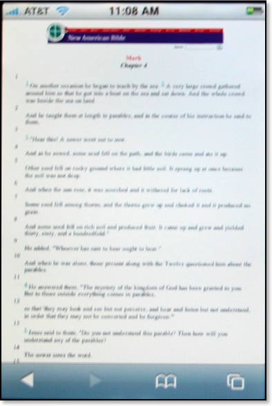
The biblical text for the iPhone actually comes from the already existing NAB pages from the United States Council of Catholic Bishops website. What that means is that these pages are not already formatted to a mobile device such as the iPhone and as demonstrated above, can be barely read at first. To see the text better, the user has two options. First, the iPhone can be turned sideways:
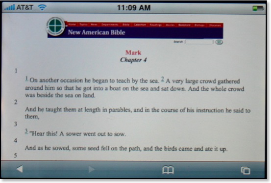
This is helpful, but still not a perfect solution. Another option of course is to simply do the iPhone multi-touch pinch resulting in text as large as desired:
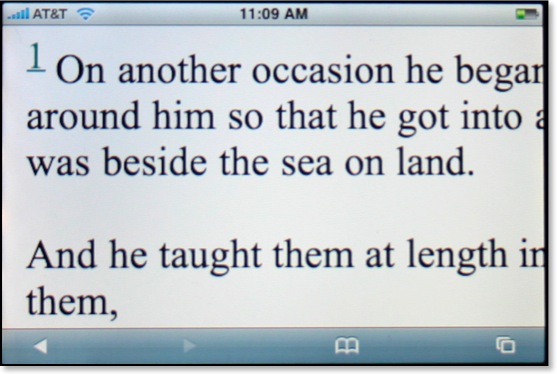
Yes, Steve said we'd have the actual internet on the iPhone, but it's not always as practical as it sounds. Even with the text enlarged, this is still not an ideal solution for reading large sections of Scripture as one would constantly have to move the page around to see the entire text.
The NAB iPhone Bible is a great idea, but it suffers from the inherently small text that renders from the original USCCB pages. There is no search function built into the iPhone Bible, but there is a search available upon arriving at the USCCB pages. However, the user will want to restrict searches to the entire Bible because by default the entire site is searched. This was certainly a good idea, but perhaps the developers could get permission to reformat the NAB text specifically for the iPhone and other mobile devices.
The Net Bible
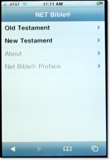
Soon after I got my iPhone, I thought to myself how incredible it might be to have the NET Bible with all 60,000 notes literally in the palm of my hand. I contacted the folks at Bible.org to suggest they offer a NET Bible iphone app, but they were already well ahead of me as they had already been considering the very same thing. The NET Bible for the iPhone also uses Hewitt's iUI, and the navigation to a particular passage of the Bible is similar to the one described above.
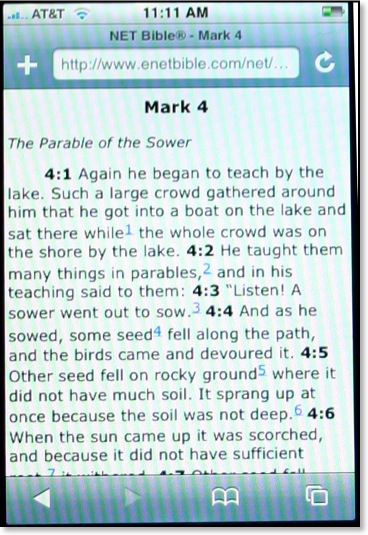
In my last set of reviews, I praised iBibleSpace for the best interface of any iPhone Bible app so far. That evaluation remains so far, but I can say that the NET Bible has the best layout of text of any of the Bible apps so far. Not only are all formatting features (italics, bold, etc.) retained from the original NET Bible, but also the text is large and not crowded. There are spaces before and after section headings so that the text does not run together. Note the blue numbers above. These are links to the NET Bible's 60,000+ textual notes. The folks at Bible.org have thought through the implementation of these notes quite well because when the user seeks to access the NET notes, an entirely separate page is launched. This allows the user to flip back and forth between the text and the notes without having to wait for a page to load from the internet.
However, a current limitation of the iPhone causes a problem in the NET Bible notes as well. Compare these two screens below--notes from Gen 1 on the left and Mark 4 on the right:
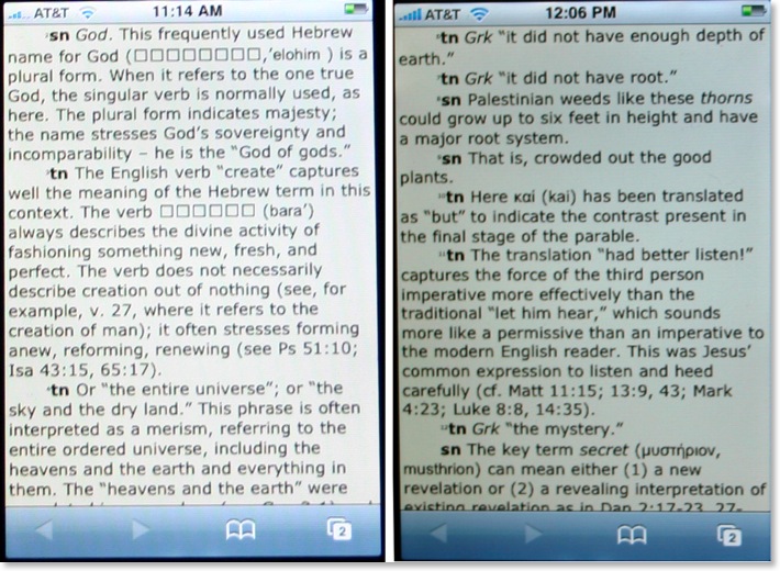
[Note: the actual screens of the NET Bible notes are the same color. The images above just reflect my poor photography skills.]
As I mentioned in a previous post, Hebrew does not show up correctly yet on the iPhone. So notice on the left image which contains notes from Genesis 1, that square boxes appear where Hebrew text displays in the original. There are other places where the boxes show up in place of Hebrew, such as the section headings in Psalm 119 and references to Sinaiticus in the NT notes. However, on the right screen, with notes from Mark 4, the Greek word μυστήριον appears correctly. I would recommend to the NET Bible team that for right now they do nothing to "fix" this text. The iPhone will have to include Hebrew as the phone is marketed internationally. One would assume that the addition of Hebrew and other international fonts will be included in a later iPhone software update. I should also point out that the since I took these shots, the superscript numbering at the beginning of each note has been enlarged.
The NET Bible on the iPhone will no doubt be very beneficial to many iPhone users, including myself. Like a lot of these apps, there's no search feature as of yet. I might also throw out a challenge to the programmers to create a window that has the biblical text on top and the notes on bottom (or side to side if the phone is turned). Regardless, this is a good and needed beginning.
God's iPhone (GWT)
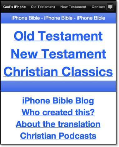
[Note: the above image was taken as a screenshot off my MacBook because the opening screen has changed so dramatically since I first took my photographs.]
God's iPhone was created by Israel Anderson of New Zealand. This Bible app uses the lesser known, but still very good, God's Word Translation of the Bible. This project is not yet complete, but so far, Anderson has made available the entire New Testament and parts of the Old Testament (Genesis, Exodus, and Psalms). Also Anderson has added a section for Christian classic (presumably public domain) works. The first entry made available is A. W. Tozer's Pursuit of God.
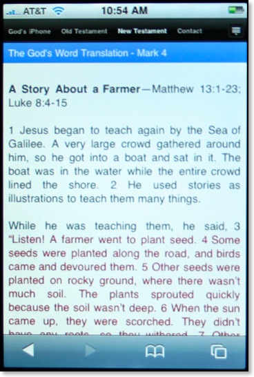
I'm assuming that Anderson has used RapidWeaver's new iPhone template for his Bible app. As a RW user myself I've played around with this template in hopes of eventually offering a Greek NT for the iPhone (but I'm not sure how legal this is since the NA text is copyrighted). The RW iPhone template includes a drop down menu seen in the icon at the far right of the image above. Anderson has opted not to take advantage of this leaving all menu items on the screen. This is just as well because I've found it difficult to make selections with this menu in my own tests.
As seen in the image above, text is clear and well spaced, but I can't help thinking it would be easier to read if the text were not displayed using full justification. Studies have shown that full justification, while looking neat and orderly, is actually harder to read because it makes it harder for the eyes to find the next line.
Regardless, God's iPhone has an easy to use interface and has the distinction of being the only way to view the GWT on the iPhone. There is no search function yet, but it is still a work in progress.
ESV Mobile
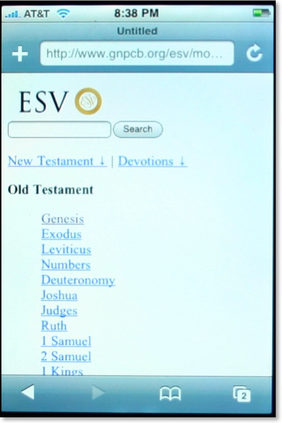
I've found the community of ESV users to be quite savvy when it comes to the internet and most things technological. They tend to be forward thinking and embrace new technologies quicker than those who sponsor competing translations of the Bible. Crossway, the publisher of the ESV has updated their mobile site making it more iPhone friendly. This now makes three separate iPhone apps that use the ESV (iBibleSpace uses the ESV by default and 3onesix allows for the ESV by including the abbreviation before a search). Crossway is distinguished as being the first major Bible publisher as of this writing that has offered a method of reading the Bible to iPhone users.
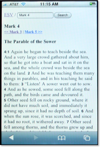
A very helpful feature of the ESV Mobile site is the inclusion of a search feature on every screen. The text is formatted with plenty of space, perhaps even better than iBibleSpace which tends to run headings and text together and use a verse by verse format. Oddly however, the text itself when viewed on the iPhone is serifed in spite of the fact that when I look at it on my MacBook it is sans serifed. I'm not sure what font is being used, or if one is specified at all, but I would think a sans serifed font like Arial or Helvetica would be much easier to read not only on the iPhone, but other mobile devices as well.
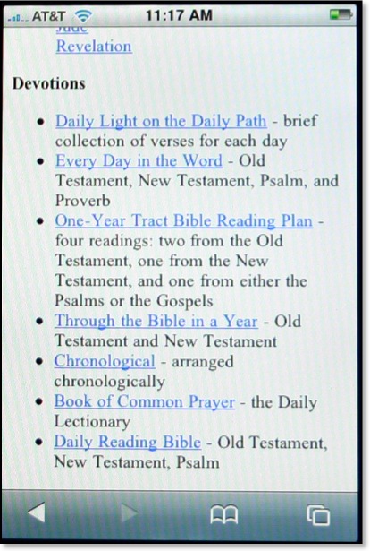
The ESV Mobile site also offers a variety of daily devotionals/readings as well. Like I said in my review of iBibleSpace, I can't imagine reading a devotional from my iPhone (or even a full daily reading of the BIble), but others may be more so inclined.
If you hear of an iPhone Bible app, or an iPhone app related to biblical studies, be sure to let me know and I'll mention it here on This Lamp.
New Version of Apple Pages Checks for Gender-Specific Words
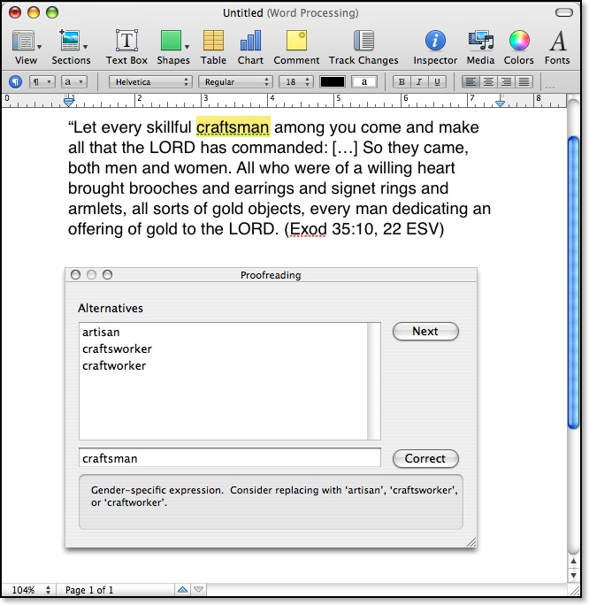
I didn't know it until today, but MS Word 2004 checks for gender-specific terms, too. However when I pasted the above verse in Word, kinsman was not flagged.
Pages, which is part of Apple's iWork suite was introduced in 2005. Version 3 (or '08), which debuted yesterday, is the first release to include a grammar checker of any kind, and evidently, it's more specific than that in the current version of Word for the Mac.
Plural "You" in John 1:51

My third point, drawn from John 1:47-51, I labeled "Be ready for the unexpected." In my initial study of this passage, I noticed that in the Greek that in v. 51 Jesus shifts from simply addressing Nathaniel to addressing other disciples who were presumably present. Translating a plural you into English can be a bit tricky since we technically don't have a separate word in standard English for the second person plural. A fairly literal translation of this verse would read something like this:
And he said to him, "Truly, truly I say to y'all [ὑμῖν], y'all will see [ὄψεσθε] heaven open...
Of course, I can translate with y'all because I grew up in the south. And I should also mention that the KJV communicates the second person plural (at least clearly in the second instance) because Elizabethan English also allowed for the distinction by using the now archaic ye:
And he saith unto him, Verily, verily, I say unto you, Hereafter ye shall see heaven open (John 1:51 KJV)
Regardless, when there is a shift of person in the Bible such as that in v. 51, I readily admit that it's not always significant. But here I believe it is. Jesus' message of what a disciple would experience was not something meant for Nathaniel alone. A few translations make an effort to represent the second person plural, but most traditionally have not. Originally, I had been planning to use the NLT for this message, not only because I believe it communicated the entire passage well, but especially because it brought out the plural "you" here:
Then he said, “I tell you the truth, you will all see heaven open... (John 1:51 NLT)
However, then on Friday, I received my copy of the NET Readers Bible in the mail. Looking at the passage and especially v. 51, I was pleased to see the second person plural rendered here as well:
He continued, “I tell all of you the solemn truth–you will see heaven opened... (John 1:51 NET)
Thus I began my little "NET for a month" experiment and preached from it on Sunday.
I should point out that a number of other translations mention the plural "you's" in the footnotes, including the ESV, HCSB, NRSV, NIV and TNIV. The REB is another translation that renders the plural in the actual text.
So which is better: text or notes? I would suggest that the better rendering is when it can be done in the text for the sake of those listening without a Bible in front of them.
Feel free to leave your opinion in the comments.
This Lamp Set to Move (Tentatively)

I also think I've begun to reach the limits of RapidWeaver's ability to handle my site. The recent update improved this somewhat, but there are still problems. The actual site on the web is over 1300 separate files, but RapidWeaver keeps them all contained in one file on my MacBook. Right now, this file is over 150 mb in size. It takes a while to load and forever to save and shut down. I have continued fear of it losing integrity one day, but I do back it up regularly.

If you simply have my site linked/saved/bookmarked as www.thislamp.com, you will be fine as I will simply change the pointers to the new site. However, if you link directly to these files or subscribe to the RSS feed, you will have to update your bookmarks.
There's still a chance this won't happen, but from everything I've seen of iWeb '08, I think it's about time to pack my virtual bags.
NET for a Month

I’m doing this so that I can get to know the translation better. When I wrote my Top Ten Bible Translations series, I included the NET Bible in my honorable mentions but not in my top ten. Like most who are familiar with the NET, I’ve been very impressed with the inclusion of the 60K+ notes in the regular edition, but I’ve never spent a whole lot of time with the translation itself. I’ll confess that my limited amount of time with the NET has made me think the translation is a bit flat at times, kind of like the original NIV. However, this may be an unfair assessment since as I have said, I really have not spent enough time with it to give the NET translation a fair evaluation.
I’d been planning this little experiment for a while, but today I received in the mail a nice top grain leather edition of the Reader’s Edition of the NET sent to me by Mitch Guthrie who works with Bible.org. This is a really nice edition of the NET Bible, with only about 10% of the full notes, but fits in the hand quite well. It has a very readable print size and mercifully, it’s not a thinline. [Thanks again for the Bible, Mitch.]
So, in an attempt to become better friends with the NET, I am going to attempt to use it as a primary (but not exclusive) translation over the next month or so. That means when I leave the house, I’ll take the NET Bible with me. I’ll use it for teaching as well as preaching (I’m filling in for my pastor day after tomorrow) and I’ll use it in my IWU classes for our devotionals. As I often bring along a Greek NT in my book bag, too, I’m going to take the NET Diglot instead of the normal Greek NT I carry.
Although my top ten series is over, I promised to continue reviewing Bible translations. So after my 30 days or so with the NET Bible, I’ll post a full review along the same kind of format as my earlier reviews. Look for this sometime in September.
Missing My Wide Margin NASB
Frequent readers of This Lamp will remember that although I've always been an aficionado of Bible translations, I used the NASB for almost two decades in teaching and preaching settings until I became convicted a couple of years ago that the formality and literalness of the translation itself was getting in the way of what I was trying to teach. Since then, I have primarily used the TNIV in public, but I've also used the HCSB and NLT to a certain extent as well. And often even when needing to carry a translation to a setting where I wasn't presenting, I tended to pick up my TNIV.
But yesterday is a good example of this "change" in my habits. I've been meeting a friend of mine for breakfast for a couple of years now, and we usually read a book together and discuss it over bagels. Over the last few weeks we've been reading Bonhoeffer's Cost of Discipleship. Yesterday as I was heading out the door to meet for breakfast, I grabbed a Bible as I always do. But instead of grabbing the TNIV Study Bible which has been my practice for a few months, I picked up my wide margin NASB.
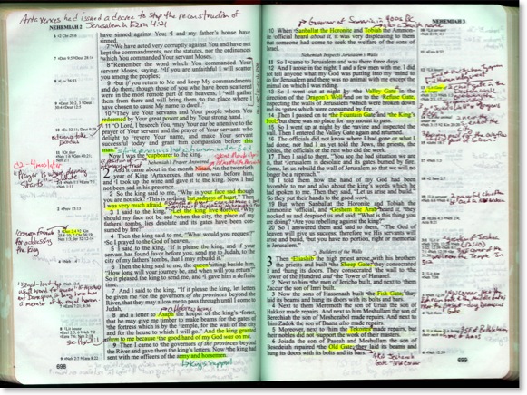
Doesn't the TNIV Study Bible have notes? Sure it does. But the notes in my NASB are my notes. These notes are the facts and insights that stuck out to me. These notes are the triggers I used to discuss the text when I was teaching it last. The TNIV Study Bible is the first study Bible that I have ever consistently carried with me. It's notes are helpful, but I find that I don't automatically turn to them. I look at them if I need to look something up and hope that the information I need is there.
After using other Bibles for over a year and a half now, I have to admit that i really miss my wide margin NASB. And I don't think it's the NASB that I miss so much, although I will always have a great familiarity with it. What I miss is the ability to refer to my notes, to refer to a tangible experience of having spent time--studied and wrestled--with a particular passage before. I don't have notes on every page of my Bible. But the notes that I do have are footprints that I was there, evidence that I stopped and camped out a while, as opposed to merely passing by.
I stay in a continuing conundrum. I really do feel committed to public use of a contemporary translation. And I would prefer a gender-accurate, non-Tyndale translation when presenting in front of mixed audiences. But no usable wide margin edition of a contemporary translation exists that meets these factors. There is no wide margin NLT and the only wide margin TNIV offering limits writing space to one column on a two column page and has paper too thin for extensive use. I might be willing to settle for the HCSB even though it is not gender accurate, but the pages in its only wide margin offering are so thin that they curl when writing on them.
At this point, I would like a new wide margin Bible (leather, of course) in a contemporary translation--any translation. I'm willing to transcribe my notes even a third time. TNIV? NLT? NET? HCSB? Something else? At this point, I'm not even overly concerned with the exact translation, in spite of the fact that I have my personal favorites and feel some are better suited for teaching than others. Whichever publisher first delivers a wide margin edition in one of these translation wins--at least with me.
Every Sunday morning when I leave for church, I push aside my wide margin NASB in favor of the TNIV Study Bible. Despite the fact that as I've studied a passage that I will be teaching I've taken diligent notes in the margins of my NASB, I've been forced to create a subset of these notes in the anemic margins of the TNIV Study Bible or in whatever white space I can manage. But the temptation to grab my trusty NASB and run remains. And I wonder if this temptation is growing stronger?


