The New Look of Leopard Previewed in iTunes 7?
09/12/2006 20:57 Filed in: Technology
Today, Apple released iTunes 7 which is one of the most significant updates since the software was first introduced. You can read about all of the new features at any of the standard Mac news sites. But there's another feature that is easily overlooked.
The OS X Aqua interface has had a translucent candy-like appearance since version 1.0. Way back when Steve Jobs first showed it off, he said the interface looked so good, you would want to lick it. Well, I've never been into an OS that much, but Aqua did look good back in the day. Basically, it was a reproduction of the translucency in the original iMacs that had helped Apple regain a place of significance in the computer market. But gradually, the candy-colored look of Aqua has started to get old after five years. It has been lessened over time--the pinstripes, for instance, have been toned down or removed altogether from many applications.
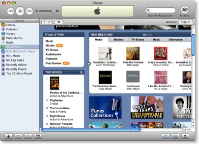
So, after installing iTunes 7 and exploring all the new features, something else jumped out at me. Other than the standard red, yellow and green buttons in the top left corner, there's no translucency in the iTunes 7 interface at all. Compare versions beginning with the previous version 6:

The most obvious example of translucency in the above image are the scrollbars, but the sign-in, play, forward, reverse, and home buttons are all translucent.
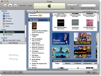
Now notice iTunes 7:

As I mentioned earlier, the only translucence in the interface is found in the buttons in the top left corner. None of the other buttons have a glassy translucence at all. Now if that were the only change, I might not have thought anything about it. But notice the scrollbars. The trademark translucent blue is gone, replaced by a shaded slate blue.
Now this is very interesting. Last month at the Worldwide Developers Conference, Steve Jobs remained oddly tightlipped about the upcoming version of OS X, codenamed "Leopard." He did show off ten new features, but said that he was keeping much of the new OS to himself for the time being so that Microsoft couldn't copy everything into the upcoming Windows Vista. At the time, this sounded simply like another jab at Microsoft from Jobs, but what if there really is something to it?
Consider this. It's no secret that Microsoft has always seemingly taken its cues from Apple in regard to its Windows interface. And in the new Windows Vista, translucency is everywhere. But it's not called "Aqua," of course--that would be too obvious. In Vista, the interface is called "Aero" (I'm not kidding). Here is a screen capture from Microsoft's own website:

You can't blame Steve for wanting to keep some of the features in the next version of OS X secret until Vista ships. And wouldn't it be funny once Vista is released in all of its Aero translucency, if Steve simply declares the see-through look passé and removes it entirely in the final release of Leopard?
For Microsoft, that'd be like showing up to the dance in last year's dress.
Wouldn't that be a kicker?
Apparently, I'm not the only one noticing this. See "Aqua Is Dead, Long Live Aqua" at the Unofficial Apple Weblog.
The OS X Aqua interface has had a translucent candy-like appearance since version 1.0. Way back when Steve Jobs first showed it off, he said the interface looked so good, you would want to lick it. Well, I've never been into an OS that much, but Aqua did look good back in the day. Basically, it was a reproduction of the translucency in the original iMacs that had helped Apple regain a place of significance in the computer market. But gradually, the candy-colored look of Aqua has started to get old after five years. It has been lessened over time--the pinstripes, for instance, have been toned down or removed altogether from many applications.
So, after installing iTunes 7 and exploring all the new features, something else jumped out at me. Other than the standard red, yellow and green buttons in the top left corner, there's no translucency in the iTunes 7 interface at all. Compare versions beginning with the previous version 6:

The most obvious example of translucency in the above image are the scrollbars, but the sign-in, play, forward, reverse, and home buttons are all translucent.
Now notice iTunes 7:

As I mentioned earlier, the only translucence in the interface is found in the buttons in the top left corner. None of the other buttons have a glassy translucence at all. Now if that were the only change, I might not have thought anything about it. But notice the scrollbars. The trademark translucent blue is gone, replaced by a shaded slate blue.
Now this is very interesting. Last month at the Worldwide Developers Conference, Steve Jobs remained oddly tightlipped about the upcoming version of OS X, codenamed "Leopard." He did show off ten new features, but said that he was keeping much of the new OS to himself for the time being so that Microsoft couldn't copy everything into the upcoming Windows Vista. At the time, this sounded simply like another jab at Microsoft from Jobs, but what if there really is something to it?
Consider this. It's no secret that Microsoft has always seemingly taken its cues from Apple in regard to its Windows interface. And in the new Windows Vista, translucency is everywhere. But it's not called "Aqua," of course--that would be too obvious. In Vista, the interface is called "Aero" (I'm not kidding). Here is a screen capture from Microsoft's own website:

You can't blame Steve for wanting to keep some of the features in the next version of OS X secret until Vista ships. And wouldn't it be funny once Vista is released in all of its Aero translucency, if Steve simply declares the see-through look passé and removes it entirely in the final release of Leopard?
For Microsoft, that'd be like showing up to the dance in last year's dress.
Wouldn't that be a kicker?
Apparently, I'm not the only one noticing this. See "Aqua Is Dead, Long Live Aqua" at the Unofficial Apple Weblog.


