


Review: NLT Premium Slimline Reference (Large Print)
05/15/2007 10:29 Filed in: Faith & Reason
When it comes to natural flow of the English language, it's hard to beat the New Living Translation. In 2004, Tyndale quietly introduced a radical (in my assessment) revision of the NLT, known as the "second edition" (see my review of the NLT for more information). Almost three years had gone by, and I didn't have what I considered to be a decent "public use" copy of the NLT second edition (or NLTse).
Going back to the original NLT first edition (or NLT1) of 1996, I had a nice burgundy bonded leather TouchPoint Bible and later a bonded leather Notemaker's Bible, which as I've said before happens to be one of the nicest wide-margin Bibles I've ever seen. But there's been nothing equivalent to these for the NLTse. The Bible publishing world seems obsessed with thinline/slimline/ultrathin Bibles or study Bibles. It seems that it's getting harder and harder to find a simple text or reference edition of the Bible, in leather, that has not only a readable text size, but also one that's not slimmed down to 3/4 of an inch. And no publisher besides Crossway seems to recognize the value of a wide-margin edition, but unfortunately, they don't publish my translations of choice. So with the NLTse, the only edition I had besides my electronic copy in Accordance, was a blue hardback/pew Bible.
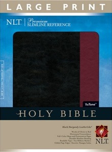
Now, about the actual Bible. I don't consider myself all that picky, but after three years of the NLTse's existence, I still couldn't find a decent copy for public use. However, just last month Tyndale released an edition that, while not perfectly matching my wants/needs, is certainly an attractive edition and will do for now. I've picked up the NLT Premium Slimline Reference (Large Print) in "TuTone" colors of black with a vertical burgundy stripe on the front cover. The binding is called "LeatherLike," and I'll come back to that shortly. You'll find an Amazon.com link to this Bible below, but I cannot find it on Tyndale's site as of this writing. I'll refer to the Bible simply as PSR from this point forward.
Slimline. My main compromise with this Bible is the Slimline factor. I don't care for thin Bibles because the pages tend to be too thin, and will not only wrinkle and wear too quickly, but also have a tendency for bleed through of the Bible's own text and any annotations that a user makes in the margins. The Amazon.com page for this Bible claims that it is 1.1" thick, but I would presume this to be in error; it seems thinner than that. I would have also preferred a single column of text, but the only single-column NLT I know of is the Life Application Study Bible, and that's not what I wanted in a public use Bible.
Text on the page. The box says that the PSR is "large print." Technically, the print size is 9.84 pt. according to a similar offering on Tyndale's site. The type is quite readable and very clear on the page. There is a certain amount of bleed through, but it's not as bad as some other popular Bibles out there. One nice thing about this edition is that even though it's large print, it doesn't say "Large Print" on the binding which is often code for "old person's Bible." Actually, I've preferred larger type in public use Bibles since I was 20 and long before I needed glasses. I've found that when I'm reading in front of an audience, in order to maintain eye contact, I'll need to regularly look away from the page and look at my audience. I found early on that if I used a Bible with small type, it was very easy to lose my place. Therefore, there's always benefit from a large type size (I'd prefer 10 pt. or larger) when teaching or preaching before a group. I suppose another compromise for me personally, is that this Bible contains red letter text for the words of Christ. I'd prefer Bibles not have red letters, but it's hard to find them without it in popular editions. At least the red isn't a glaring bright red; however, I'd have preferred the darker brick-like shade in the sample on the box than the actual pinkish dark red found on the page.
My main complaint about this Bible has to do with how close the inside column of text rests near the binding. It's way too close, and this may be an example of a something that seemed fine in the original proofs but doesn't work in the actual product. The inside margin should be at least 3 or 4 centimeters wider for readability's sake. I'm not exaggerating here when I say that to read from the inner columns of text in this Bible, whether aloud or to yourself, it will take holding it with one hand while the other hand presses the center open. I'm not sure what the continued strain on the binding will do to the spine over a long period of time. And considering the fact that this is not a saddle-stitched Bible, I wonder how well this edition will hold up.
What makes a reference edition a reference edition? To be honest, I'm always on the fence when it comes to cross-references. Extremely large numbers of cross-references don't impress me. I'm not opposed to a cross-reference system, but generally all I need in terms of references are those that point me to intertextual quotations and allusions and those that refer to parallel passages. Many cross-references tend to be thematic in nature and that's not so big of a selling point with me. Since this Bible is called a "Reference" BIble, I was expecting a full cross-reference system. However, that's not the case. Rather, in some verses, there is a † symbol (what is this symbol called?) and a corresponding reference is placed at the end of the paragraph. That's not a bad system in my opinion, but I imagine it would be limited by the space left available at the end of each paragraph. To see the kind of references that are in place in the PSR, I turned to the Gospel of Matthew. There was a † at the end of v. 17: "...and fourteen from the Babylonian exile to the Messiah." This corresponded to a reference to Luke 3:23-38, which is Luke's somewhat different genealogy. Turning the page, I saw another † at the end of Matt 1:24 following, "And Joseph named him Jesus." This led to a reference to Luke 2:1-7, which is part of Luke's account of the birth of Christ.
Then, however, I happened to look up at v. 23:
Look! The virgin will conceive a child!
She will give birth to a son,
and they will call him Immanuel,
which means "God is with us."
There was an asterisk after Immanuel pointing to the textual notes at the bottom of the page which referred to Isa 7:14 the source of the quotation in Mtt. 1:23. Therefore, it looks like the parenthetical references distinguish themselves from the cross references in the textual notes as being more thematic in nature. Turning a couple of pages over, I noticed that in Jesus' Sermon on the Mount, many of the notes cross reference to Luke's so-called "Sermon on the Plain" and other passages with parallel themes. In my opinion between these references and those in the textual notes, this is all someone like myself would really need. Others however may still wish for a more traditional columnar cross-reference system.
The PSR also includes a 52-page dictionary/concordance in the back with entries from abandon to zeal. So Aaron is not included, but Abraham is. In actuality, there aren't many individuals listed here. But an entry such as Abraham takes on more of the "dictionary" aspect to this section as it includes topical information with references to particular passages. A few other helps are included in the Bible such as "Great Chapters of the Bible," "Great Verses of the Bible to Memorize" (three pages' worth), a 365-Day Reading Plan (all Bibles should come with one or more reading plans) and eight full-color Bible maps. And although this isn't a wide-margin Bible, so one can't take notes in the text, I counted 18(!) blank pages between the reading plan and the maps which would be perfect for adding one's own notes.
Is it leather if it doesn't "Moo"? I said above that I prefer leather Bibles for public use. Well, technically, this isn't leather--it's something that Tyndale calls "LeatherLike" and I assume is very similar to the materials in Zondervan's "Italian DuoTone" and Crossway's "TruTone" Bibles. A good leather Bible gets softer over time with continued use. This is caused by the natural oils of your hands which soften a Bible's leather over time (and that's also why putting a Bible in a Bible cover or leaving it on a dashboard where it dries out in the heat is the worst thing you can do for a Bible). Well, this LeatherLook looks and feels like a Bible that's well worn in (first we have pre-faded jeans, and now...). It's soft to the touch and even has a slight leather smell (I wonder if that was artificially added at the factory?). I have no idea how these covers hold up over time, and what they'll look like in a couple of decades or more, but I have to say that they are so nice, I wouldn't mind it if I never bought actual leather again. The cover on this Bible is black with a wide vertical burgundy strip going down the front. It' looks very elegant and makes the Bible look like it cost much more than it did. Using these kinds of artificial materials accomplish a couple of things: (1) no cow has to die for your Bible [I'm not overly opposed to leather, but if you had Bossie right there in front of me and said "Leather or no leather..."] and (2) offers an elegant looking Bible at greatly reduced price. Who knows, if fine wines can move away from actual corks, maybe Bibles can move away from real leather.
I
n the final analysis, this is a very nice NLT which will be suitable for the time being as a public use Bible. I don't like to think of Bibles as consumable items, so I've taken to passing them on when if I decide I'm not going to use a particular edition anymore in the future. For those waiting for something even better, I do know that there is another project in the works at Tyndale which is probably more along the lines of what a person thinks of when considering a true "Reference Bible." At this point, I'm not allowed to say anymore about that Bible, but as I can I will let you know. In the meantime, if you need a nice NLT Bible for public use right now, the Premium Slimline Reference may be your best bet.