


First Look: Zondervan's NoteWorthy Bible
04/08/2009 23:49 Filed in: Faith & Reason
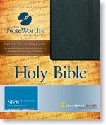
The official Zondervan description reads as follows:
Bible users, take note! With its unique design featuring blank right-hand pages, this Bible offers plenty of room for note taking. An accordion pocket inside provides added storage for loose notes. And an elastic band provides closure so you can keep everything securely in place.
Here are Theophrastus’ comments on the NIV Noteworthy Bible:
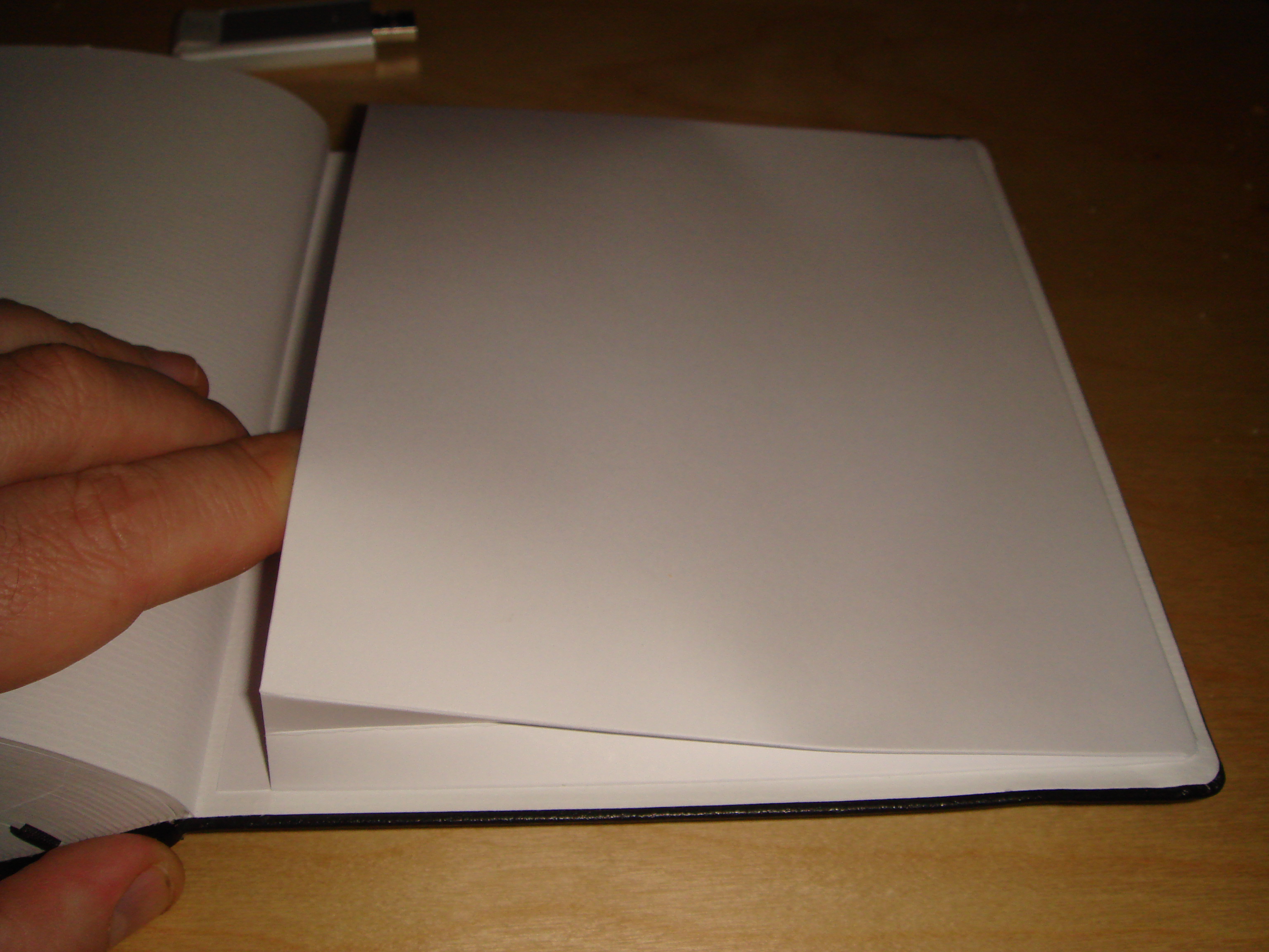
(a) Don't use this edition for taking notes. The bleed-through on the paper is so bad I can see down three pages. Since this is not a true interleaved edition (with a double-sided blank page of paper between each double-sided printed page of paper) your ink marks will mar right through the other side.
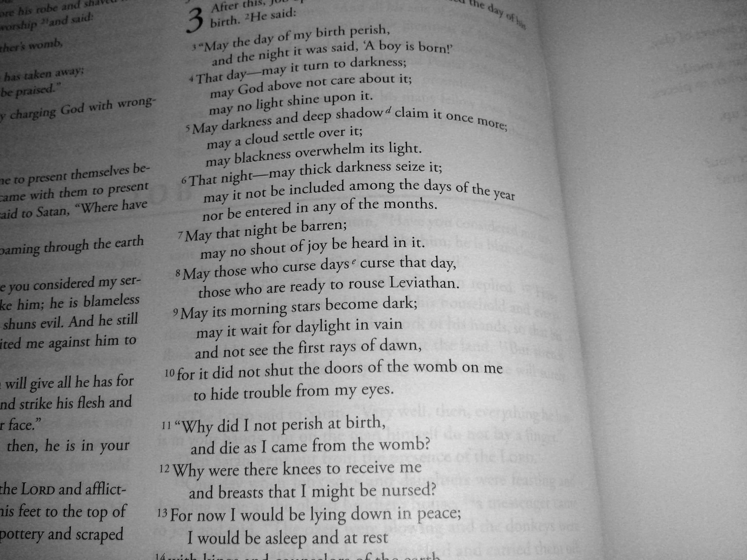
(b) Tiny font. The font size of the Little Oxford Bible is just five point, but the font size of the Noteworthy NIV appears to be slightly smaller than that. Thanks to my near-sightedness, I can read the Little Oxford Bible without magnifying glass, but I can't say the same Noteworthy NIV.
(c) Relatively generous inter-line spacing. Double column. Square size.

(d) Binding claims to be bonded leather but feels like slightly stiff paperback to me. No one would confuse this with a moleskin notebook.

(e) The elastic on the the outside binding makes it look like this binding is designed to fail! It also give the bible a slight fetishistic look -- maybe it is designed for folks who like to wear latex and elastic.


(f) The internal paper pocket on mine is already failing and I haven't put anything in it.
(g) The left top margin has the page number, an ugly 4-fold diamond mark, the book, name and chapter/verse, but the right top margin only says "notes", the diamond mark, and the page number, making it somewhat more difficult to find sections than one might desire. On the other hand, bleed-through on the Bible is so bad that one can simply read the mirror-image of text on the next page.
(h) No bonuses (no maps, no concordance, no cross-references, no book introductions) except for a half-page table of weights and measures.
All-in-all, I can see no use for this volume except as a fashion accessory among the Goth set.