


First Look: A Reader's Greek New Testament, Second/Revised Edition
09/24/2007 02:40 Filed in: Faith & Reason | Books & Literature
SOME BACKGROUND: THE FIRST EDITION
I've always found A Reader's Greek New Testament (RGNT from this point forward) to be an extremely practical resource. The RGNT addresses the issue that while there are over 5,000 distinct words in the Greek NT, the reality is that many of this words only occur a few times or even in single occurances. While it's an admirable goal for a student of Greek to memorize every word, it's not a reality for most. Most introductory grammars, in fact, only cover a little over 300 words, but these words occur so frequently that they account for roughly 80 of the entire New Testament. But that remaining 20% is still enough from keeping the average person who has a familiarity with Greek from sitting down and reading the New Testament in its original language as easily as one might read an English translation. In fact, in my experience and observation, I've known personally of only about two or three people who can really read the Greek NT without stumbling. Oh, sure, the dirty little secret is that any of us can read a passage just fine when we've taken the time to work through it ahead of time. But as soon as someone asks us a question about a different passage--one that we haven't prepared beforehand, we stumble and stammer as we try to read it in a quick and efficient manner.
The RGNT is noted for including lexical forms for all words of the Greek New Testament that occur 30 times or less. If this sounds like a crutch, think again. The reader still has to know his or her Greek grammar fairly well to use this resource. In fact, I tend to carry the first edition of the RGNT with me to church on Sundays. If I need to look up something quickly, and come across a word that's not part of my working vocabulary, I can look at the footnote at the bottom of the page. It's not realistic for me to carry a lexicon with me to church, and I usually don't have my MacBook so that I can access such tools in Accordance. Perhaps one day, I'll make time to memorize all 5000+ words in the Greek NT, but for right now it's not a practical goal and the RGNT is an ideal solution.
The other distinct feature of the RGNT first edition has to do with its textual basis. Most might assume that this is simply an edition of the current UBS/NA eclectic Greek text with a special apparatus. Not so. The Greek text in this edition is actually one that has been retrofitted, so to speak, to match the text that underpins the New International Version. The reality is that every translation committee makes decisions that sometimes causes them to choose a different textual route than the majority opinion of the UBS/NA committees. The RGNT first edition has about 200 instances, all noted in the footnotes, where its text differs from the standard text.
IMPROVEMENTS/CHANGES IN THE SECOND EDITION
New Greek font. I don't know if the font itself is actually a different font, but the main difference from the first edition is that the text in the second edition is not in italics. And I say, "Thank goodness!" My major complaint about the first edition of the RGNT is the italicized text that is extremely difficult to read. I have no idea why some publishers of Greek texts like to do this. The UBS 4th edition Greek NT uses a horribly thin italicized text also making it difficult to read. Thankfully, Zondervan changed this policy in the RGNT 2nd edition.
However, the font itself does look slightly smaller than the original edition. I've made a comparison in the graphic below that displays the first page of Matthew's Gospel on the left in the first edition and with the second edition on the right (note that the image below is not actual size).
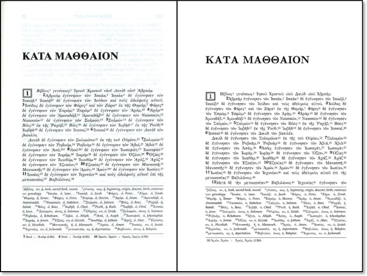
The observant reader may notice that there's slightly more text (most of Matt 1:12) on the second edition page. Therefore, the font is either tighter or smaller. Zondervan offers a PDF sample of the RGNT2 featuring the first five pages of Matthew. The second edition ends with Matt 3:17 while the equivalent page in the fist edition ends with 3:15. Two verses--is that a big deal? Probably not, but there is definitely an attempt to use fewer pages. Why? Because while there are more features in the RGNT2, but there are actually fewer pages than the first edition. Therefore, an attempt was made to conserve space. And while I wish Zondervan had not chosen to use a tighter/smaller font, I will say that regardless, the new text is much easier to read than the italicized text of the first edition.
But that brings us to another issue, and frequent readers of This Lamp will have to pardon a familiar complaint that I've discussed many times before. This New Testament, (presumably) like its predecessor is a thinline. How do I know this? Well, in spite of the fact that complete measurements have not been released, we do know a few things. I'm guessing the dimensions are a bit wider because the outer margin on each page is wider (see more below). We also know that although there is about a twenty page difference in the two editions, the weight is comparable (1.065 lbs. for the first edition vs. 1 lb. for the second edition). Thickness measurements for the second edition have not been released, but the first edition is 7/10 of an inch thick. Since the two editions weigh virtually the same, I can only assume that the second edition will be just as thin.
Personally, I hope that one day, publishers will get over their infatuation with thin Bibles and realize that the target market for a resource like this does not mind having a book that is somewhere between one inch and one and a half inches in thickness. I'm sorry, but cramming 576 pages into 7/10 of an inch is ridiculous.
Again, this is an area where I with publishers would realize that those who buy products such as the RGNT appreciate not just thicker paper, but also wide margins for making notes, Regardless, whereas, the first edition's anemic margins were useless for any annotations, the new wider margins begin to approach a minimum width for note-taking,
Mlnl-Lexlcon. For those occasions when the reader forgels one of those words that occur more than 30 times, a new mini-lexicon has been added, presumably in the back of the RGNT.
Maps. Four new color maps have been added to the second edition of the RGNT. Already UBS/NA Greek New Testaments tend to have basic contextual maps inside the front and back covers. With the addition of these maps to the RGNT, this resource begins to take the feel of a standard reference tool and even a one-stop instrument for public use.
And the rest. Like the first edition, the new RGNT comes in an Italian Duo-Tone binding, I've stated before that I like this material just as much as actual leather. Assuming that these covers are going to hold up over decades-long use, I find them to be a very adequate substitute for real leather, especially if this keeps the price down. Perhaps Zondervan could put a disclaimer on the copyright page: "No cows were harmed in the publishing of this New Testament."
And of of course, the RGNT second edition will continue to offer lexical forms of words that occur less than 30 times in the Greek NT as well as noting where the text diverges from the UBS/NA texts. I'm pleased that they continue to keep these notes on the same page as the NT text, in footnote fashion, rather than by some other means.
I'll have more to say about the RGNT2 after I get my hands on one in November, Butfrom what l can already determine, it is already looking to be a great improvement over what was already a very practical and useful resource.