New Look
03/02/2007 15:05 Filed in: Miscellaneous

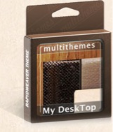
Incidentally, for those of you who are curious about such things, I edit this website using RapidWeaver, and this particular theme is called "My Desktop," which I obtained from Multithemes.
UPDATE 3/3: Based on comments, I've widened the main body. I've also tried to streamline subpages. The Multithemes came with .png objects that could be dropped into place. It's nifty to have that ability, but the stuff scattered around the borders may be a bit much. I'll see if it grows on me.
UPDATE 3/5: Okay, I've removed the .png objects and tried to do some basic cleanup. If everything looks okay after this next publish (which means you're reading this), I'll leave it alone at least for a while. I still may move the site to iWeb if the forthcoming v. 2.0 does everything I want it to do.


